
jingram2

Small Stages

Small Stages

Details:

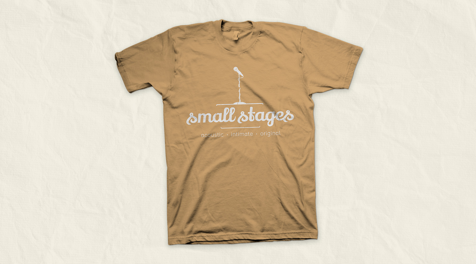
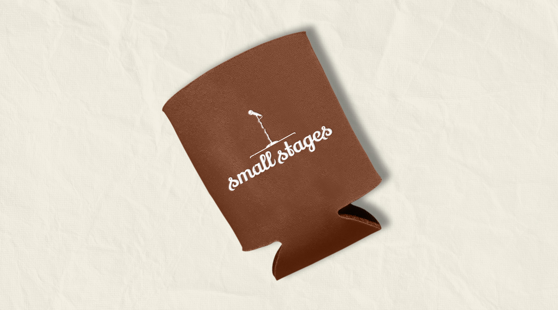
This logo was created for Small Stages, which is a series of events where various locales will host small, intimate performances, usually by local, up-and-coming artists. I created this logo to reflect the friendly, down-to-earth nature of the event, without allowing it to be associated too closely with any single genre of music, as the performers change between events. This brand was also created pro bono, in order to support the local artists and organizers.

  • Branding
  • Print
Posted by jingram2 in Branding, Print
Leapfrog Systems Consulting

Leapfrog Systems Consulting

Details:

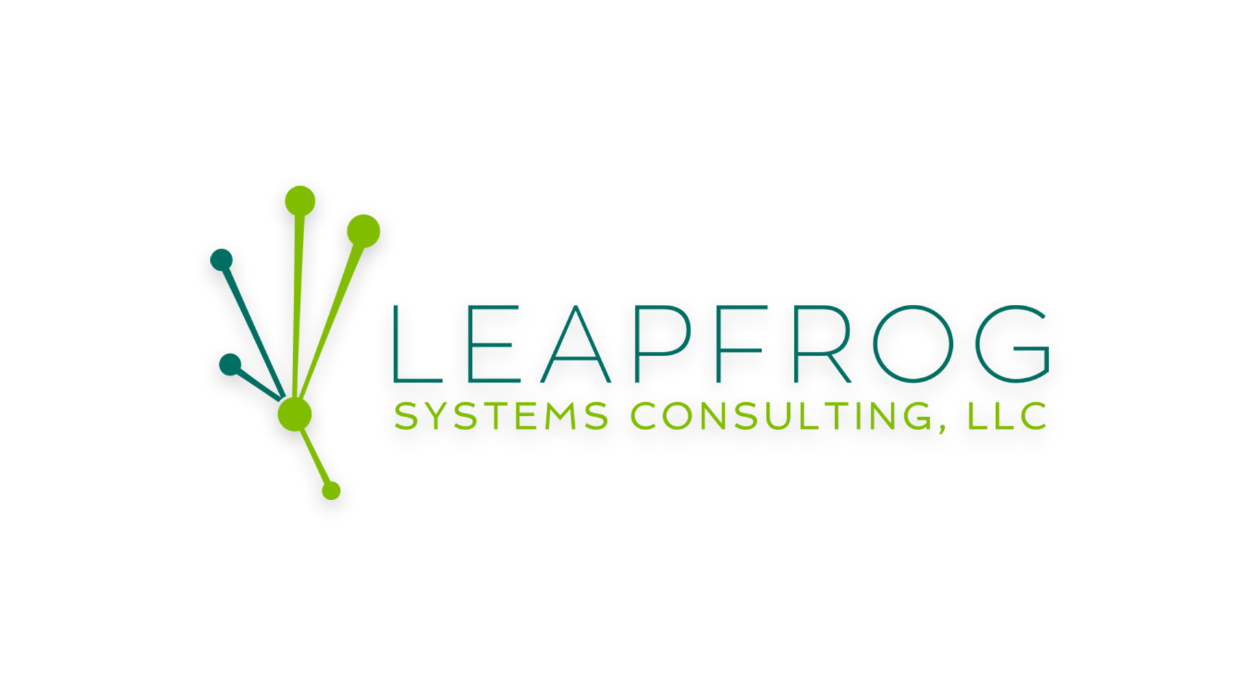
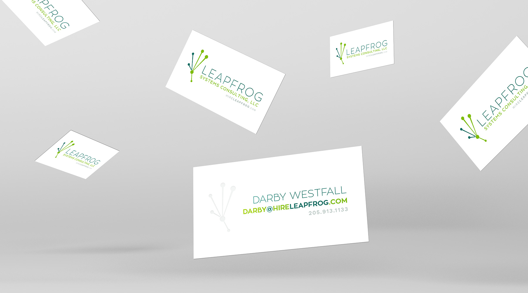
Leapfrog Systems Consulting is a group which consults in the world of technology and communications systems.  I was asked to create a brand and collateral for them, which resulted in a logo which is still one of my favorites. The Leapfrog logo is simple, but carries a ton within it. Based on the shape of a frog's footprint, it is made up of connected, tech-themed points, which also form the back-to-back initials L and F – this allows the icon to stand very strongly on its own whenever necessary.

  • Branding
  • Print
Posted by jingram2 in Branding, Print
Let’s Think On It

Let's Think On It

Details:

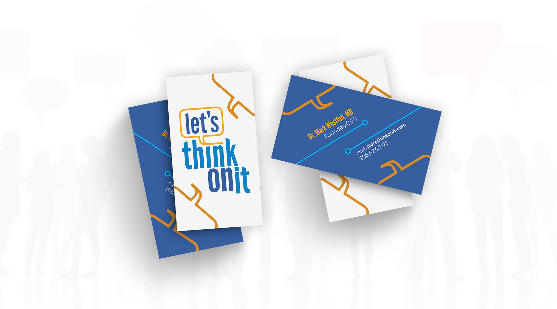
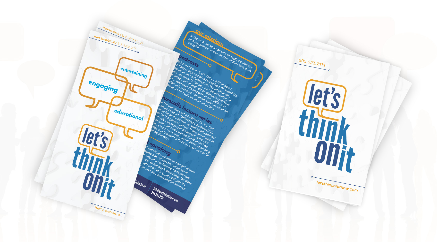
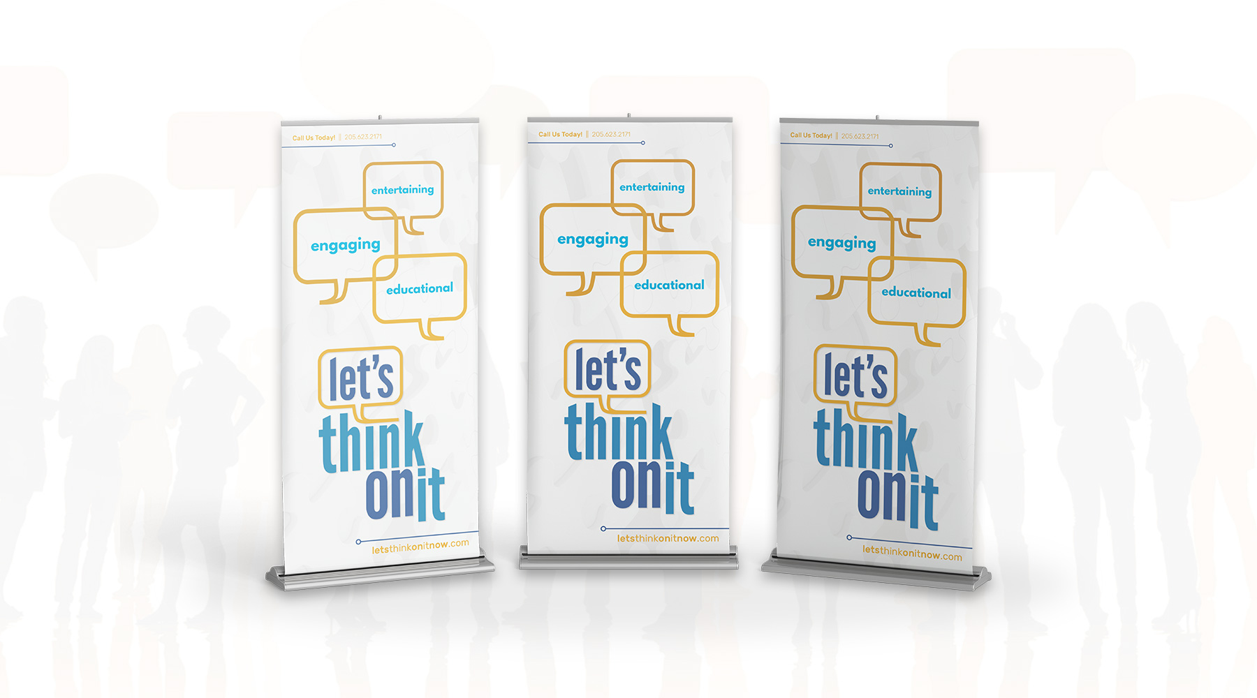
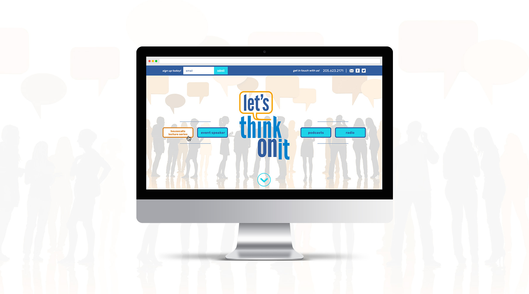
Let's Think On It began as a podcast wherein Dr Mark Westfall would talk with guests about mental health issues, largely in an effort to help those without these issues understand the struggles of others. From there, it grew into an in-person lecture series, which required quite a bit more branding than the existing podcast artwork could provide.  I created the whole new brand then, as well as several pieces of collateral, and a new website design.

  • Branding
  • Web Design
  • Print
Posted by jingram2 in Branding, Print, Web Design

An Untethered Life

An Untethered Life

Details:

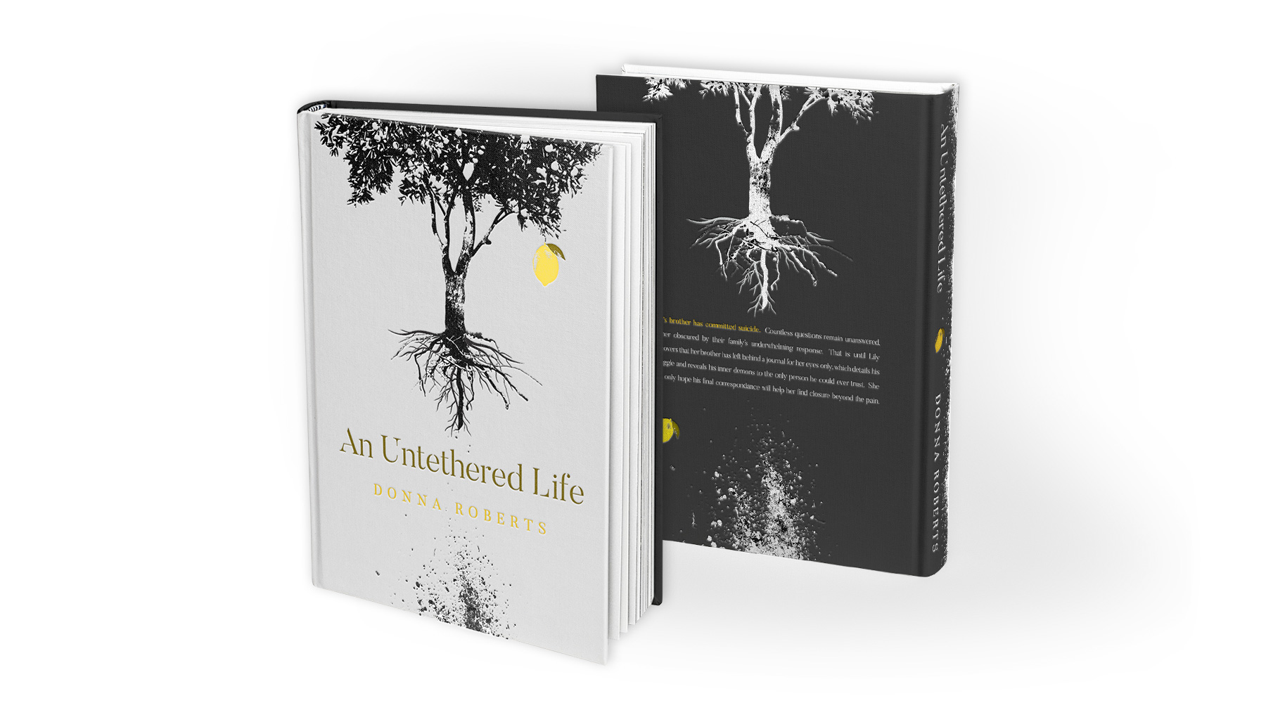
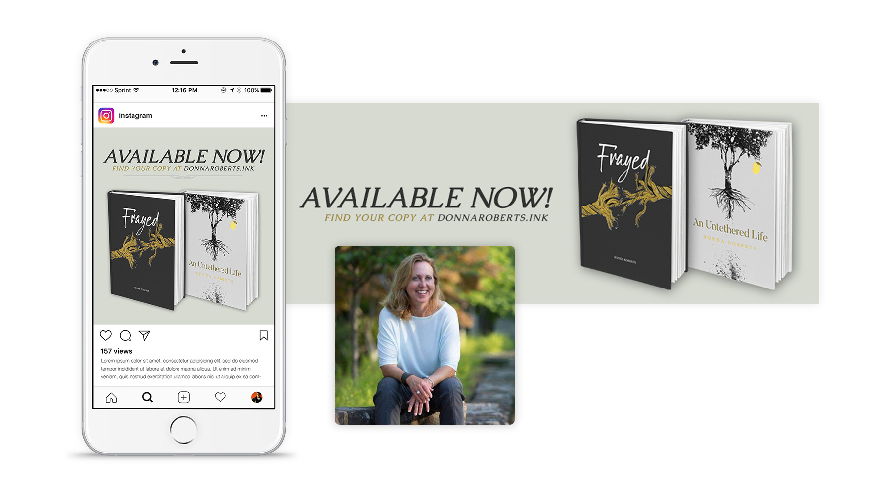
When author Donna Roberts was preparing to release her second novel, she gave me a copy of the manuscript and asked me to design the book cover.  An Untethered Life is about a young woman coping with the loss of her brother to suicide, and is full of compelling imagery and symbolism. In creating the cover, I made sure to convey the tone of the work, as well as utilize the symbolism in a way that grabs a reader's attention and holds it until the very end of the story.

  • Advertising
  • Packaging
  • Print
Posted by jingram2 in Advertising, Packaging, Print

COCM

COCM

Details:

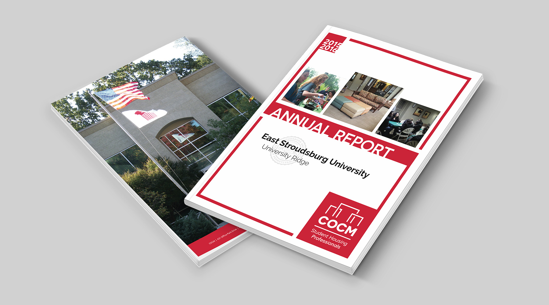
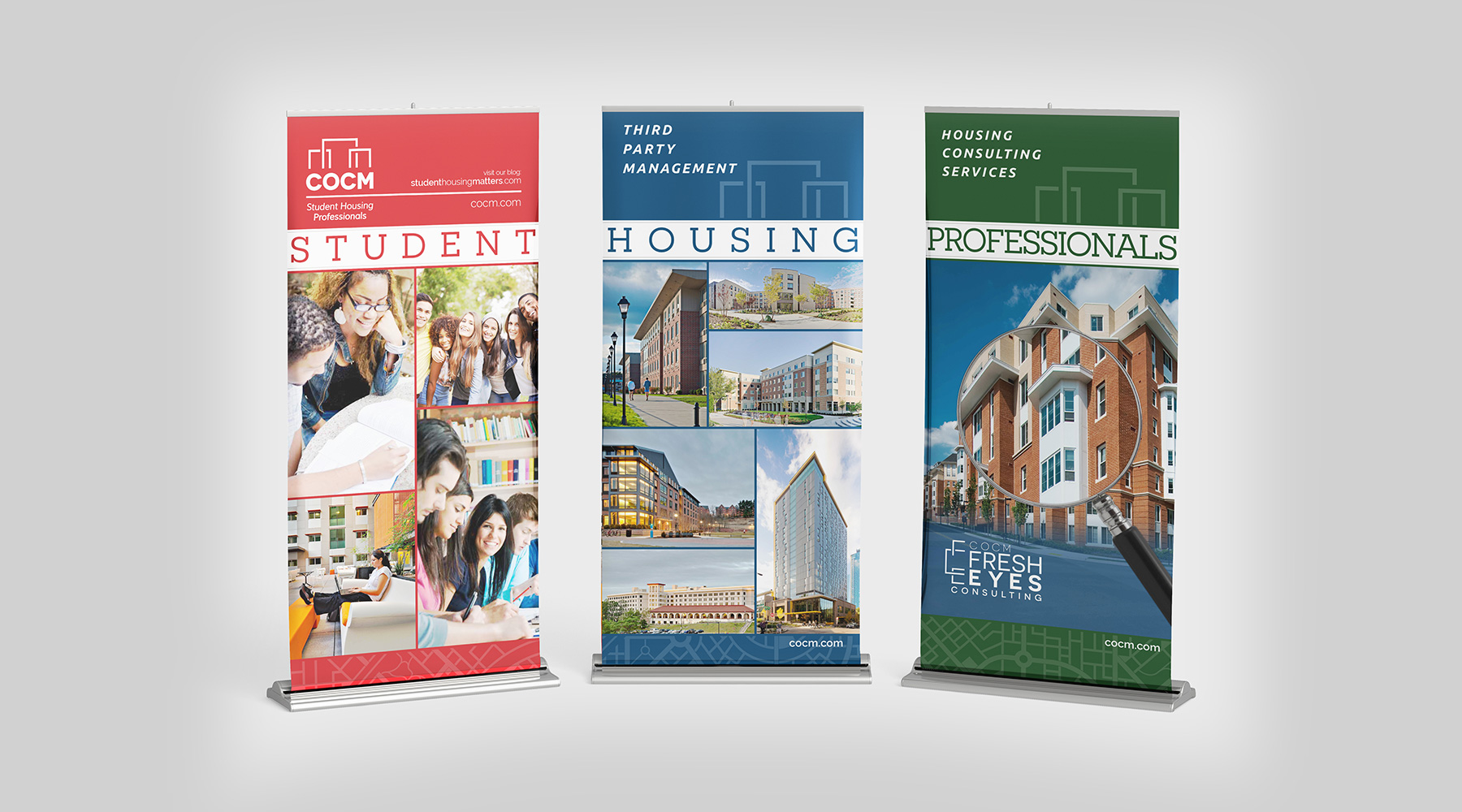
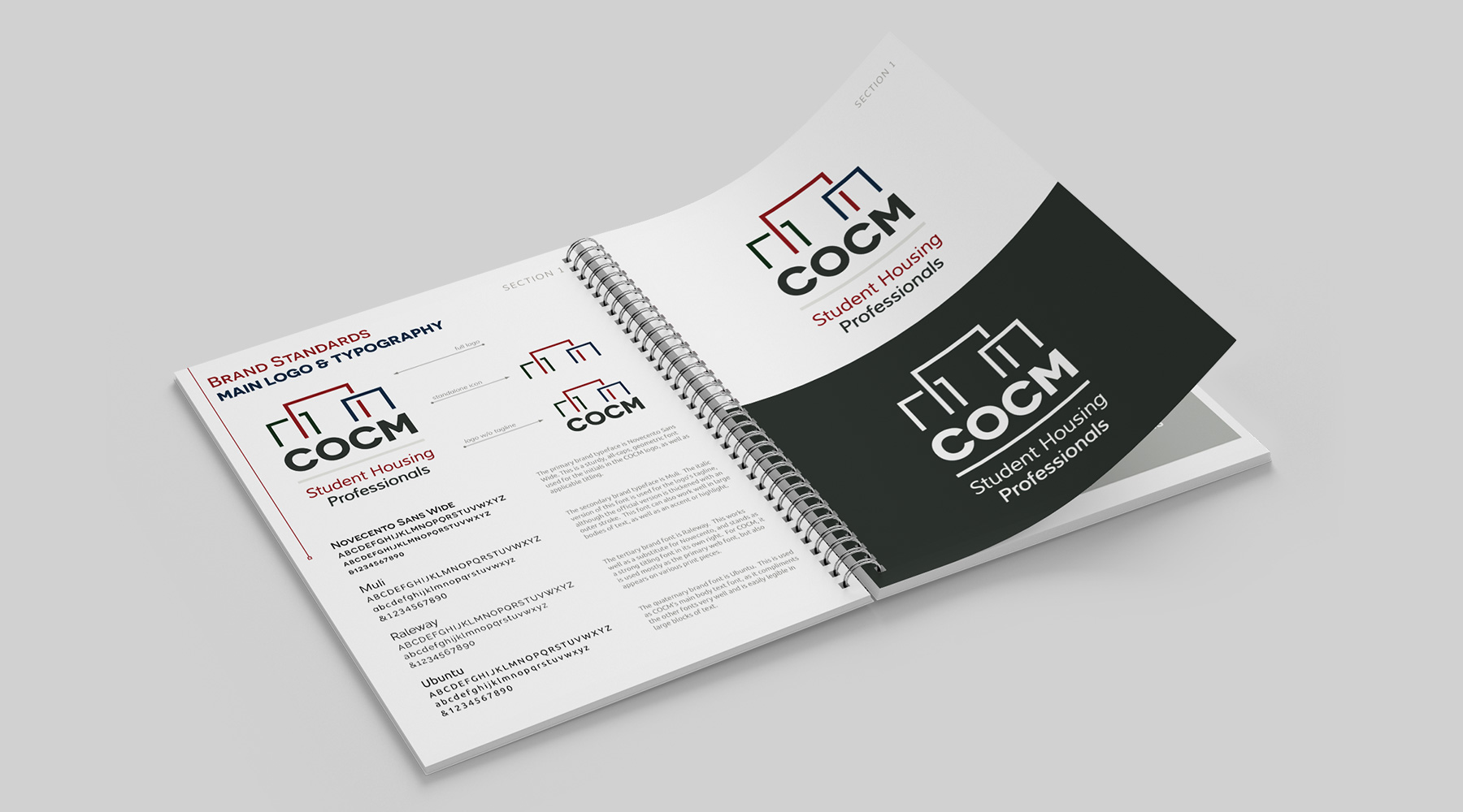
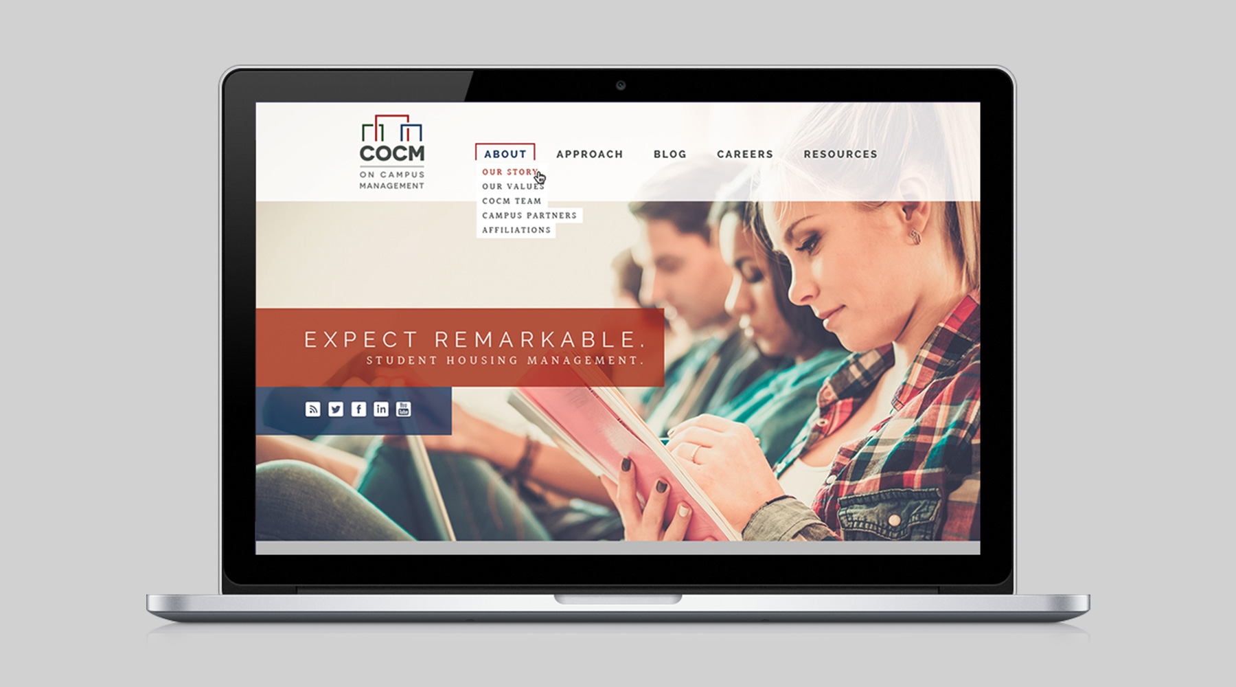
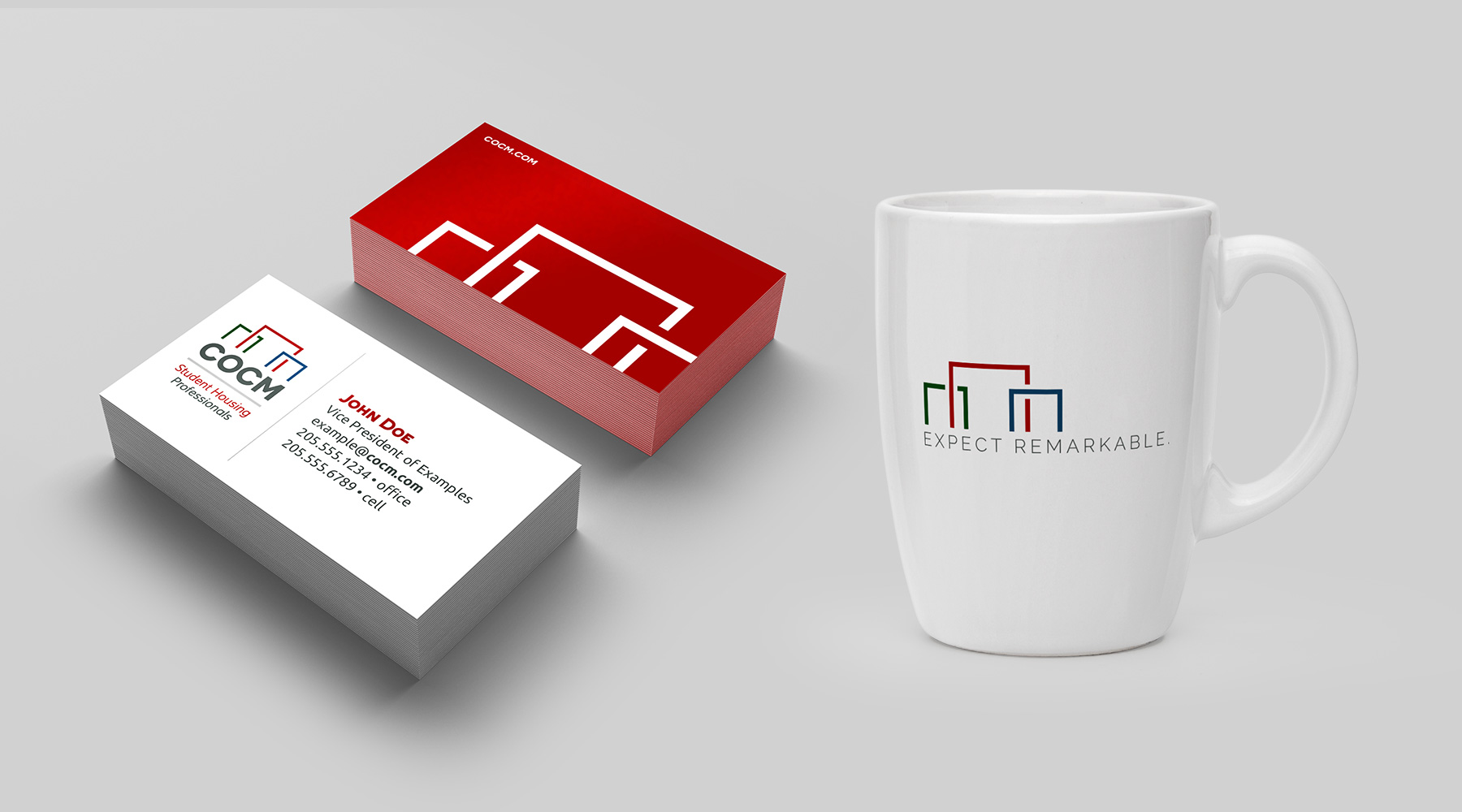
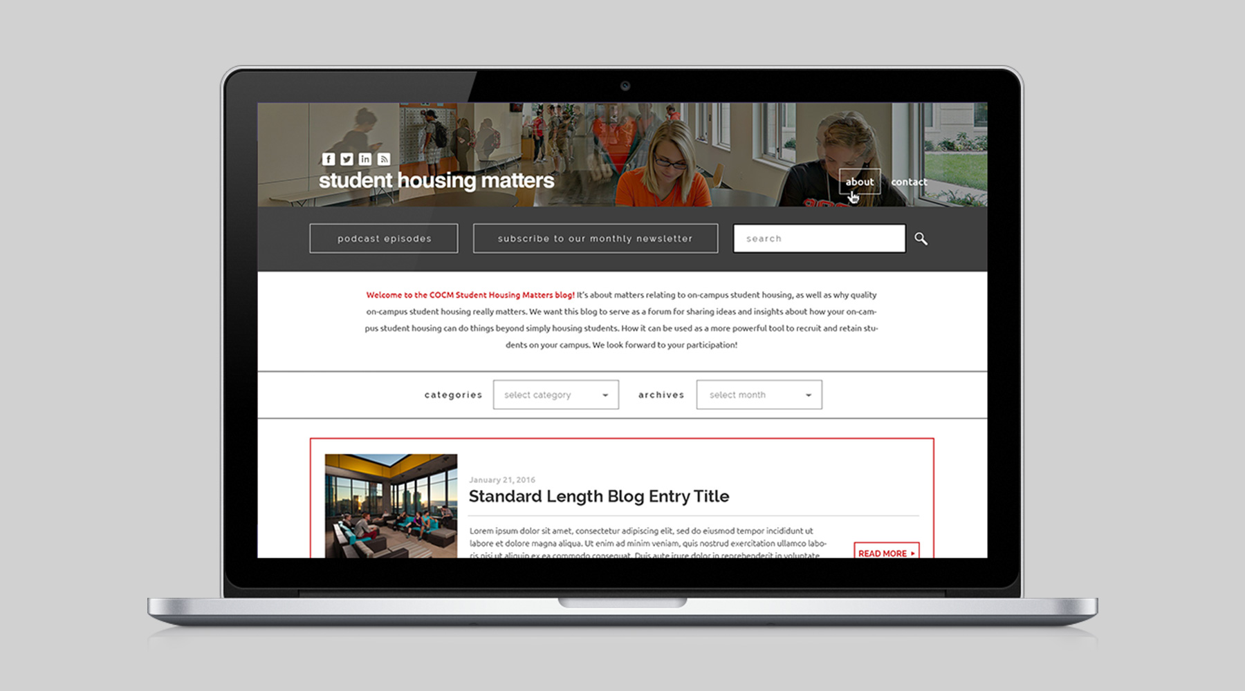
During a long professional relationship with COCM, I created countless pieces for them. I designed and formatted their Annual Reports, created standing banners for them, designed their website as well as the website for their blog/podcast, created their brand standards book, and designed tons of print collateral. Shown here are some of my favorite pieces.

  • Advertising
  • Print
  • Web Design
Posted by jingram2 in Advertising, Print, Web Design

Magic City Whiskey

Magic City Whiskey

Details:

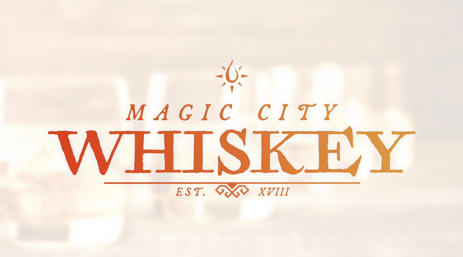
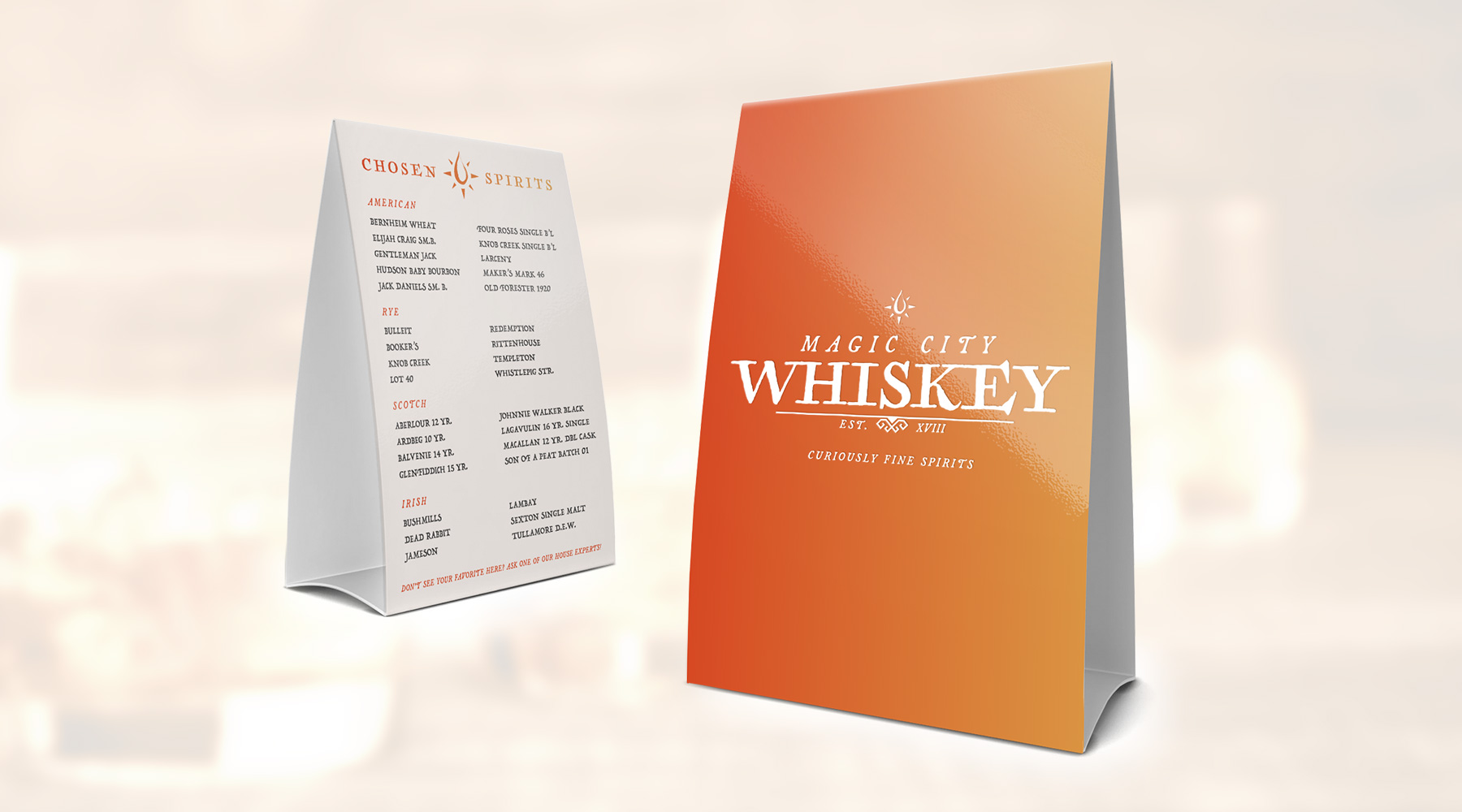
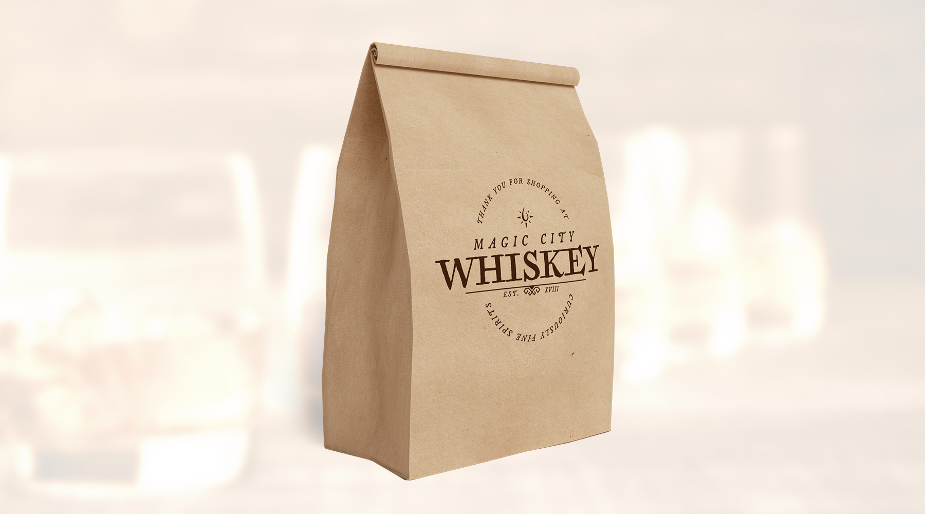
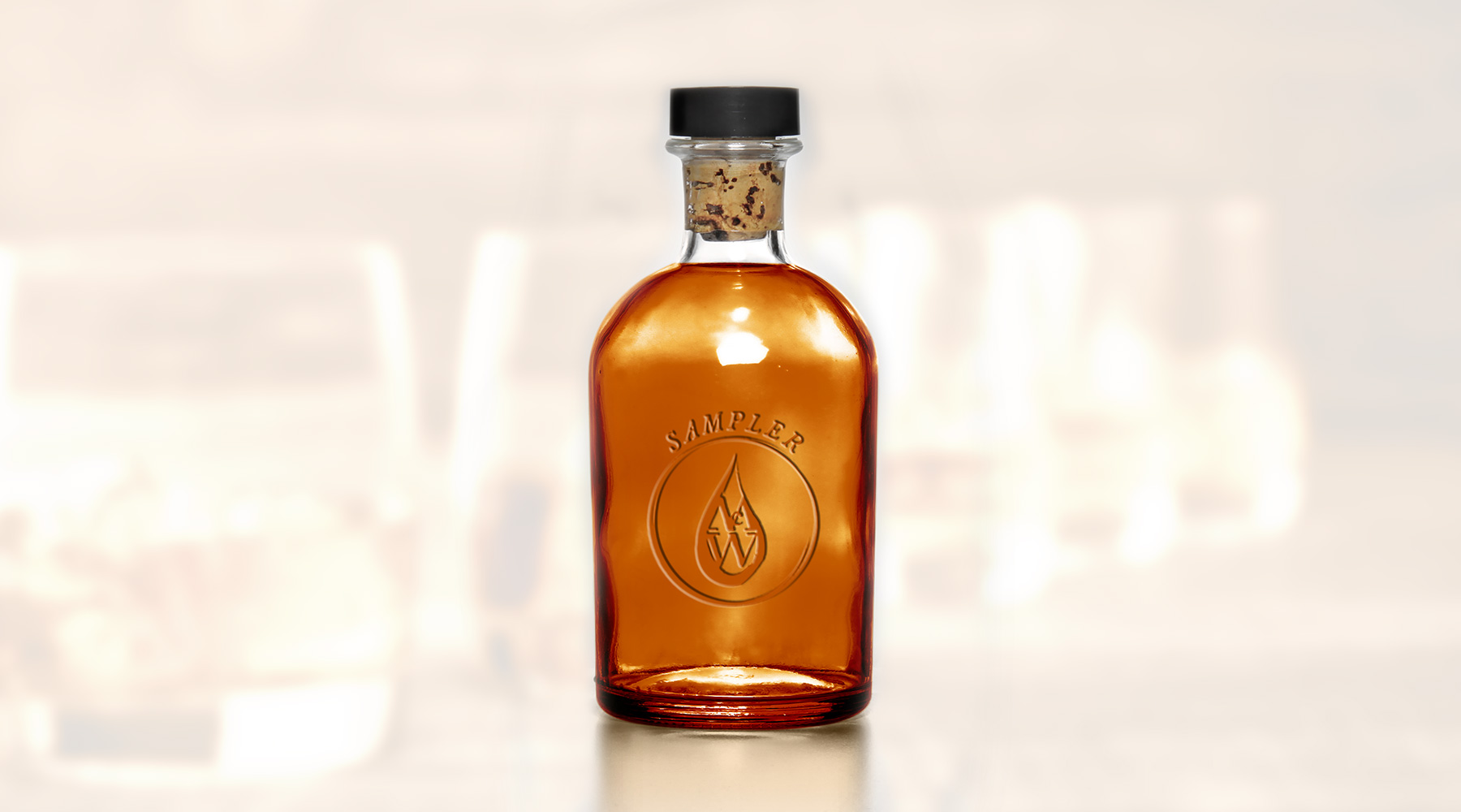
In preparation for opening one of the first whiskey bars in downtown Birmingham, this client asked me to create a brand that utilized a fresh take on Birmingham's "Magic City" nickname in its look and feel.  To accomplish this, the client asked me to use the aesthetic of the Harry Potter film series as inspiration. The end result is a unique and engaging brand, blending motifs of "old magic" and "distinguished taste" in a fun, almost tongue-in-cheek way.  The plans to open the bar sadly fell through, but this remains one of my favorite pieces.

  • Branding
  • Merch
  • Packaging
  • Print
Posted by jingram2 in Branding, Merchandising, Packaging, Print

Simpson Basgier Law

Simpson Basgier Law

Details:

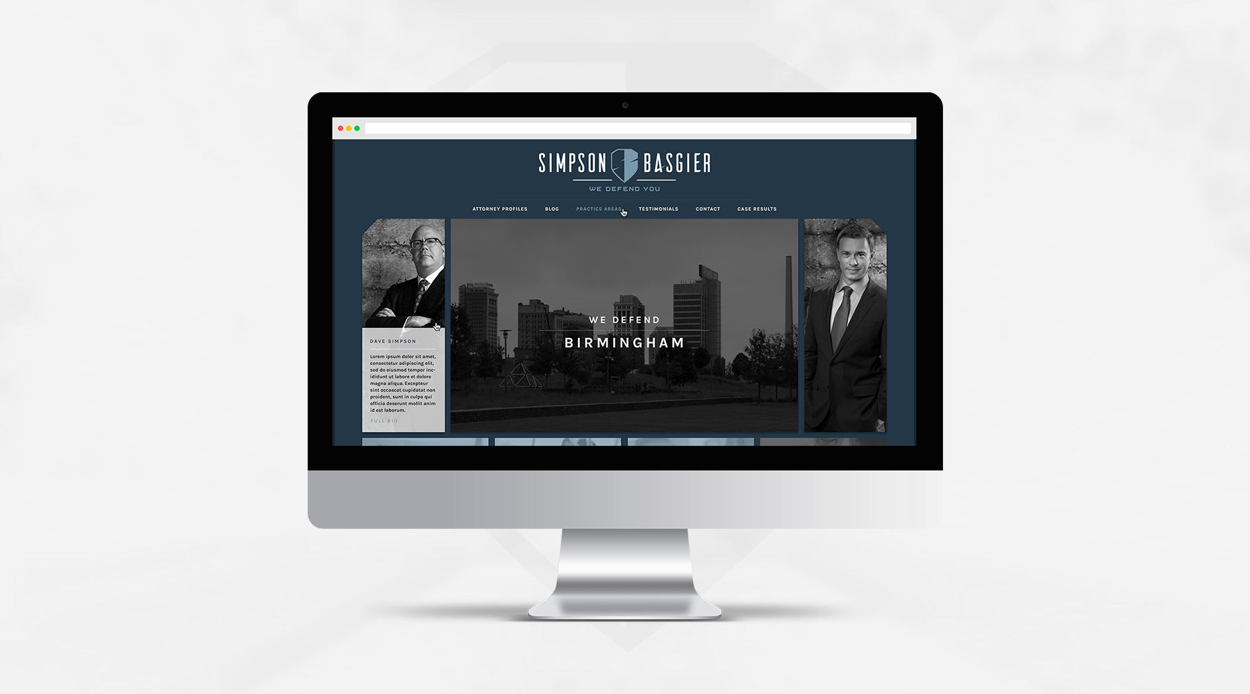
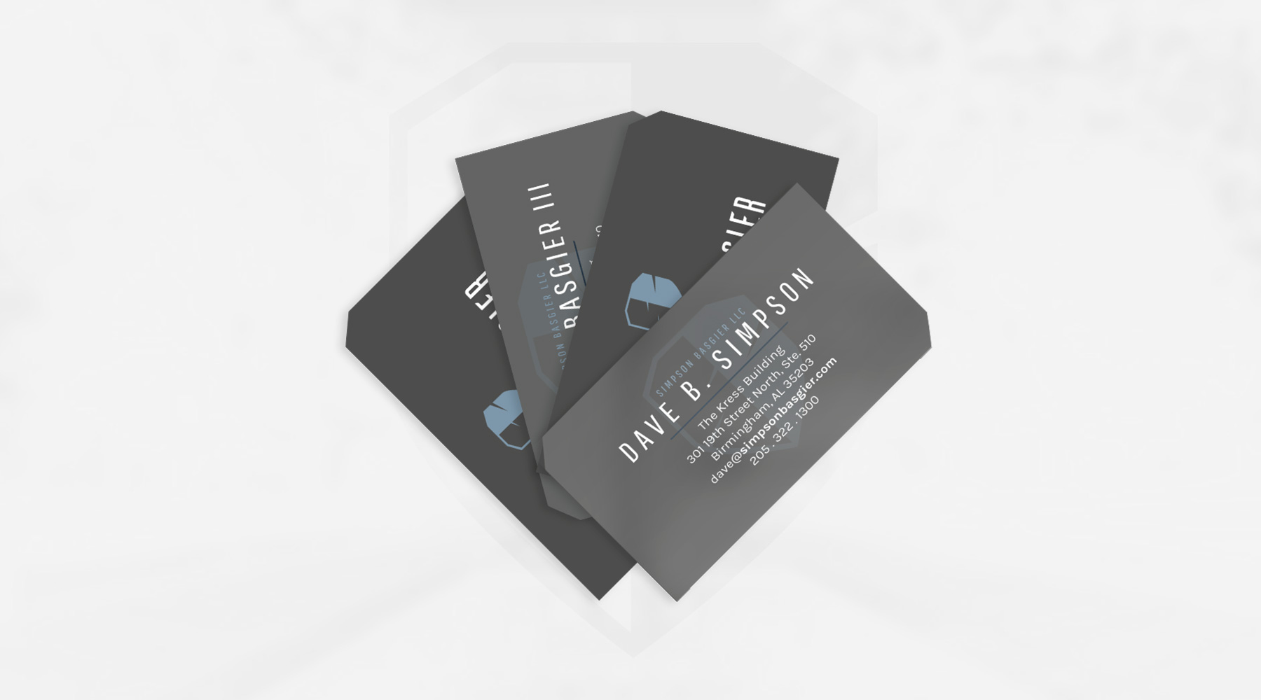
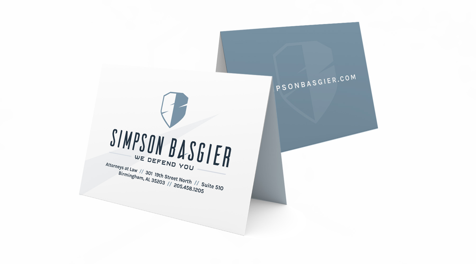
When two of Birmingham's premiere defense lawyers formed a partnership, I was tasked with branding the new dual identity, as well as designing their new brand collateral and website. The end result is a simple shield, which subtly contains the two lawyer's initials, formed from "reflective" strikes.  Every element, from the beveled edges to the upward strikes, is an intentional addition to cultivate the idea of a razor-sharp defense team that rises above all others.

  • Branding
  • Print
  • Web Design
  • Photography
Posted by jingram2 in Branding, Print, Web Design

SheRox

SheRox

Details:

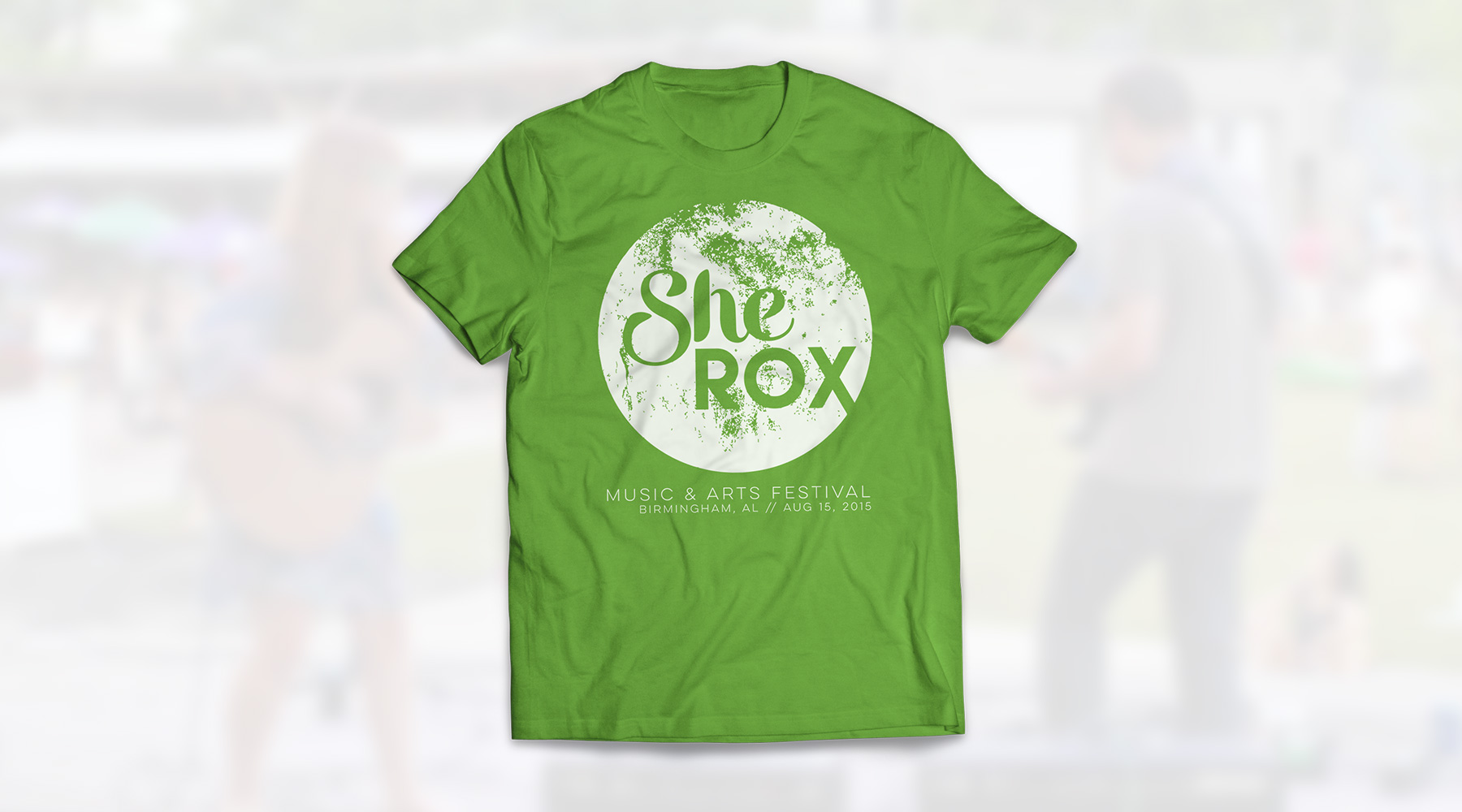
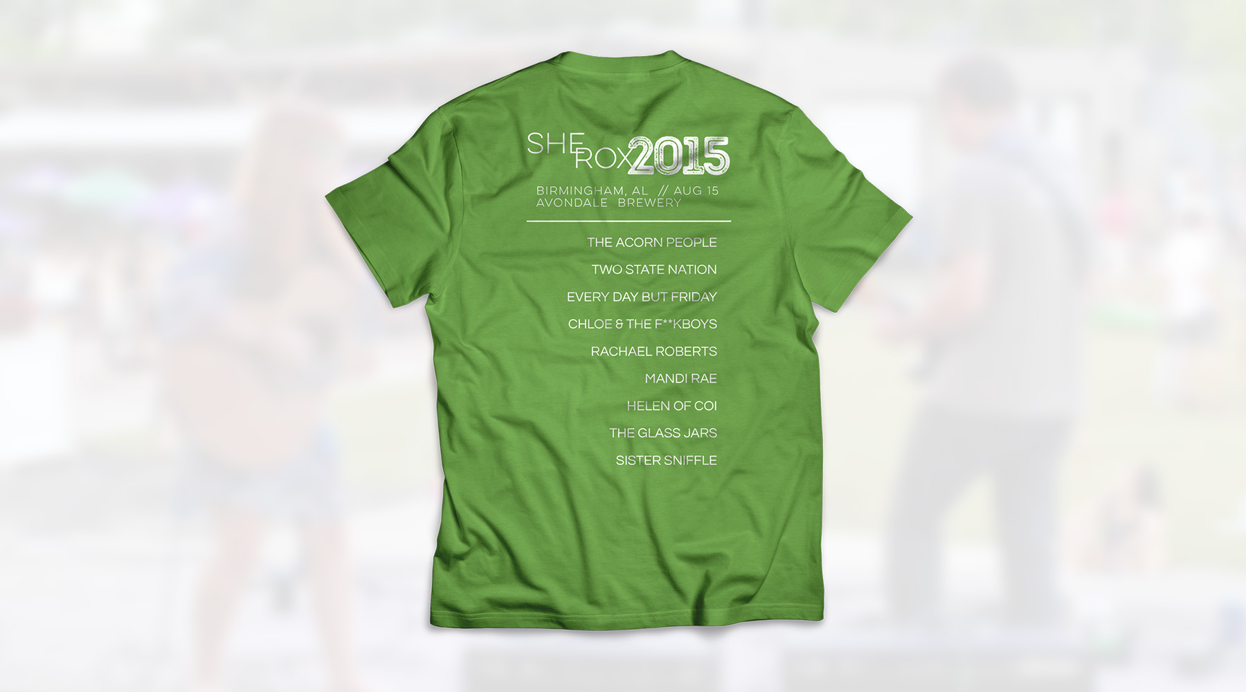
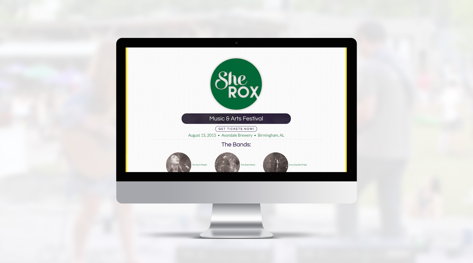
As a pro bono project, I was asked to spearhead all of the creative work for the first ever SheRox Arts & Music Festival in Birmingham, which is a female-led, nonprofit event benefitting victims of trafficking and abuse. I created the brand, designed the shirts, designed and coded the website myself, even helped with some of the photography during the event. This is a project I'm very proud of, and a cause I'm excited to support.

  • Branding
  • Web Design
  • Merch
Posted by jingram2 in Branding, Merchandising, Web Design

Wagstaff-Taylor & Associates

Wagstaff-Taylor & Associates

Details:

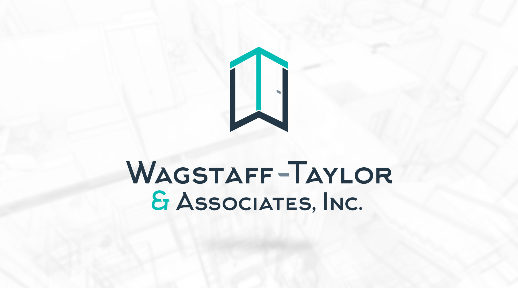
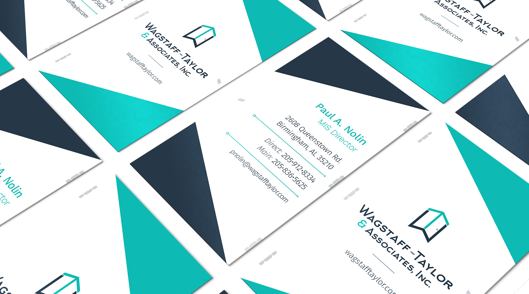
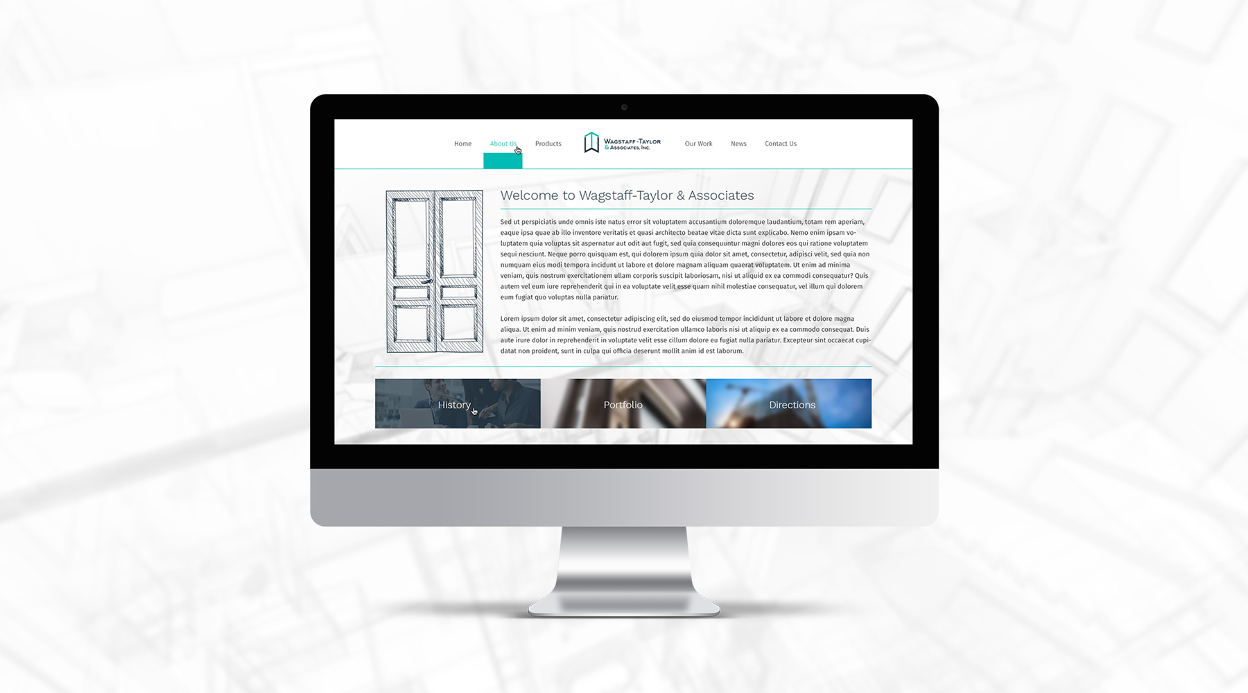
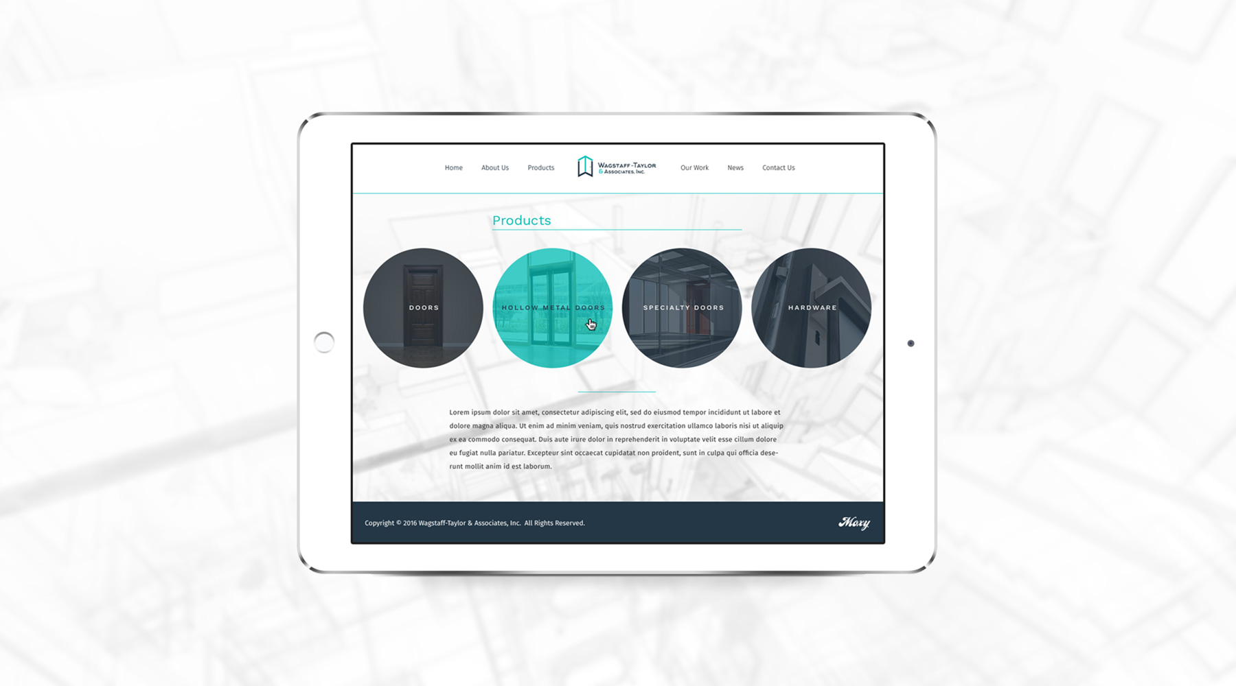
I was tasked with spearheading a complete rebrand of Wagstaff-Taylor & Associates, a company which provides industrial design and construction, specializing in different kinds of door installations. The end result was a logo which turned the initials of the group into a door frame, complete with an eye-catching, dynamic movement upward, alluding to the group's improvement of any industrial space. My team and I also created a new site to follow the modern direction of the new brand.

  • Branding
  • Web Design
  • Print
Posted by jingram2 in Branding, Print, Web Design

Nickels & Dimes

Nickels & Dimes

Details:

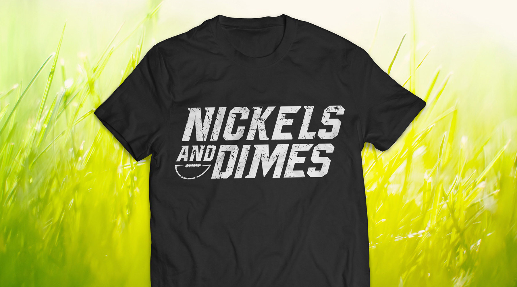
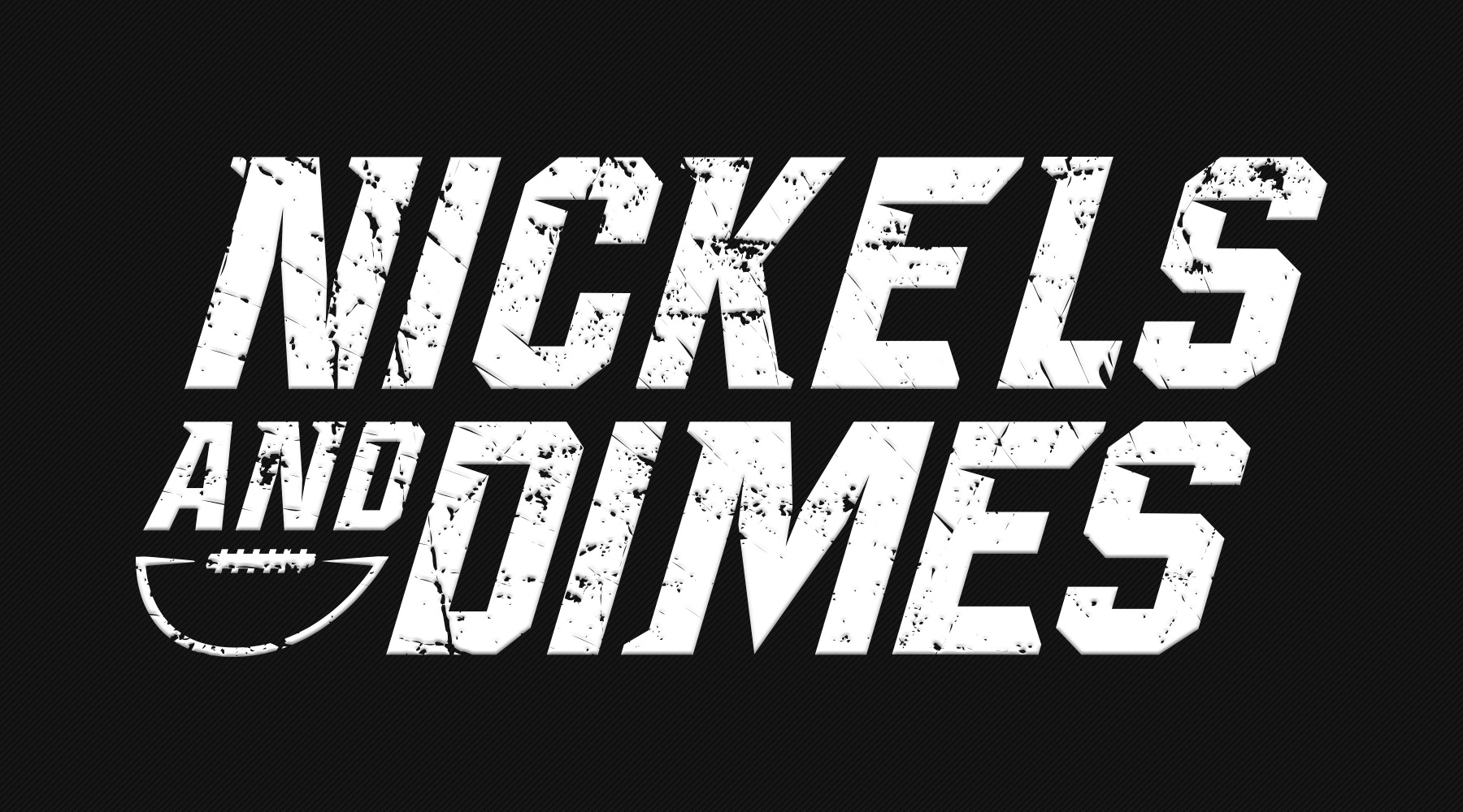
For this project, I was asked to create jerseys for a co-ed football team – according to the direction I was given, we were unable to use standalone marks or any significant imagery; the name was meant to stand alone almost completely. The end result required some experimental typography, but turned out to be the perfect blend of "intimidating and fun" that they were looking for.

  • Branding
  • Merch
  • Typography
Posted by jingram2 in Branding, Merchandising, Typography