jingram2

Chisel App

Chisel

Details:

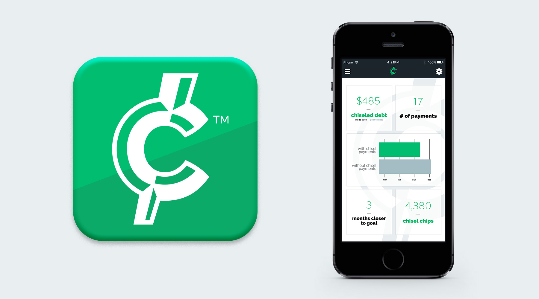
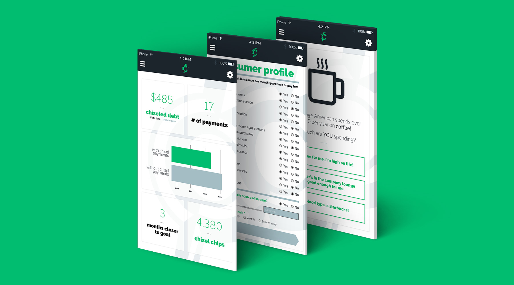
During a partnership with Whiteboard IT, one of Birmingham's top app developers, I was asked to design a brand and interface for Chisel, an app which serves the user by collecting his/her spare change from various purchases into an account which pays off the user's debt, little by little. It's not only a great idea, it also turned out to be a pretty excellent brand.

  • Branding
  • App UX/UI
Posted by jingram2 in App UX/UI, Branding

Unified

Unified

Details:

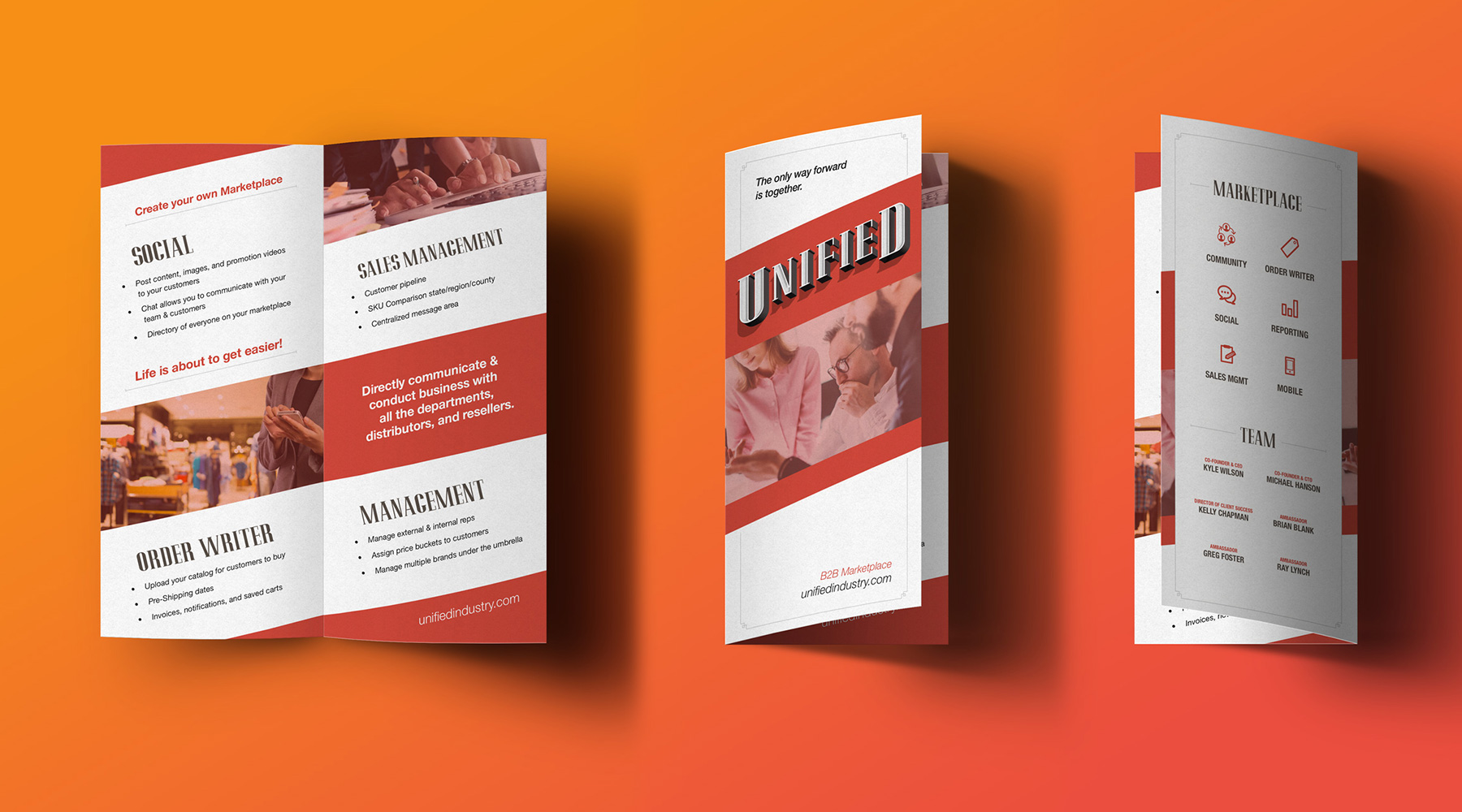
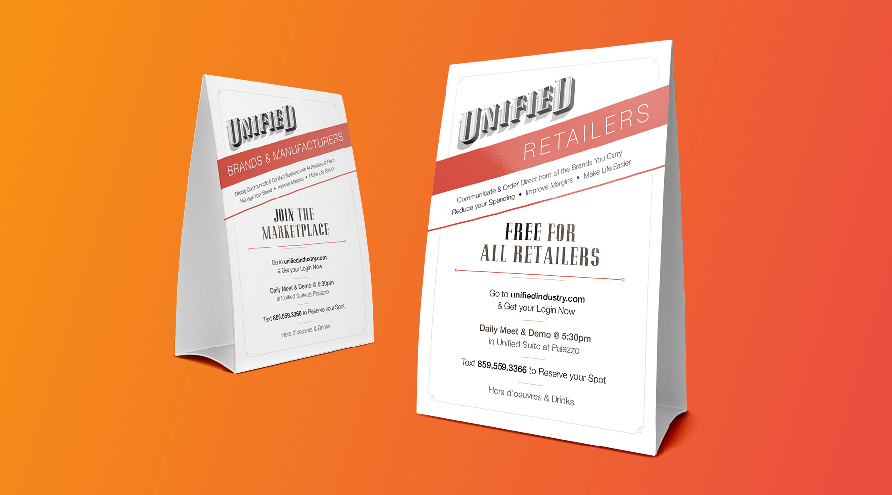
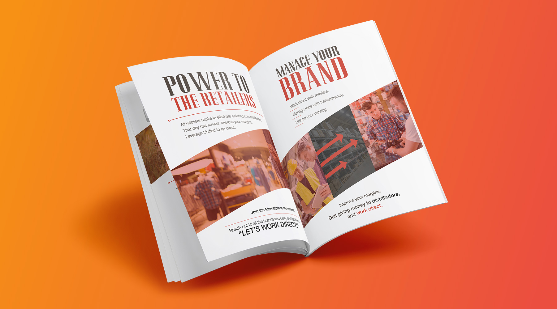
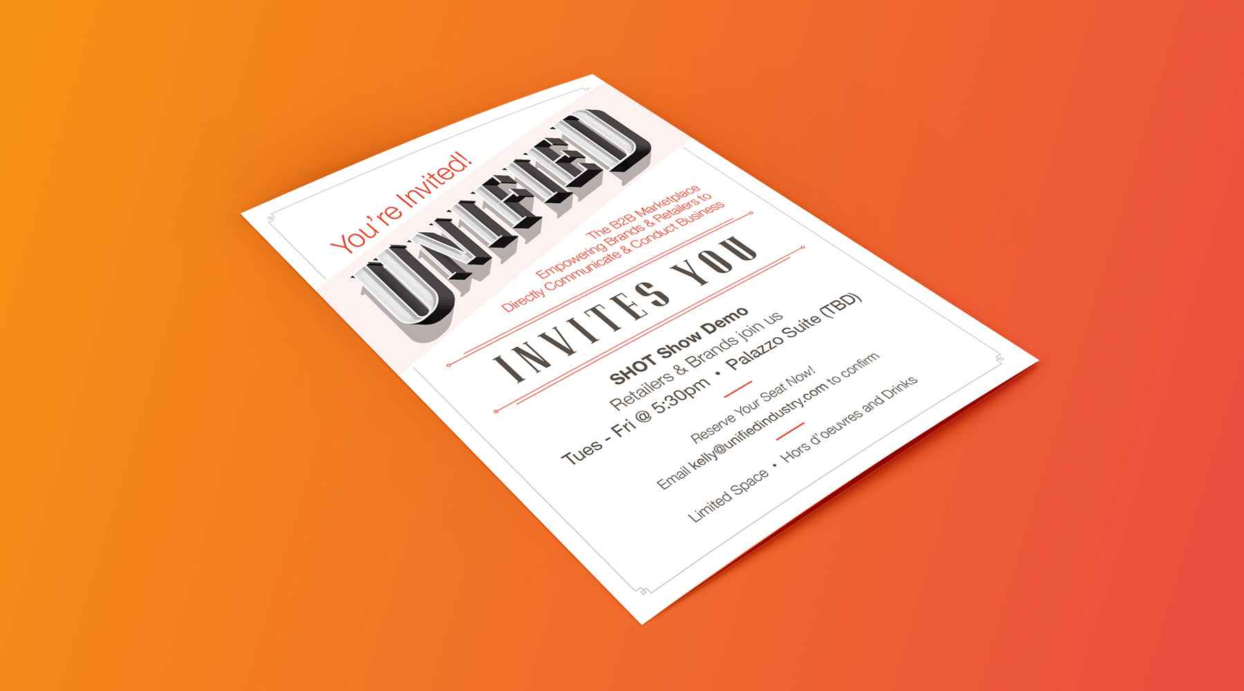
Unified is a company which provides businesses with easier, more direct B2B services through their own custom platforms. During my relationship with Unified, they have asked me to create numerous print and collateral pieces, including table tents, event invitations, sales booklets, and more. While I did not create their logo, I was able to use elements of it to maximize the effectiveness and overall feel of the print pieces utilizing it.

  • Advertising
  • Print
Posted by jingram2 in Advertising, Print

Frank S. Buck

Frank S. Buck

Details:

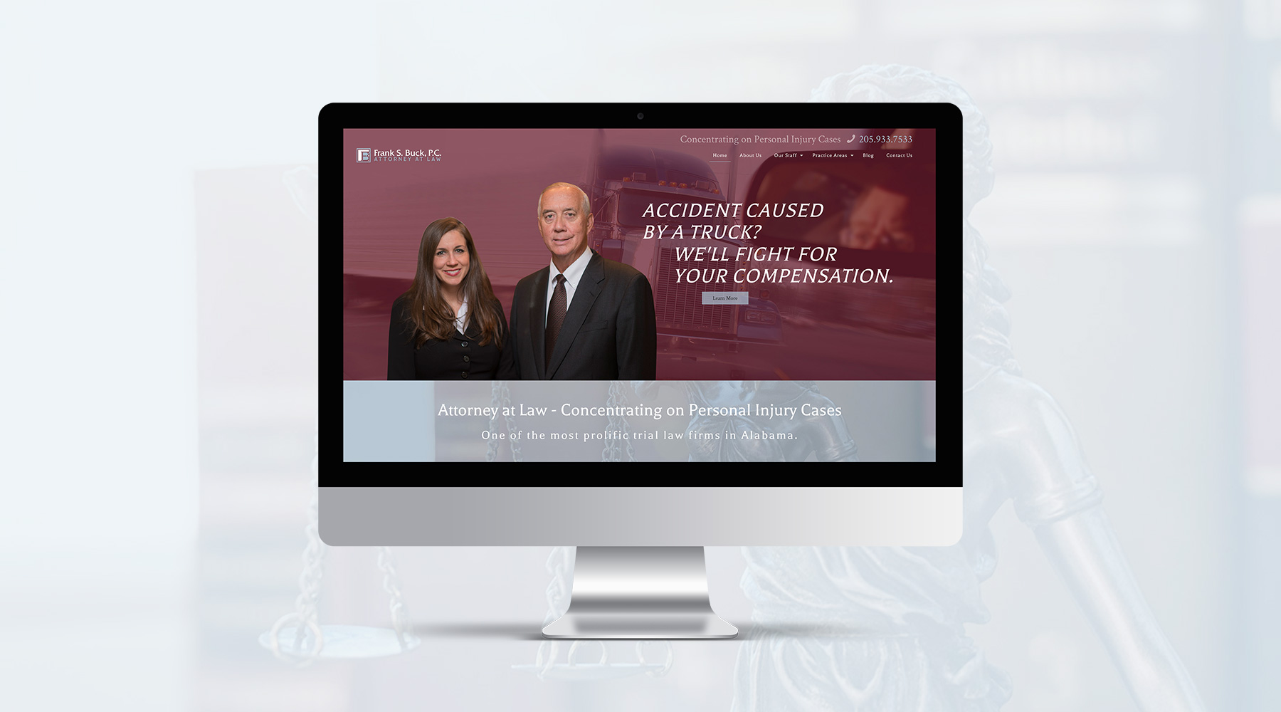
Frank S. Buck is one of Birmingham's premiere personal injury attorneys. While creating his firm's new site, I also pitched a new logo for them, which they instantly fell in love with.  It's as simple as simple gets, without looking stale or hackneyed.  The typography is subtly inspired by law's presence in television, which creates an instant, subconscious connection in the minds of our audience.

  • Branding
  • Web Design
Posted by jingram2 in Branding, Web Design

Biotech Balancing

Biotech Balancing

Details:

Biotech Balancing is a company which helps laboratories and other scientific facilities maintain controlled environments, whether that means temperature, air filtration, contamination control, or the like.  I spearheaded their rebrand, creating a new logo for them which not only includes a mark which bears their initials, but also speaks much more successfully to what they do – bringing balance to the spaces where science gets done.

  • Branding
  • Print
Posted by jingram2 in Branding, Print

Andy Sidaris Collection

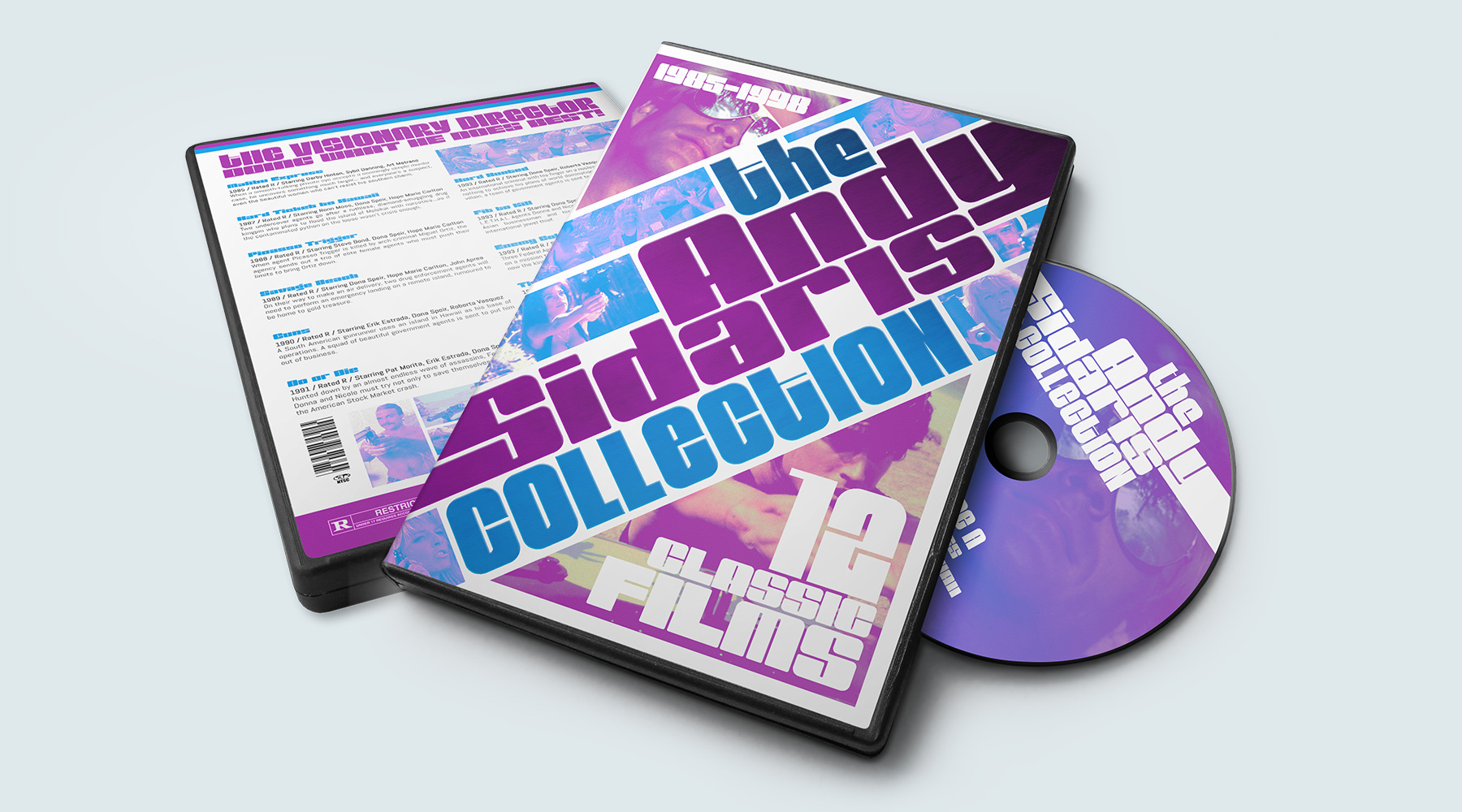
The Andy Sidaris Collection

Details:

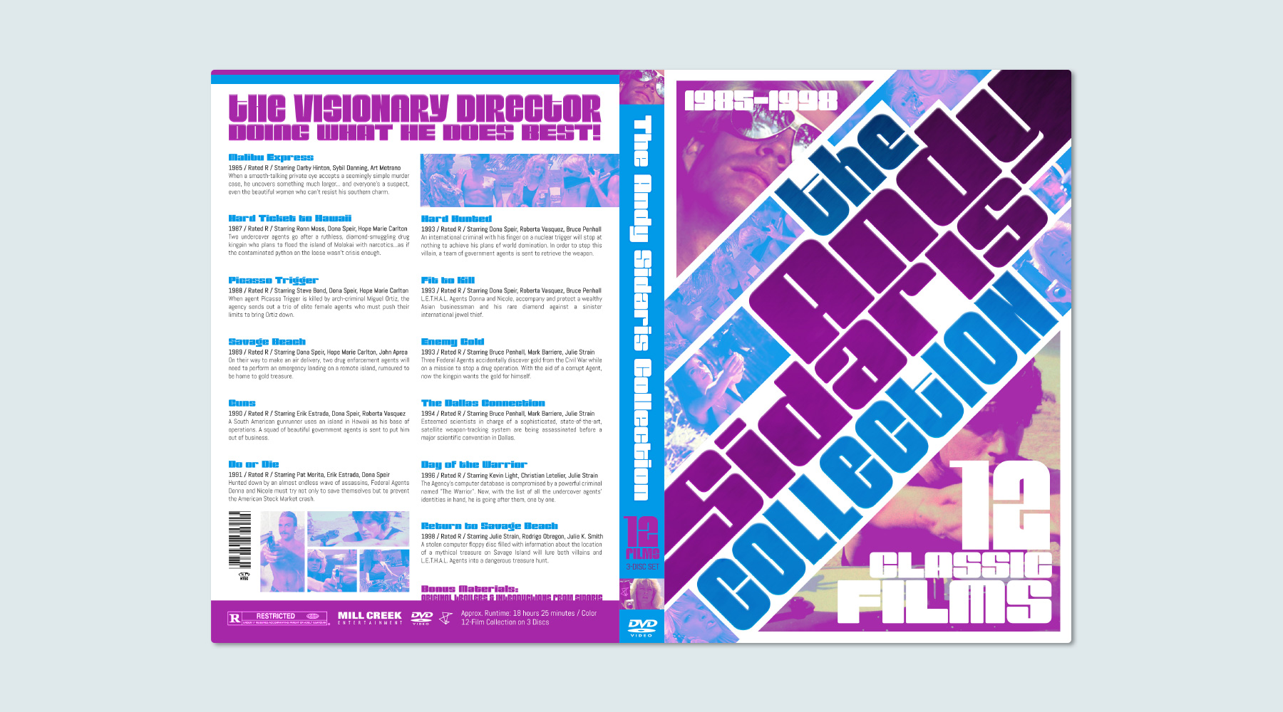
I take a lot of pride in my personal movie collection.  When I ordered this set of films, it was delivered with a case that I felt the need to replace – so I decided to make it myself, and have some fun with it. In the process of redesigning this DVD set, I actually ended up learning quite a bit about the details that go into a movie's packaging.  As a result, even though this project was just for fun, I ended up being pretty proud of how this turned out!

  • Print
  • Packaging
Posted by jingram2 in Packaging, Print

Beaker Seekers

Beaker Seekers

Details:

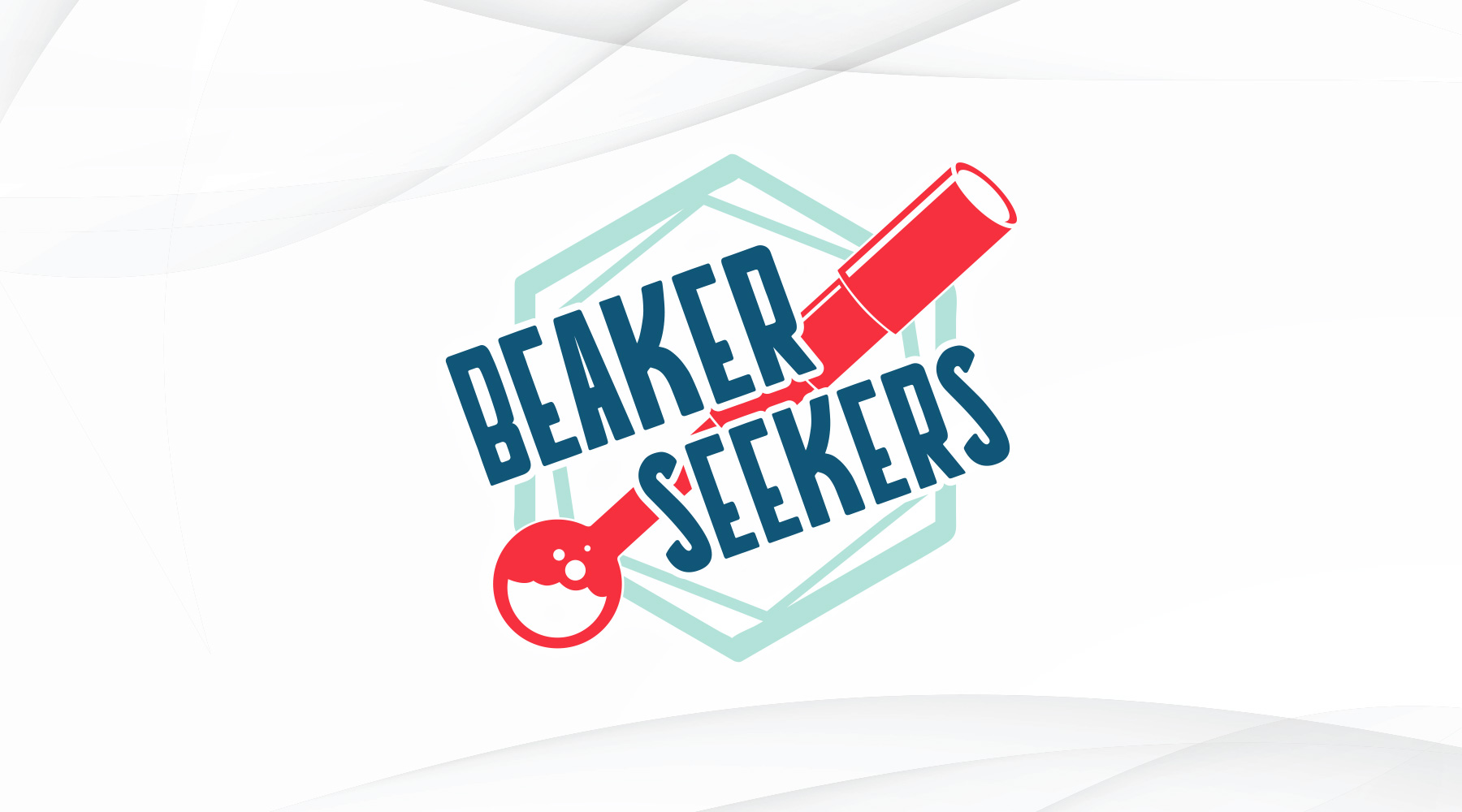
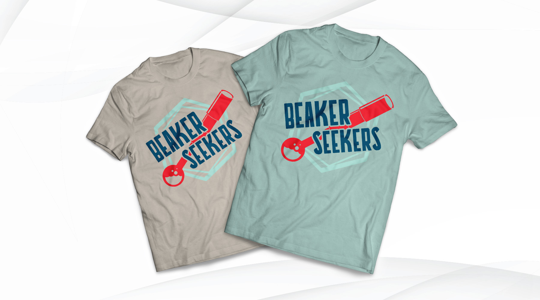
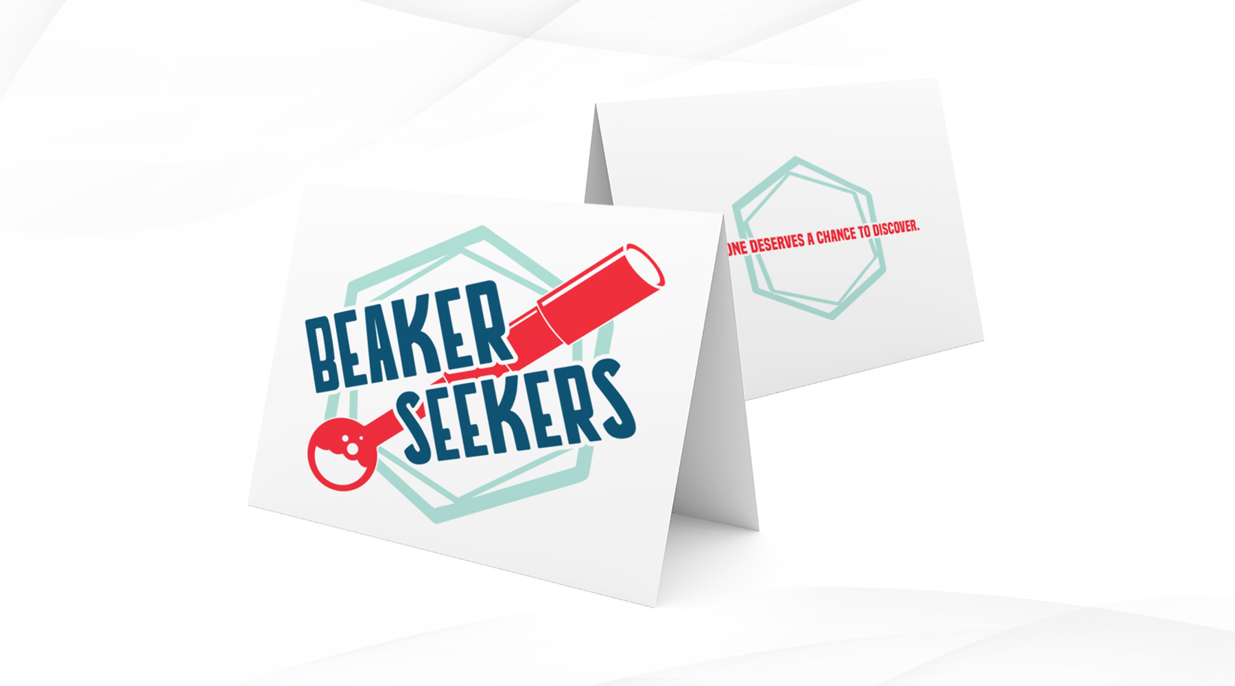
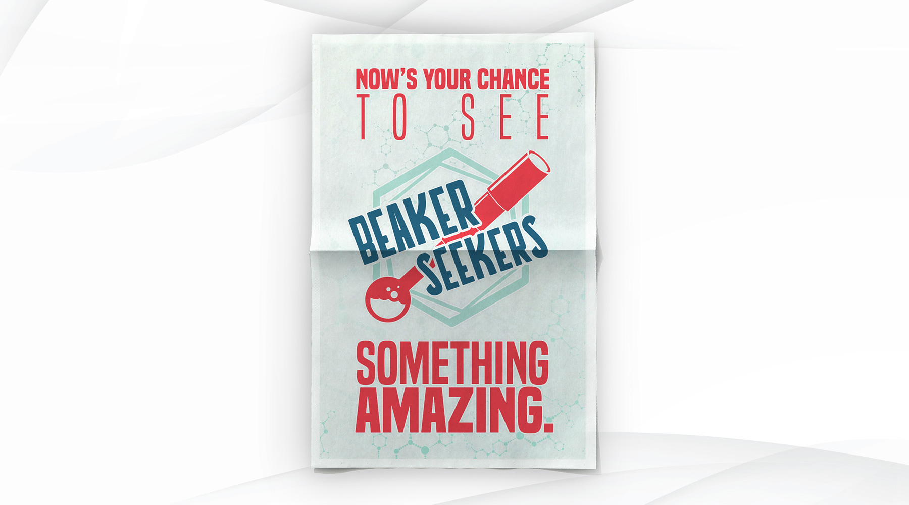
Beaker Seekers is a group which raises funds to help school systems in low-income areas afford different learning resources and field trips to places like Birmingham's own McWane Science Center. As a pro-bono project, I was asked to create a brand for them, as well as mock up a few print pieces that the logo may be used in.

  • Advertising
  • Branding
  • Merch
  • Print
Posted by jingram2 in Advertising, Branding, Merchandising, Print

UltraBlast Factions

UltraBlast Factions

Details:

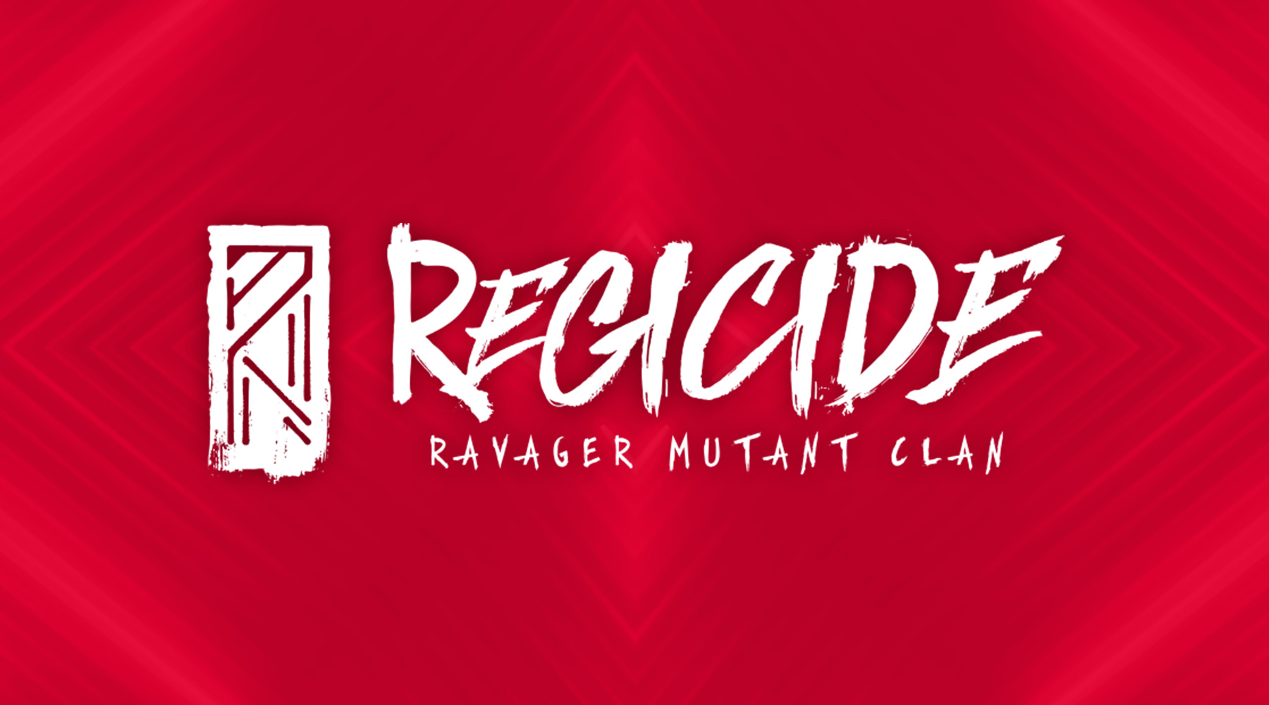
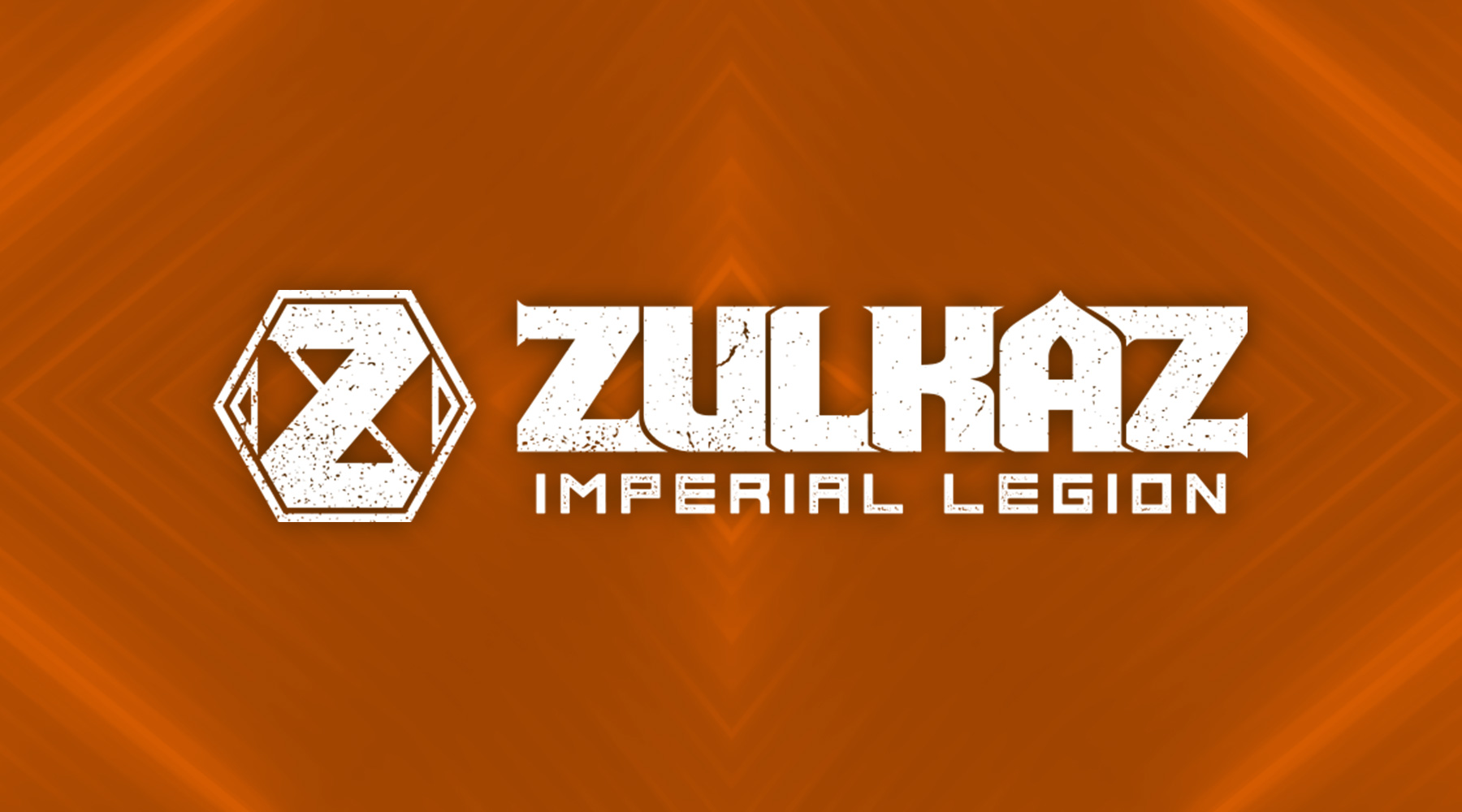
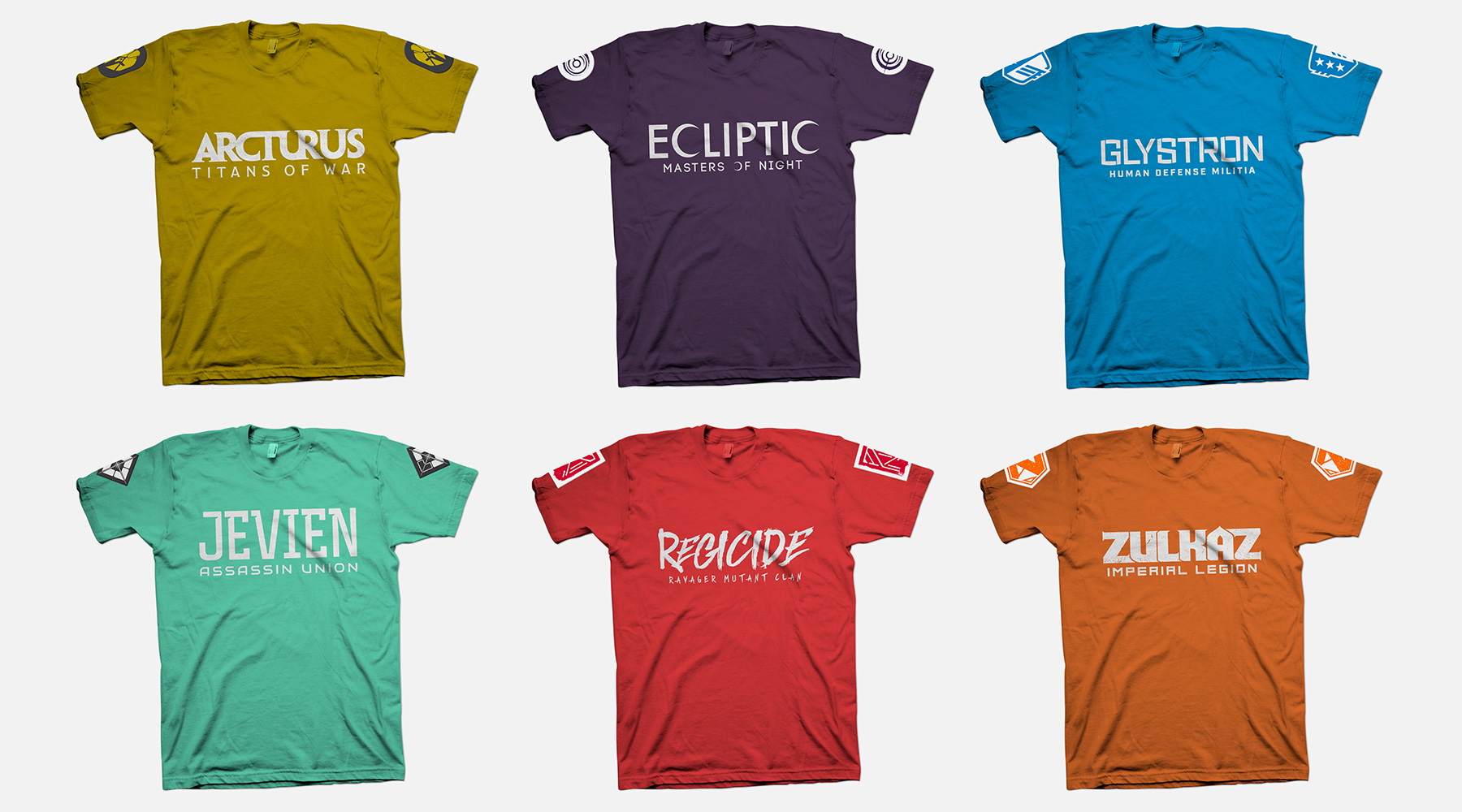
As part of the rebrand for UltraBlast Laser Combat Center, they wanted to introduce narrative "lore" to the customer experience. This narrative centered around a war between an evil, all-powerful corporation, and a growing rebellion fighting against them. The patron joins the fight by first choosing one of six factions, which could be made up of anything from "defenders of earth" to "underground mutants" to "necromancer androids" and more. My job was to create the logos for each of these factions, which would then be used on in-store interfaces, apparel, and anything else necessary. My main goal was to make sure each logo represented a unique style so that customers understood the basics of what each faction represented, and would be equally drawn to join any of the six. As an added measure, I made sure the first initial of each faction's name was present in its respective logo mark, so that each mark can work successfully as a standalone icon.


  • Branding
  • Merchandising
  • Print
  • Typography
Posted by jingram2 in Branding, Merchandising, Print, Typography

Moxy: Ads

Moxy: Ads

Details:

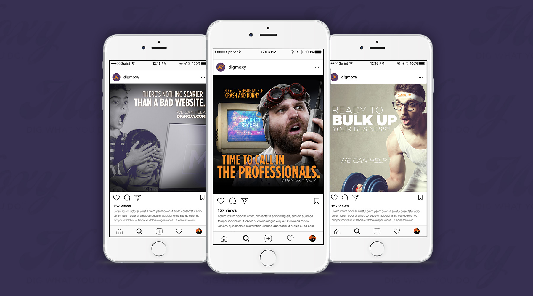
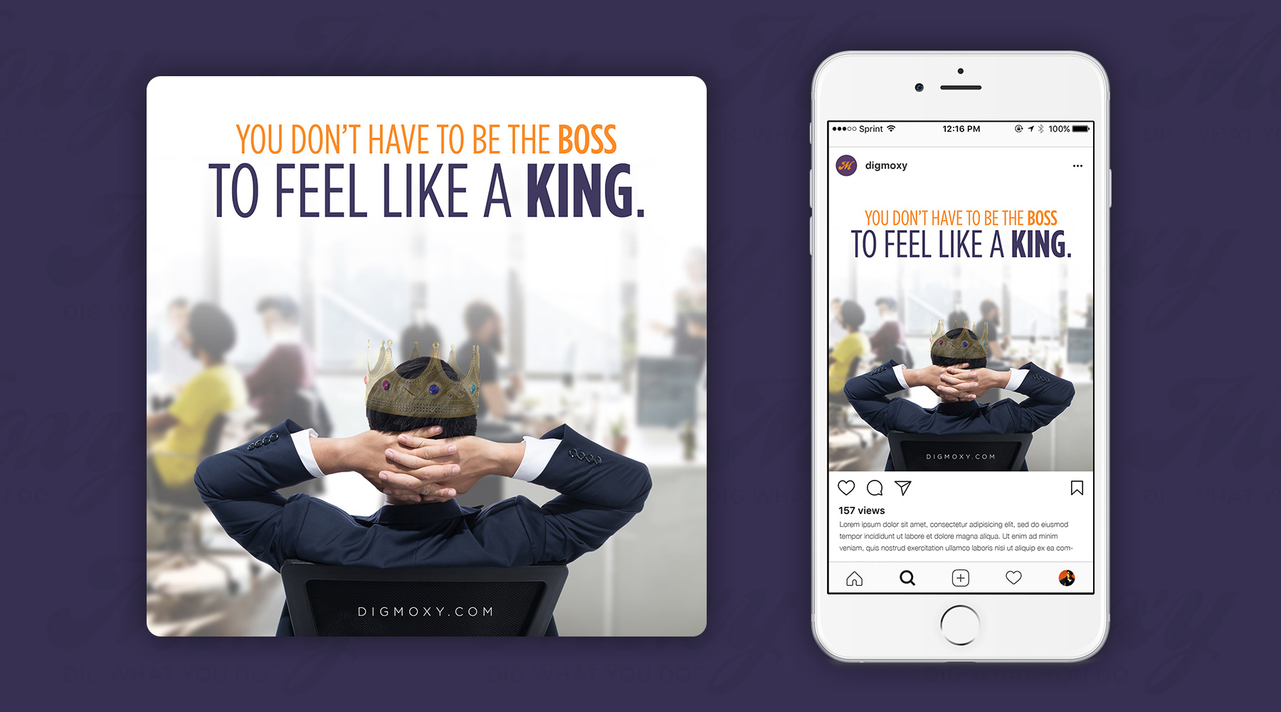
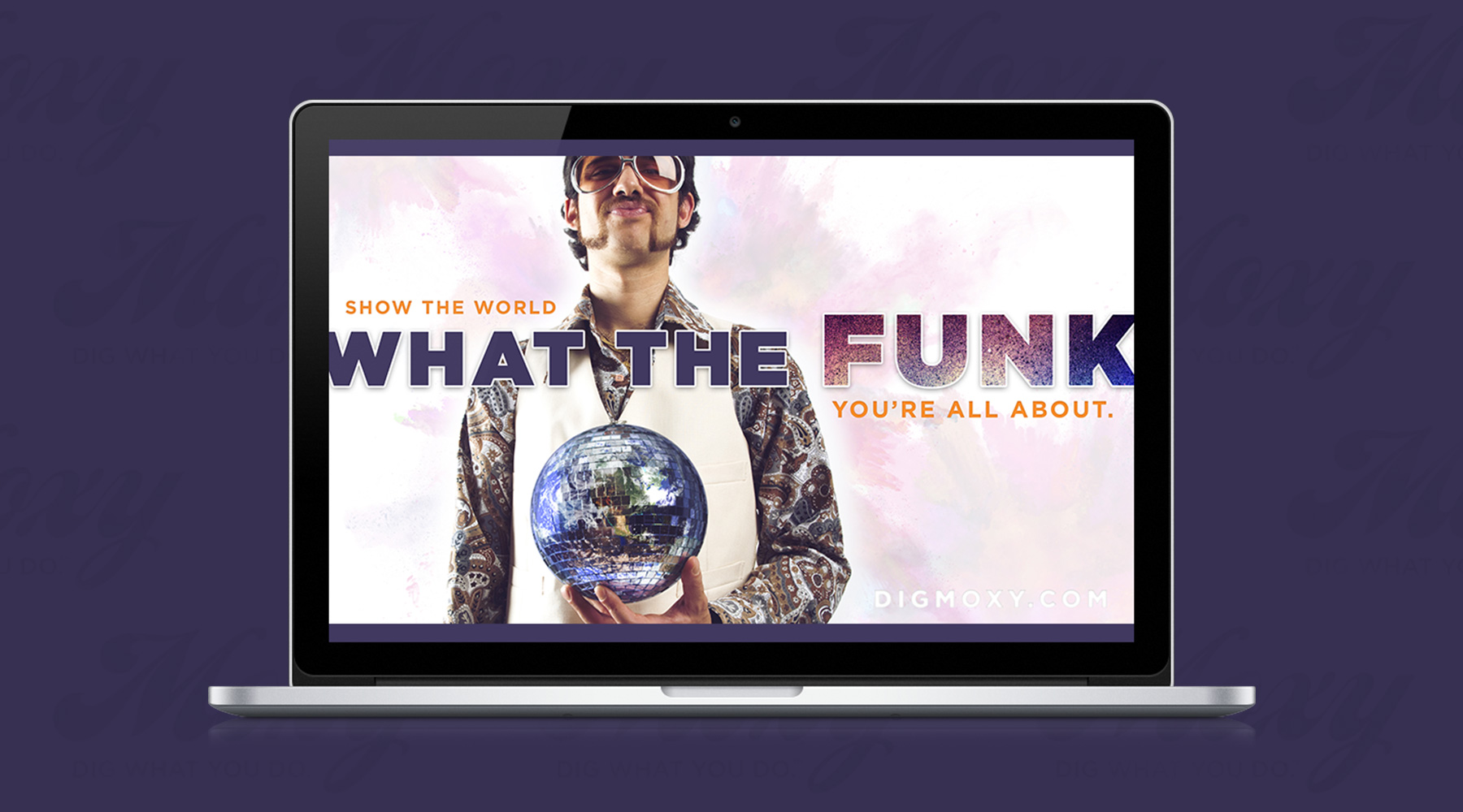
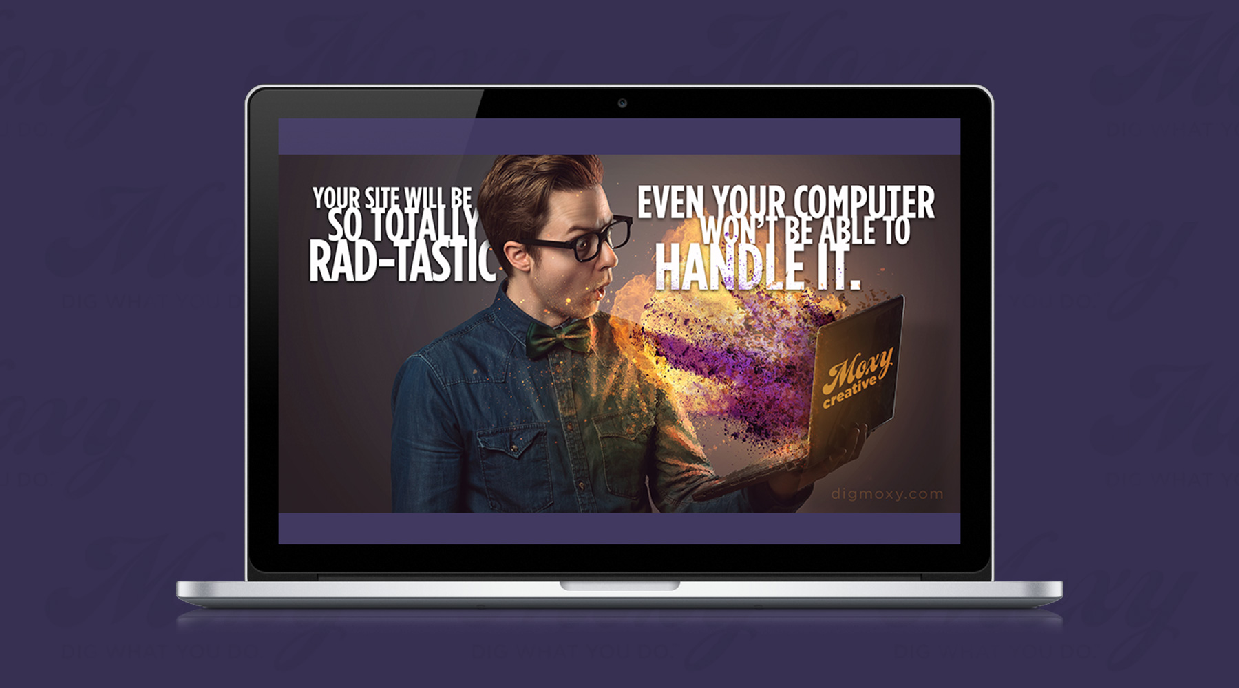
During my time as Moxy's Principal Designer, I created countless advertisements for the company. At the time, Moxy functioned as two separate but symbiotic agencies – one a creative agency, the other a staffing and talent agency. I created numerous ads for each, sometimes focusing on the fun and youthful energy of Moxy, sometimes conveying a more professional tone, depending on the group each ad targeted. Shown here are just a few of my favorites from over the years.

  • Advertising
Posted by jingram2 in Advertising

Smart Financial

Smart Financial

Details:

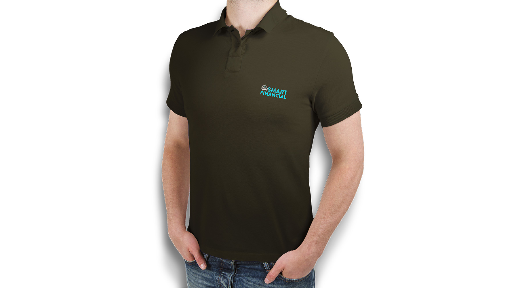
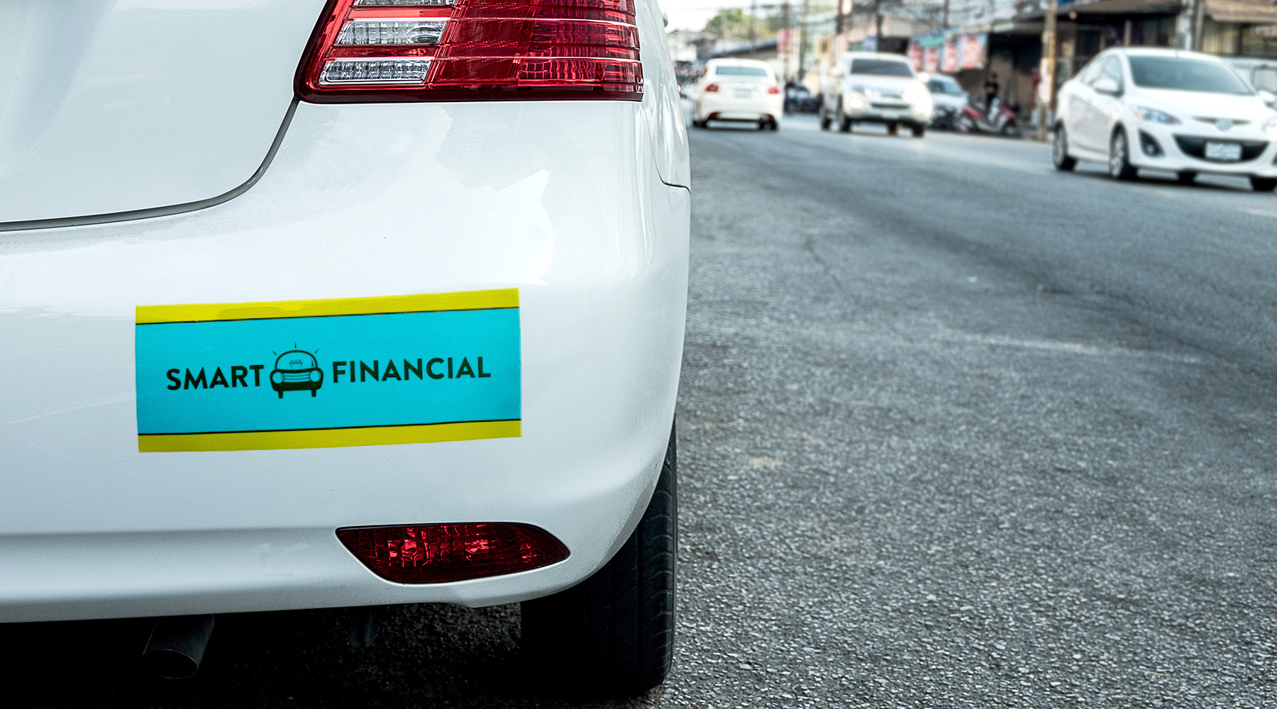
Smart Financial is a company that sells cars at specific rates and under specific arrangements so that those who might otherwise have difficulty buying a car are able to do it more easily.  I was asked to create their brand; once it was finished, it became a surprising favorite of mine. My goal with this logo was to combine the ideas of intelligent decision making with automotive motifs, and I've always really loved the way it turned out.

  • Branding
  • Print
Posted by jingram2 in Branding, Print

Junkyard Bots

Junkyard Bots

Details:

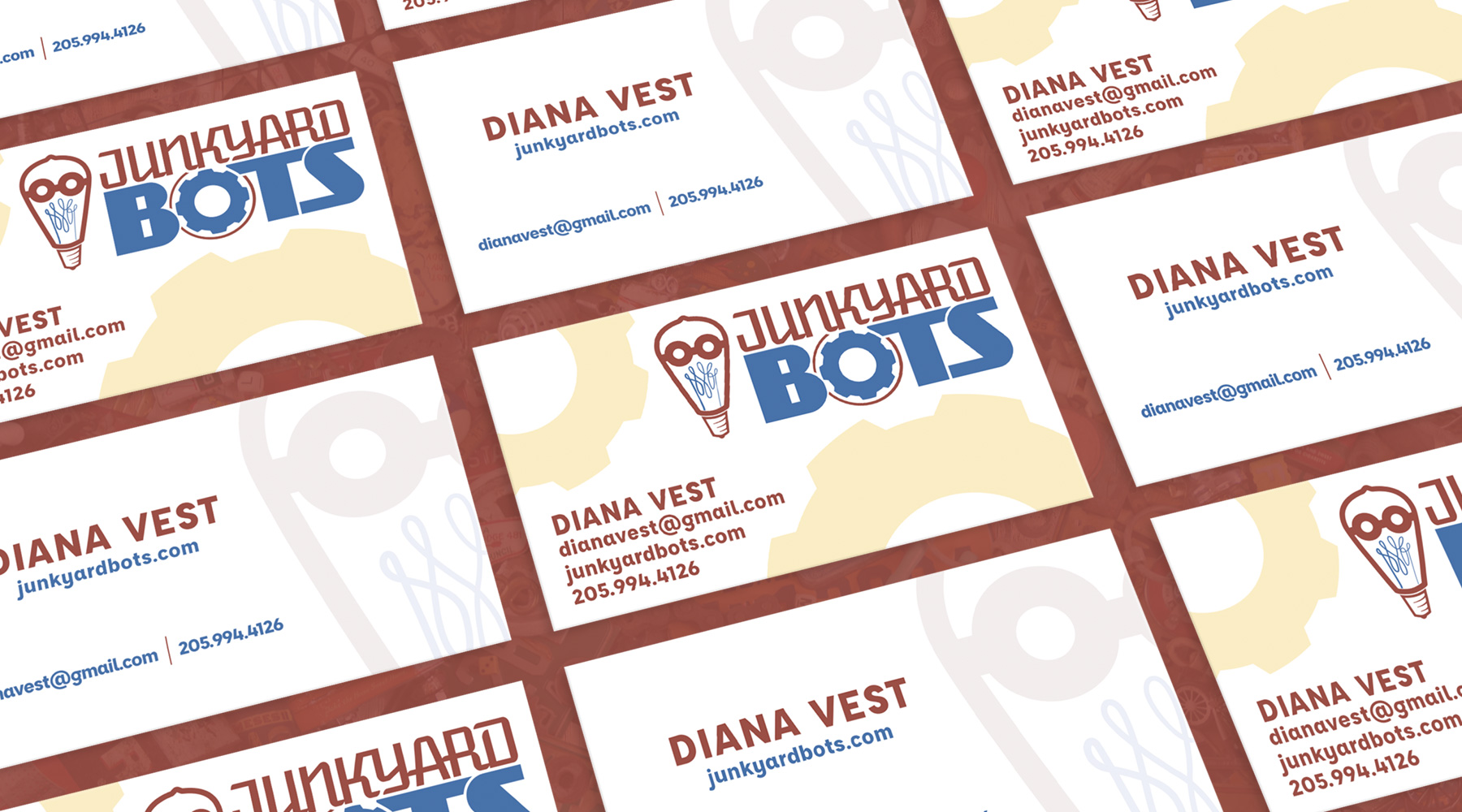
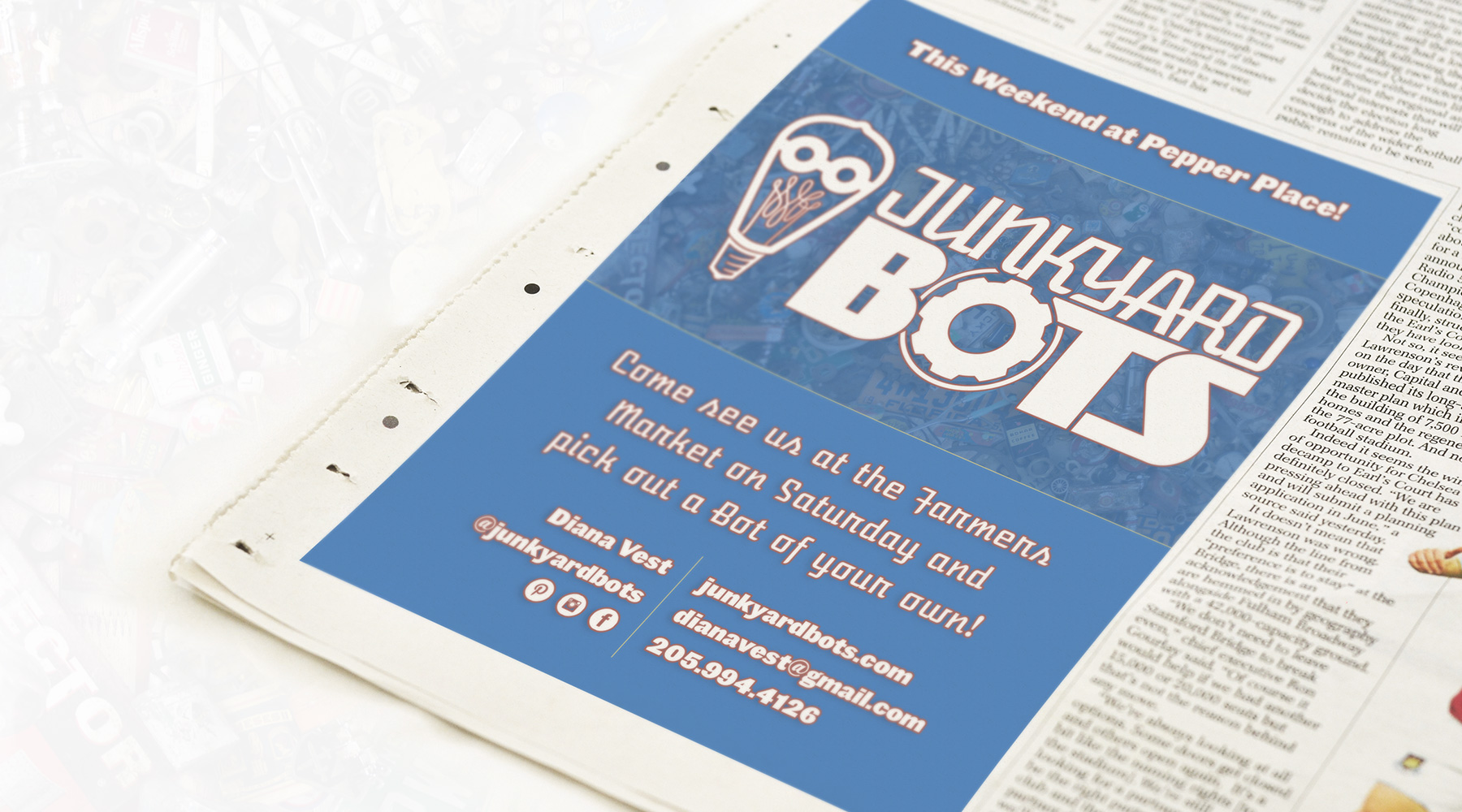
This brand was created for Junkyard Bots, a series of "junk sculptures" by artist Diana Vest.  The logo was created with several of the artist's specific bots in mind – Vest often uses light bulbs as the "heads" of her sculptures – which is why the mark somewhat resembles a face.  The mark also contains a sort of cursive form of the initials JYB within the bulb's filament, so that it works exceptionally well as a standalone icon.
  • Branding
  • Print
  • Advertising
Posted by jingram2 in Advertising, Branding, Print