
Print

UltraBlast

UltraBlast

Details:

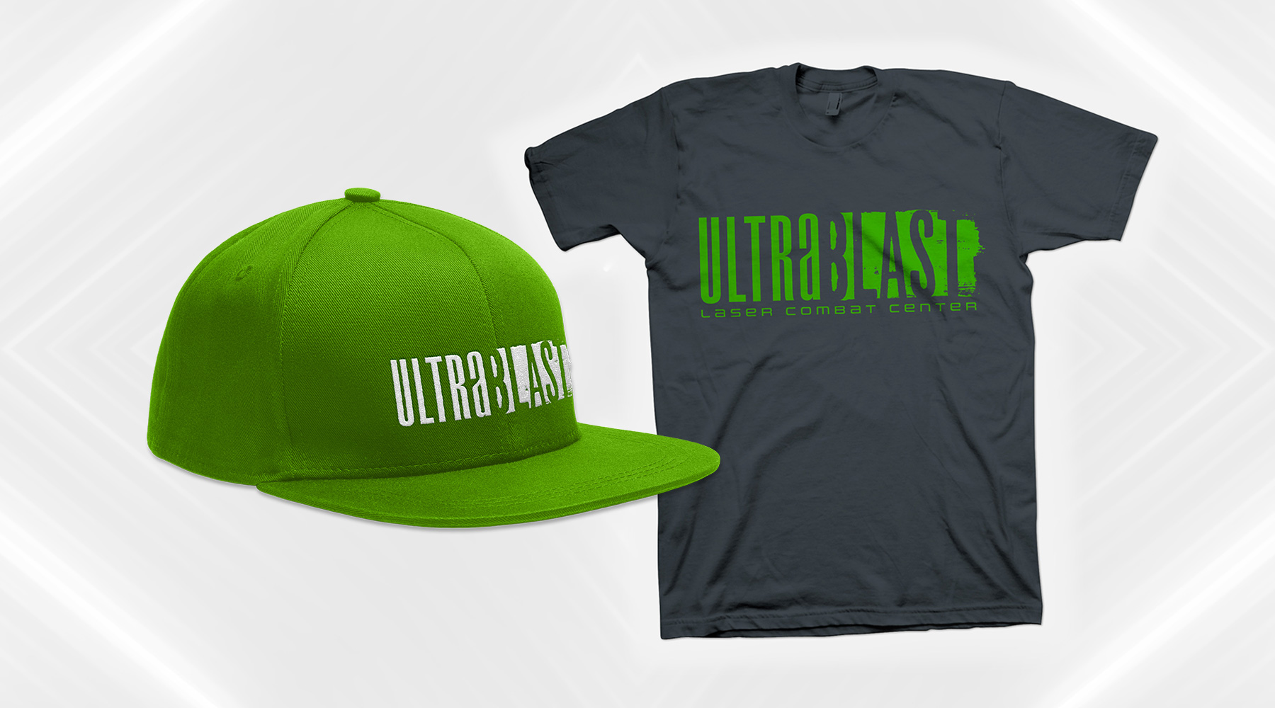
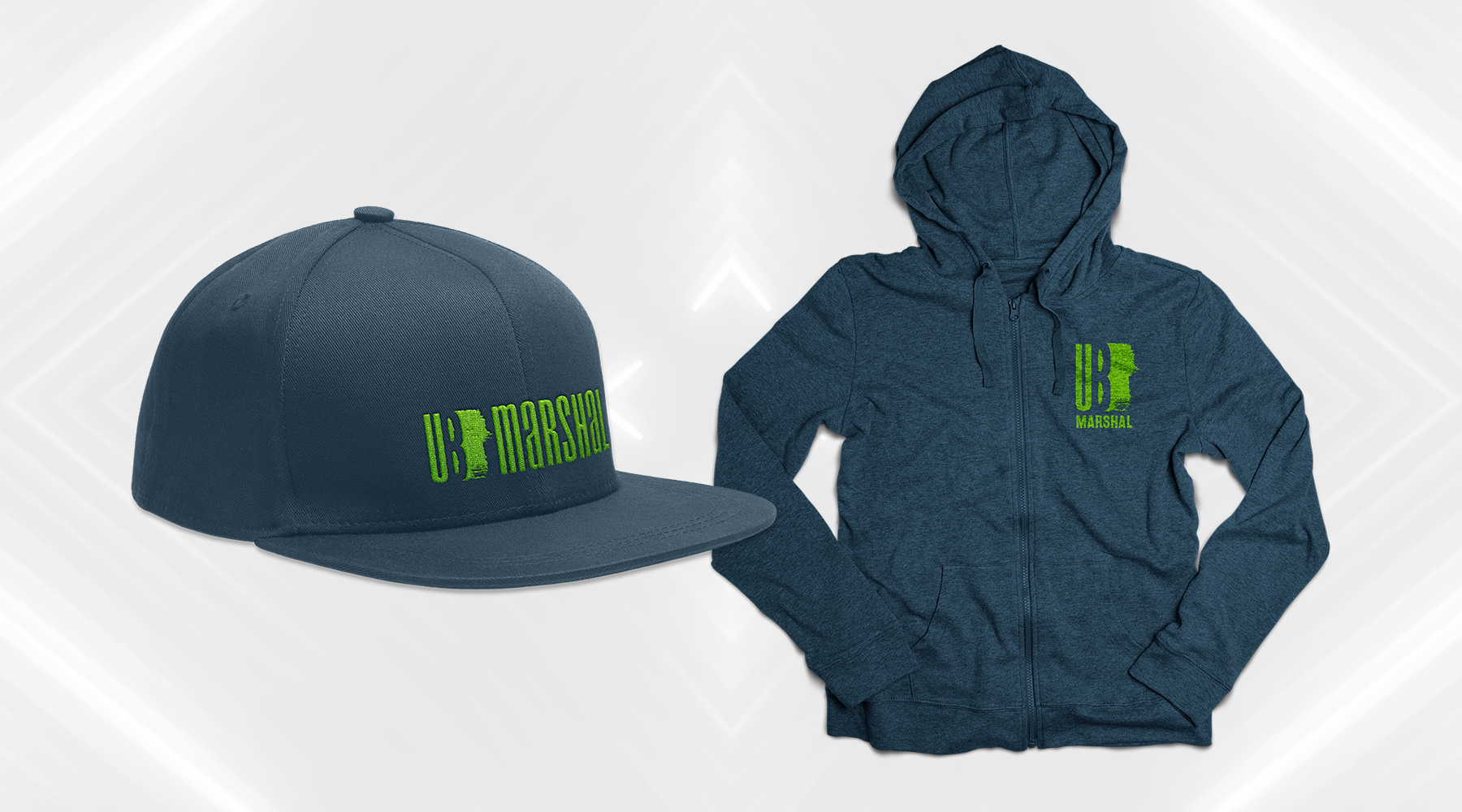
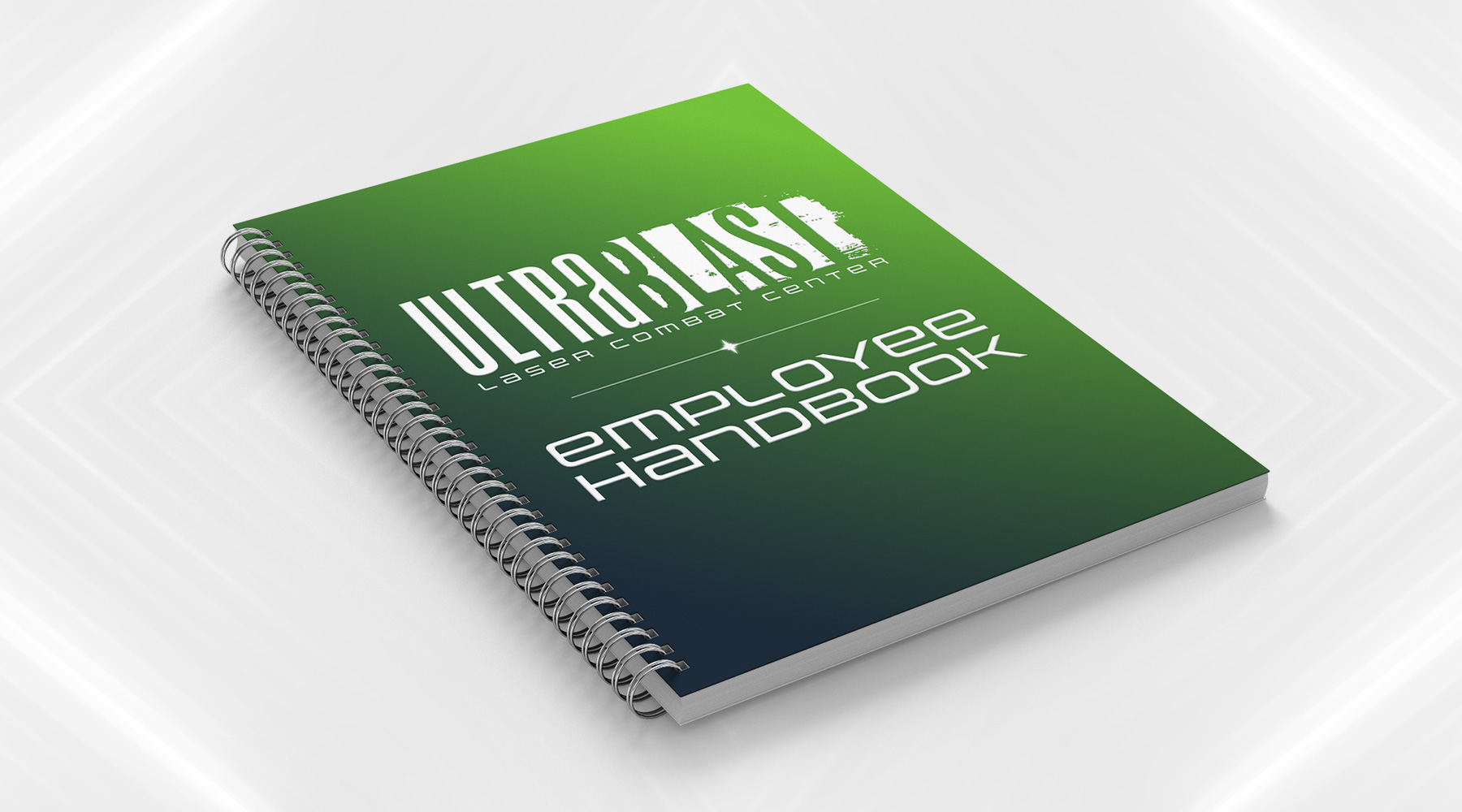
UltraBlast Laser Combat Center asked me to create for them a new brand, which needed to focus on the duality of the narrative lore they wanted to introduce as part of the patrons' experience. The futuristic narrative essentially boiled down to this: stepping into UltraBlast meant stepping into a war between an evil, all-powerful corporation, and a growing rebellion fighting against them. Each side is associated with a handful of factions, each of which may be made up of mutants, androids, warriors, and the like. The brand I created is focused mostly on the tone of the story – the solid, modern, clean "Ultra" is juxtaposed against the messy, aggressive, chaotic "Blast," with neither side looking objectively "better" than the other, allowing the patrons of the games to freely choose their own sides without influence.

  • Branding
  • Merchandising
  • Print
  • Typography
Posted by jingram2 in Branding, Merchandising, Print, Typography
Red Hills Brewing Co.

Red Hills Brewing Co.

Details:

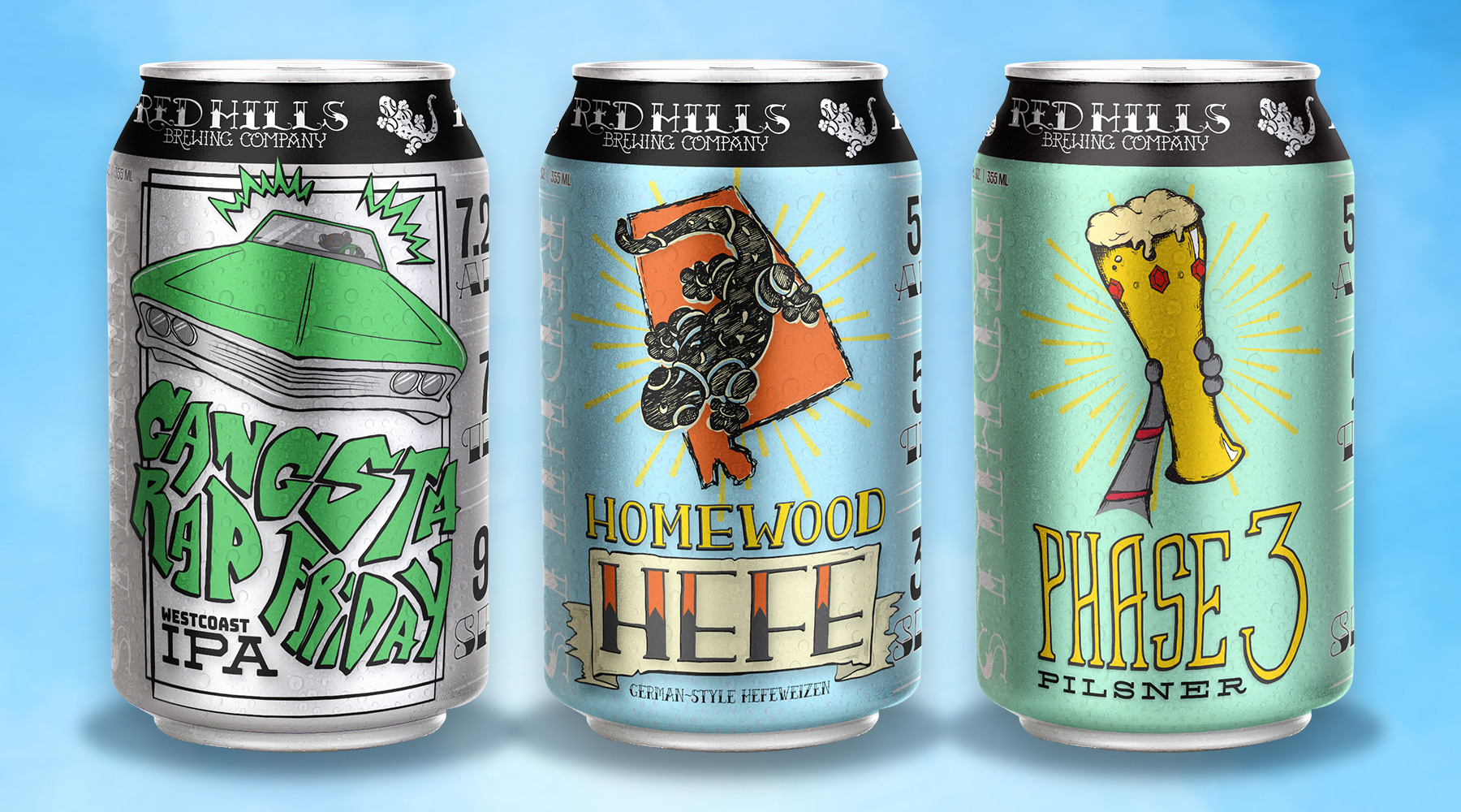
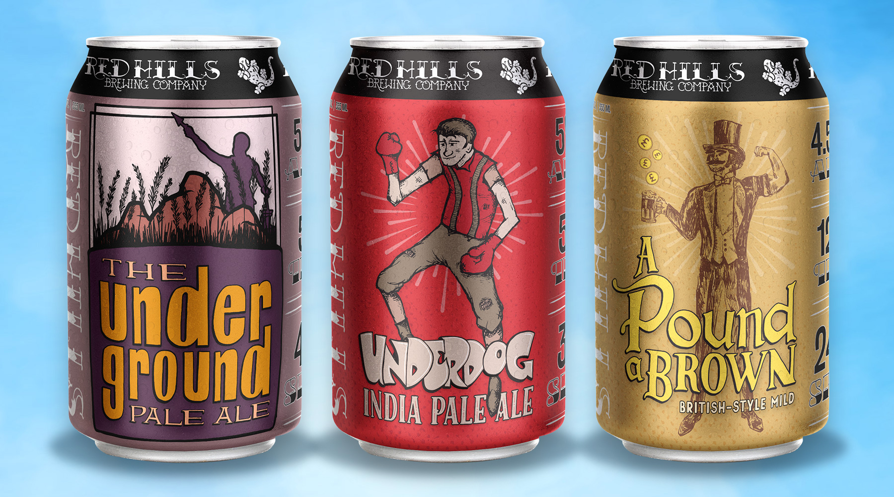
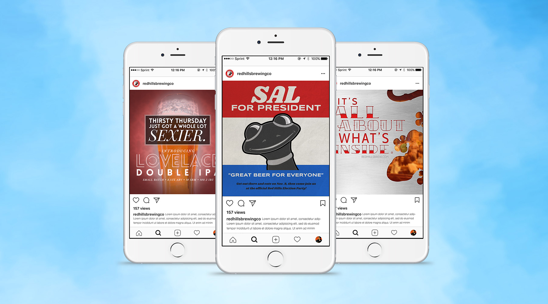
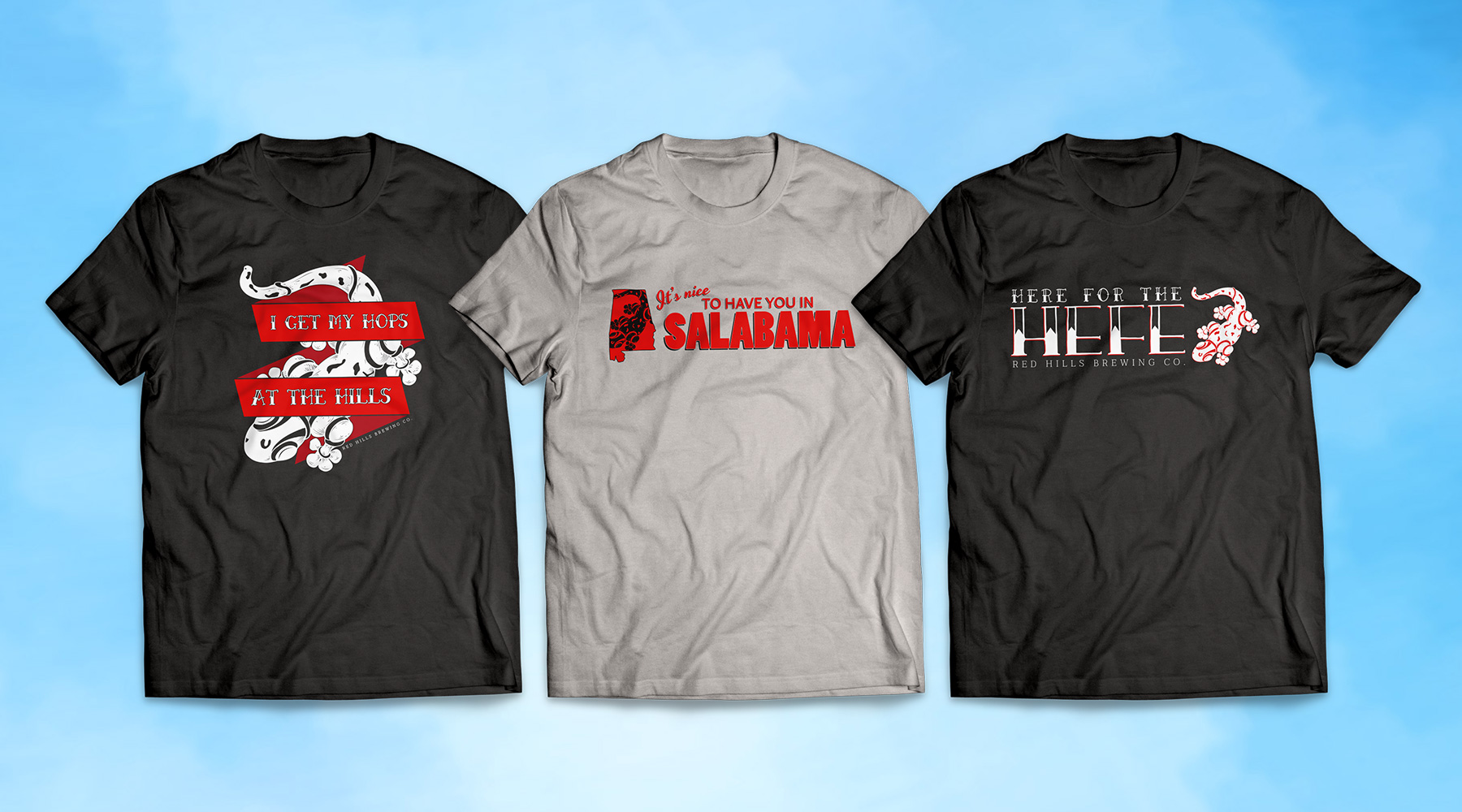
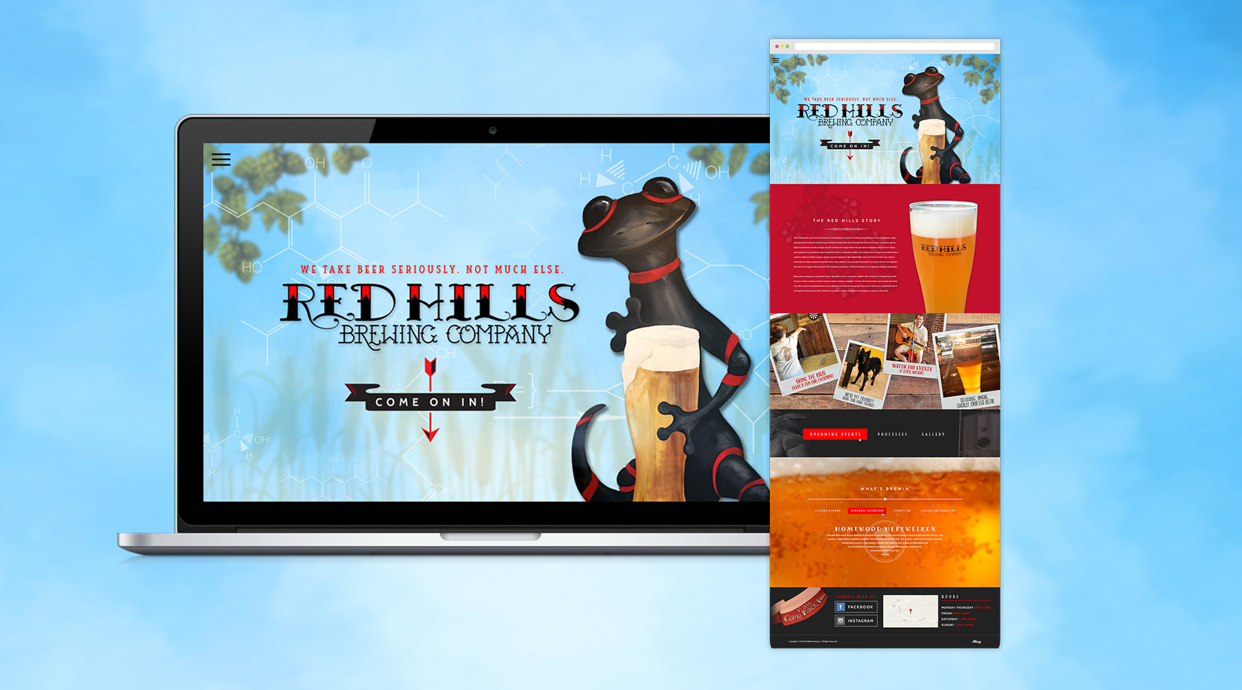
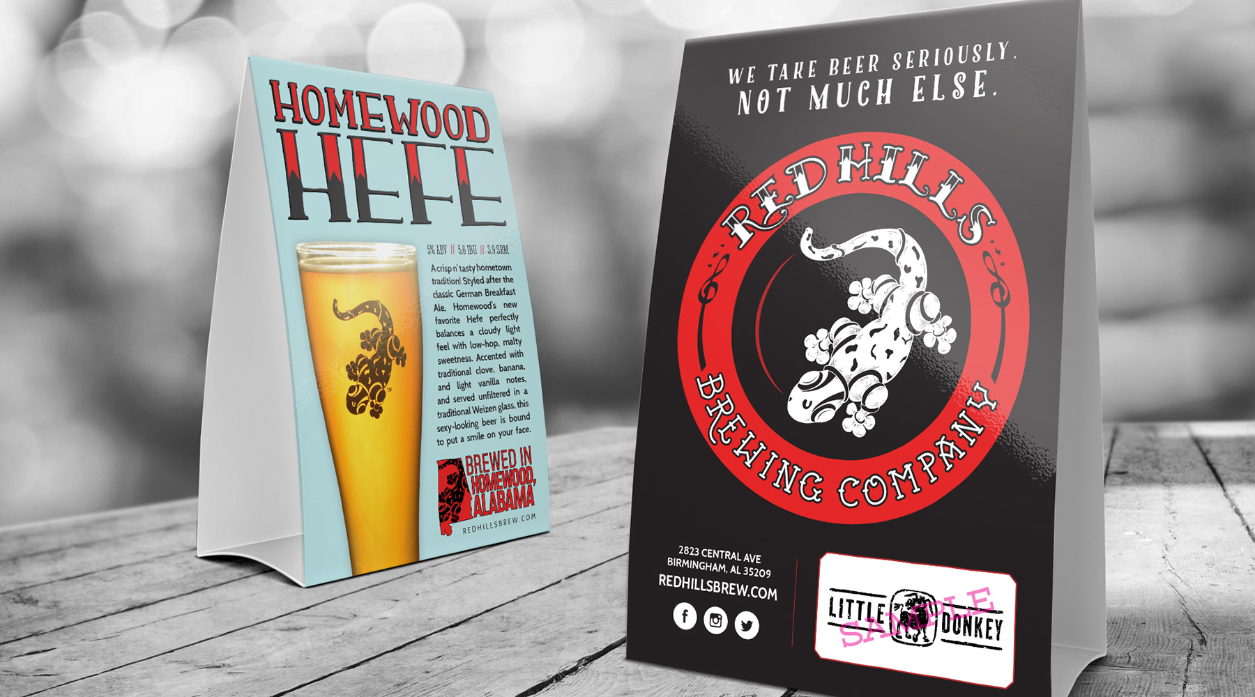
During a long relationship with Red Hills, I produced an incredible amount of creative work for them. This included beer can labels, website designs, merchandising, brand collateral, signage, countless social media ads and more. Shown here are some of my personal favorite pieces, chief among which are the beer can labels. My team and I produced a ton of hand-drawn illustrations for these, and although they may never be seen in stores, I'm incredibly proud of how they turned out.

  • Advertising
  • Merch
  • Packaging
  • Print
  • Typography
  • Web Design
Posted by jingram2 in Advertising, Merchandising, Packaging, Print, Typography, Web Design

BlueJireh

BlueJireh

Details:

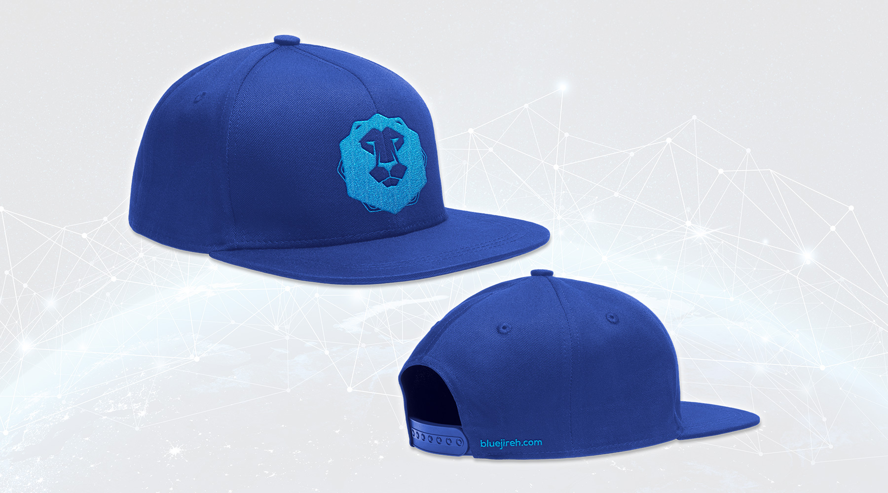
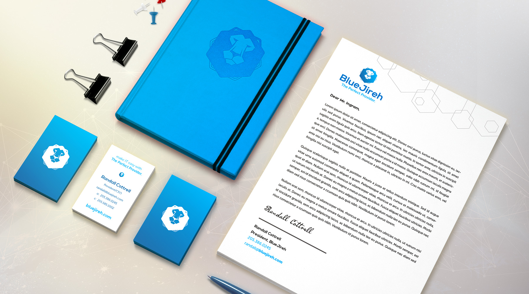
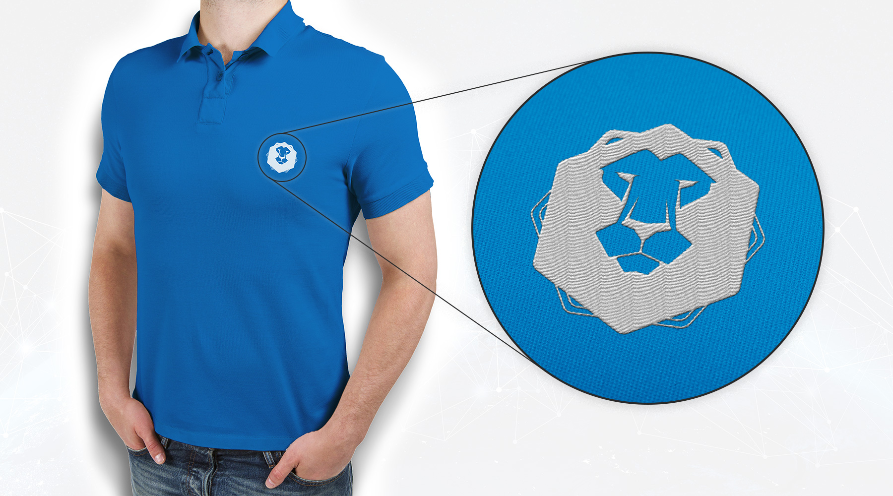
BlueJireh is an IT consulting firm who pride themselves in being an "all-inclusive, one-stop shop" for their clients. This is part of the firm's backstory involving the lion – "Jireh" is a Hebrew word for "provider," and the lion is often used as a symbol with similar connotations. I was tasked with rebranding them, with the requirement that a lion remain in the logo.

  • Branding
  • Merch
  • Print
Posted by jingram2 in Branding, Merchandising, Print

Expectations

Expectations

Details:

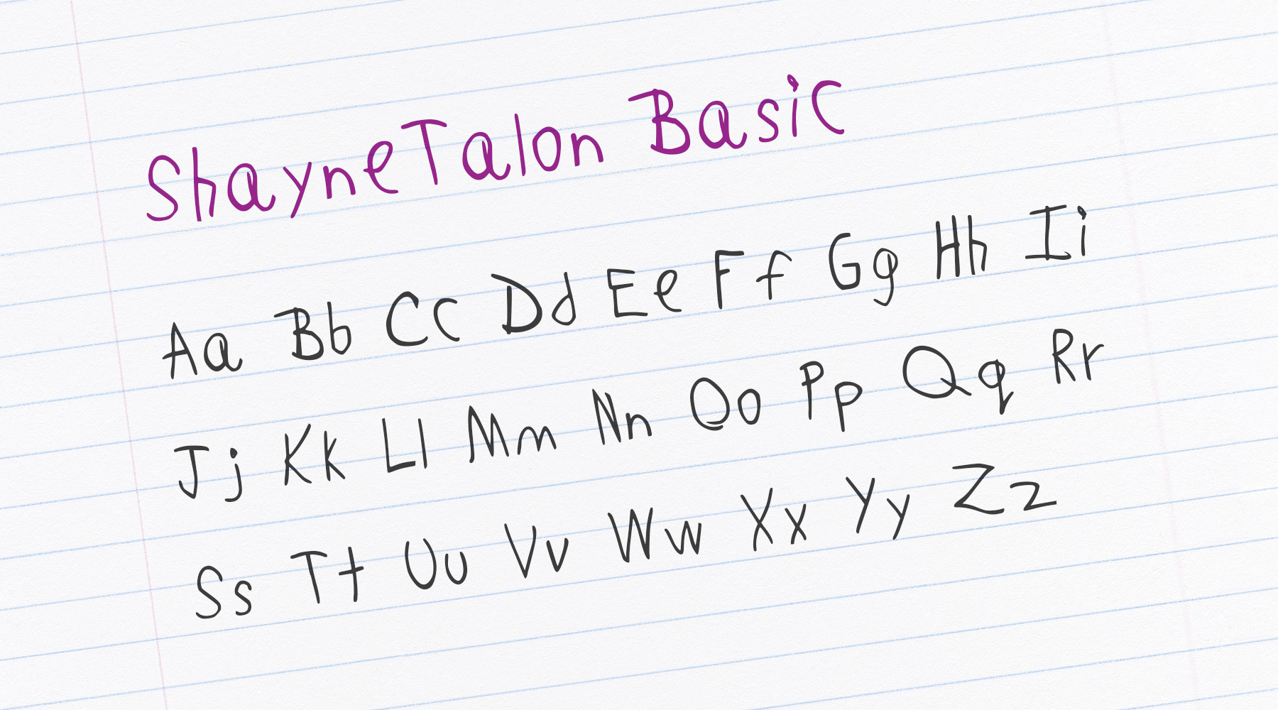
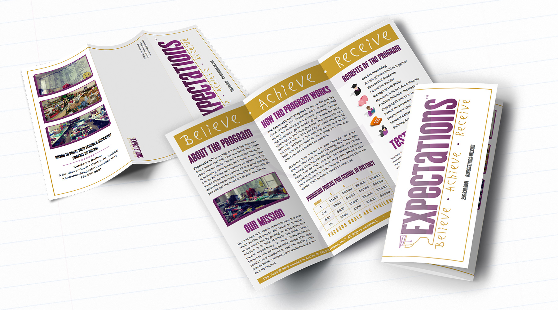
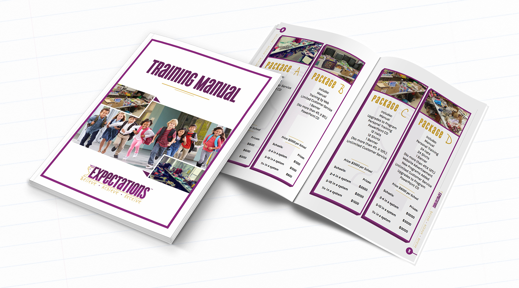
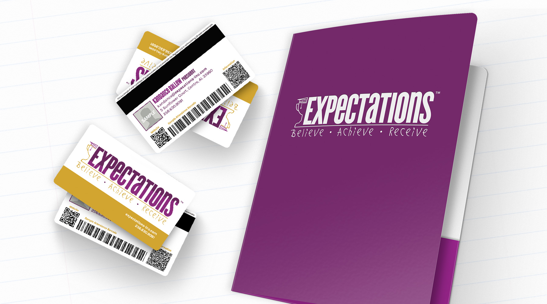
Expectations is a company which provides grade schools with an incentive program meant to encourage students to reach their full potential. I created their new brand, which includes a custom-designed font (based on the handwriting of the owner's child). I also created several print and collateral pieces for the new brand, complete with fully redesigned and reformatted workbooks.

  • Branding
  • Typography
  • Print
Posted by jingram2 in Branding, Print, Typography
Red Cat Coffee House

Red Cat Coffee House

Details:

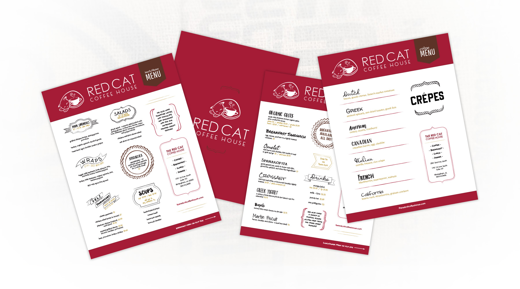
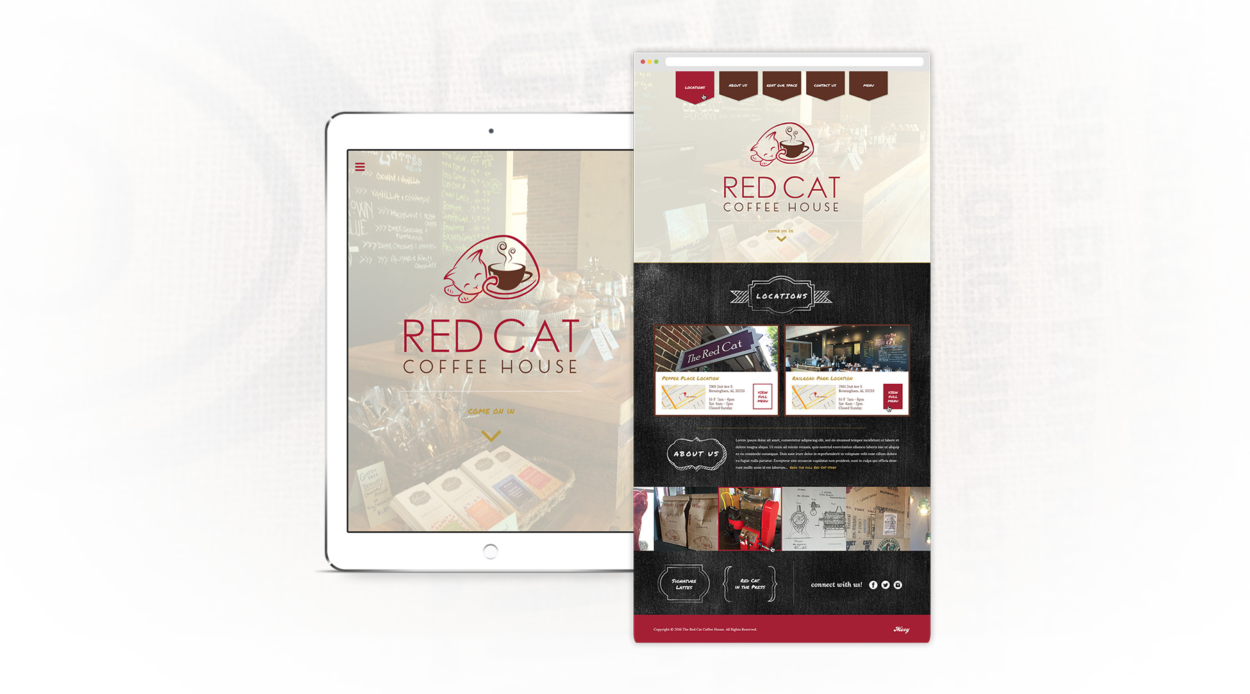
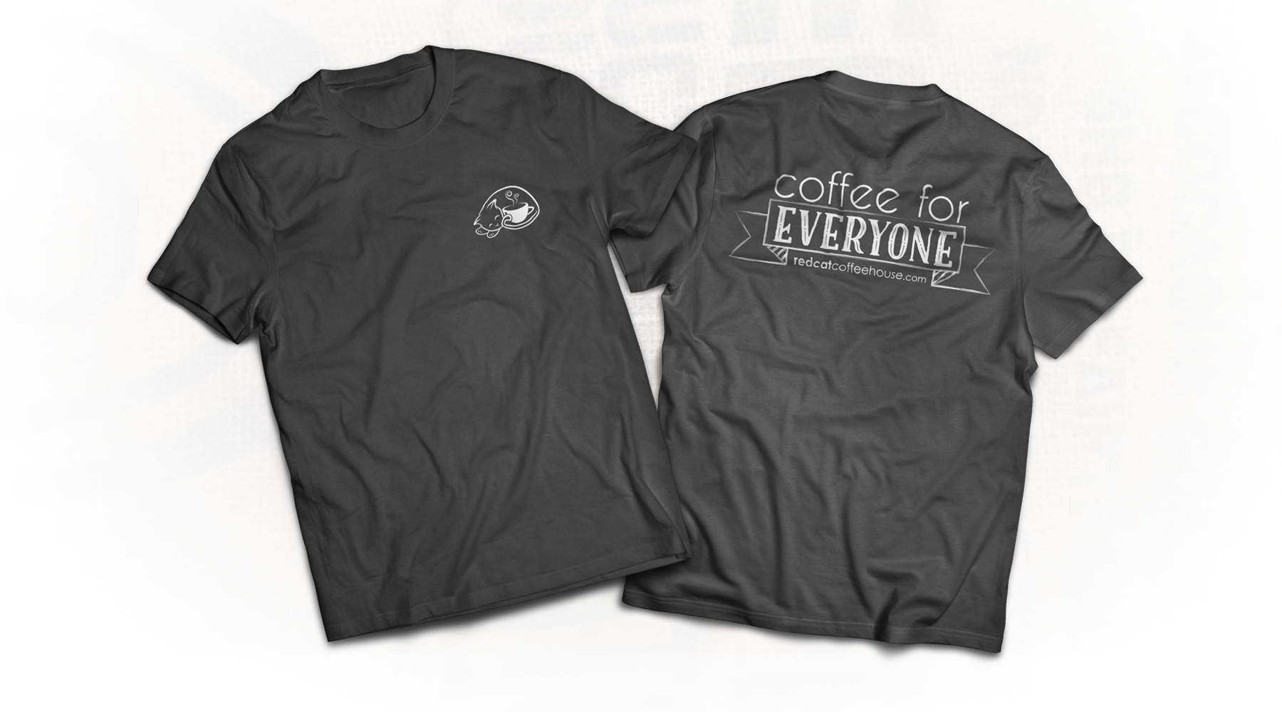
Upon opening a second Birmingham location, Red Cat asked me to help update their aesthetic.  I refined their existing logo to look a bit more up to date, and I designed various printed menus, a new website, and a few merchandising pieces for them as well.  These projects were meant to simultaneously reflect the updated brand, while tying in their original cozy look and feel, providing a smooth transition into a new public image.

  • Branding
  • Web Design
  • Print
  • Merch
Posted by jingram2 in Branding, Merchandising, Print, Web Design

Tech On Tap

Tech On Tap

Details:

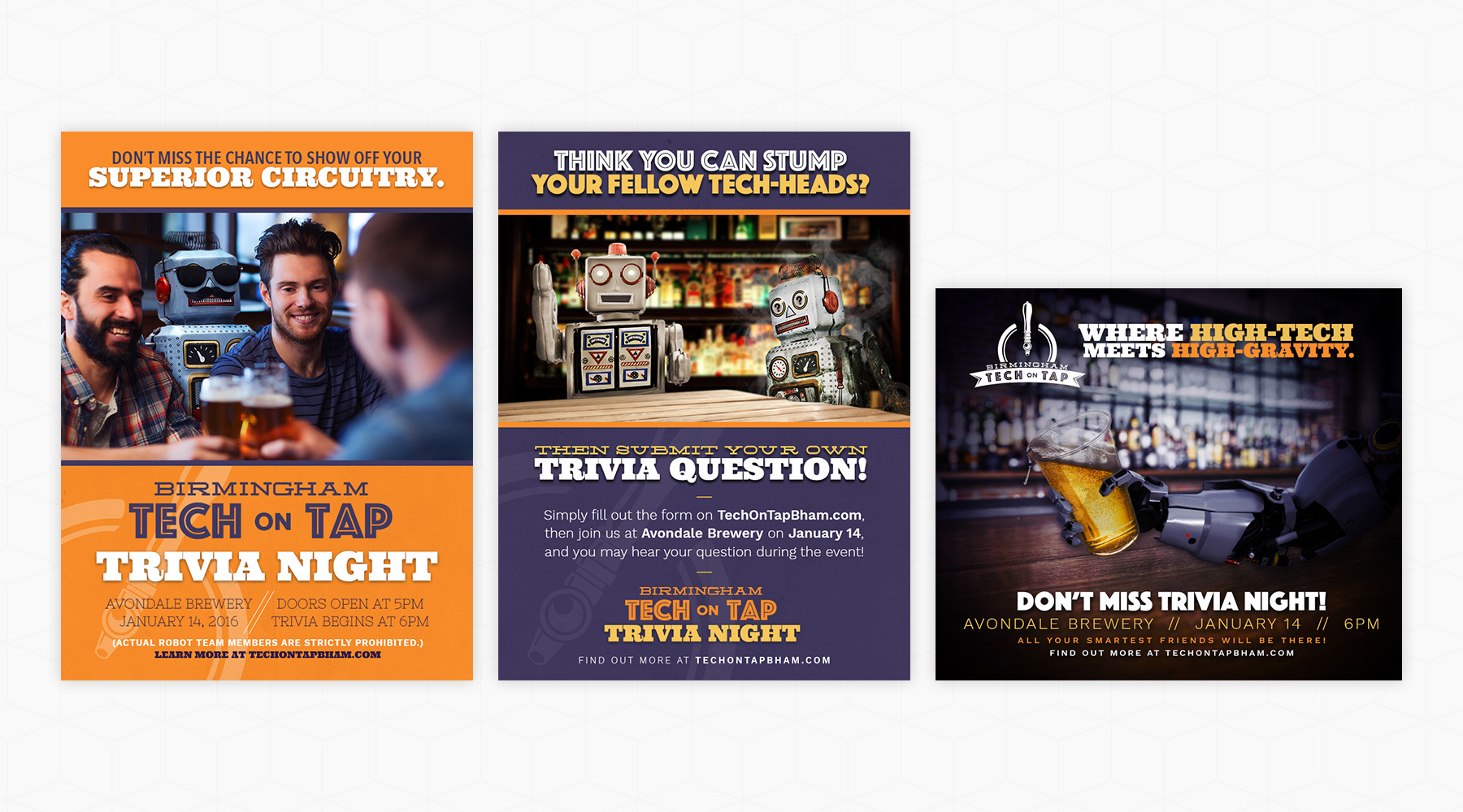
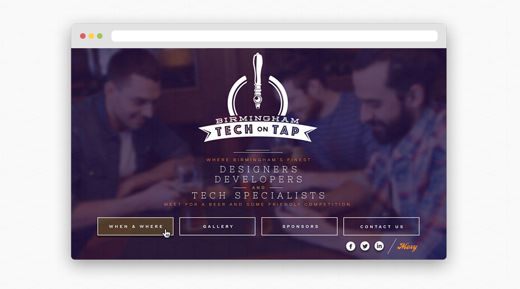
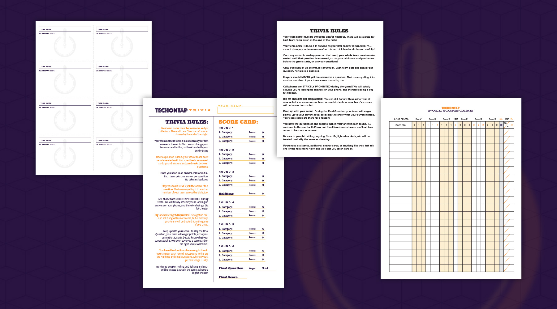
I was one of the chief creative forces behind the 2016 rebuild of Birmingham's Tech on Tap event.  I created the brand, the advertisements, and the social media graphics, as well as anything and everything necessary for the event – this included score cards, rule sheets, signage, and the on-screen trivia presentation. (I even wrote most of the trivia questions myself!)  I also designed the website and created a pre-loader animation for it.

  • Branding
  • Advertising
  • Web Design
  • Print
  • Animation/Video
Posted by jingram2 in Advertising, Branding, Print, Web Design

Blendit

Blendit

Details:

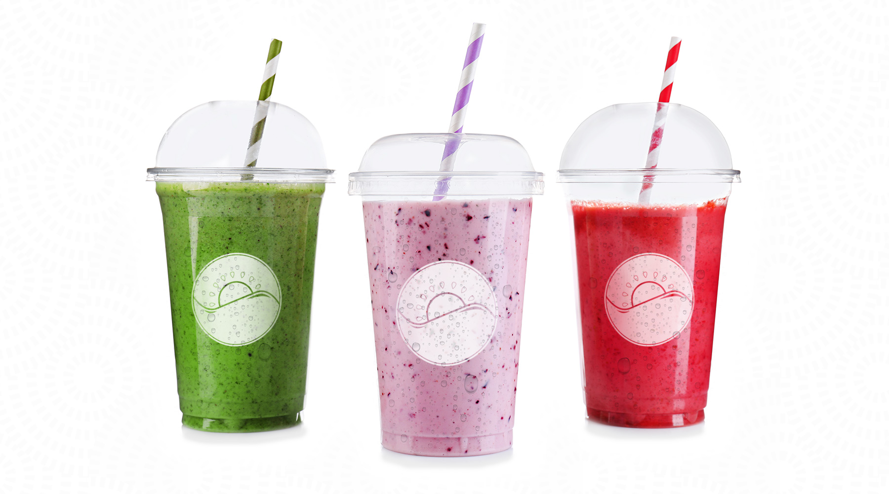
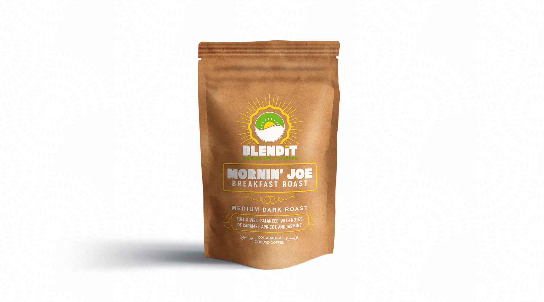
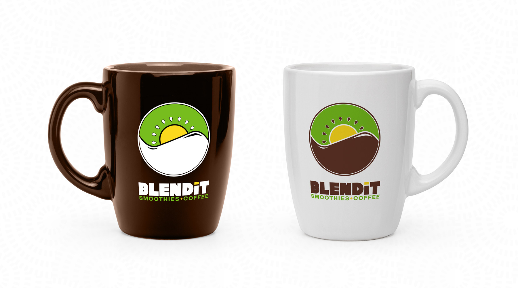
Blendit was a prospective startup, making gourmet coffee and smoothies. I was asked to create a brand for them, in order to help them get off the ground with a clear vision in place for how the company would look and feel. Unfortunately, the plans for the startup fell through, but this remains one of my favorite pieces. The mark is one I'm especially fond of, as the "kiwi-coffee-sunrise" mark speaks to the duality of the brand, and the almost yin-yang shape creates a visually pleasant balance between the two main elements.

  • Branding
  • Packaging
  • Print
Posted by jingram2 in Branding, Packaging, Print

Unified

Unified

Details:

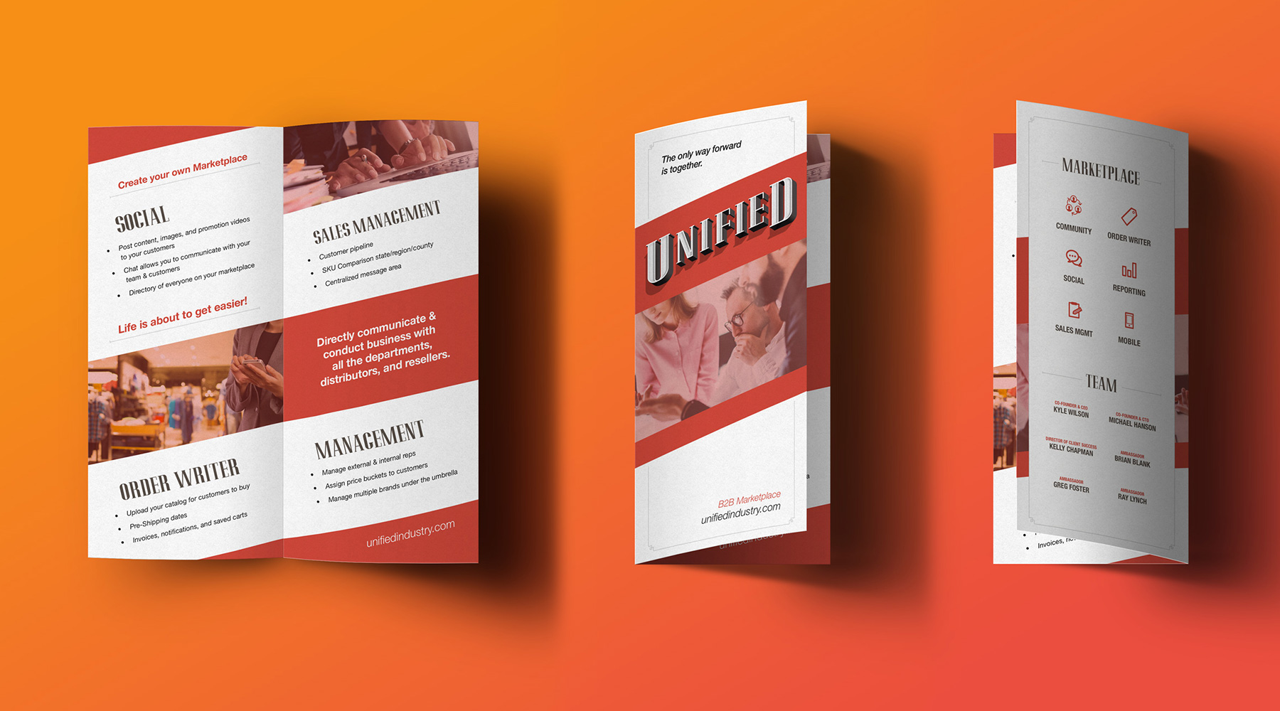
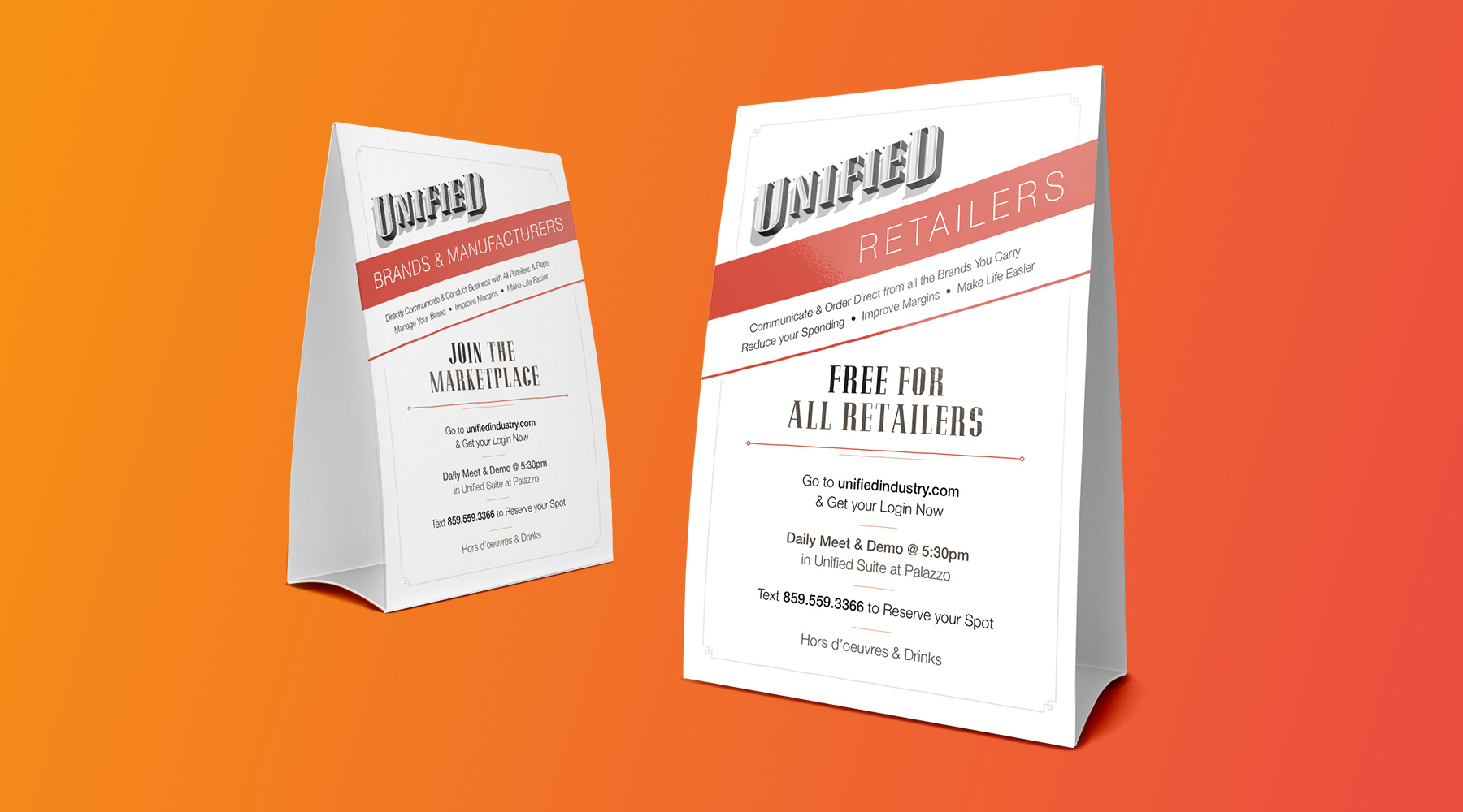
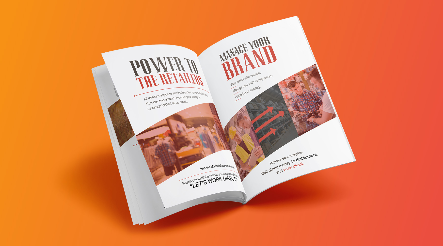
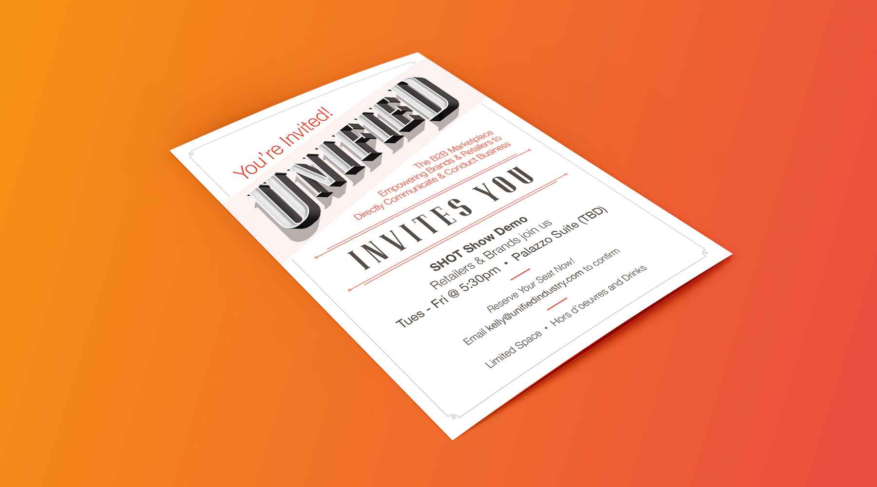
Unified is a company which provides businesses with easier, more direct B2B services through their own custom platforms. During my relationship with Unified, they have asked me to create numerous print and collateral pieces, including table tents, event invitations, sales booklets, and more. While I did not create their logo, I was able to use elements of it to maximize the effectiveness and overall feel of the print pieces utilizing it.

  • Advertising
  • Print
Posted by jingram2 in Advertising, Print

Biotech Balancing

Biotech Balancing

Details:

Biotech Balancing is a company which helps laboratories and other scientific facilities maintain controlled environments, whether that means temperature, air filtration, contamination control, or the like.  I spearheaded their rebrand, creating a new logo for them which not only includes a mark which bears their initials, but also speaks much more successfully to what they do – bringing balance to the spaces where science gets done.

  • Branding
  • Print
Posted by jingram2 in Branding, Print

Andy Sidaris Collection

The Andy Sidaris Collection

Details:

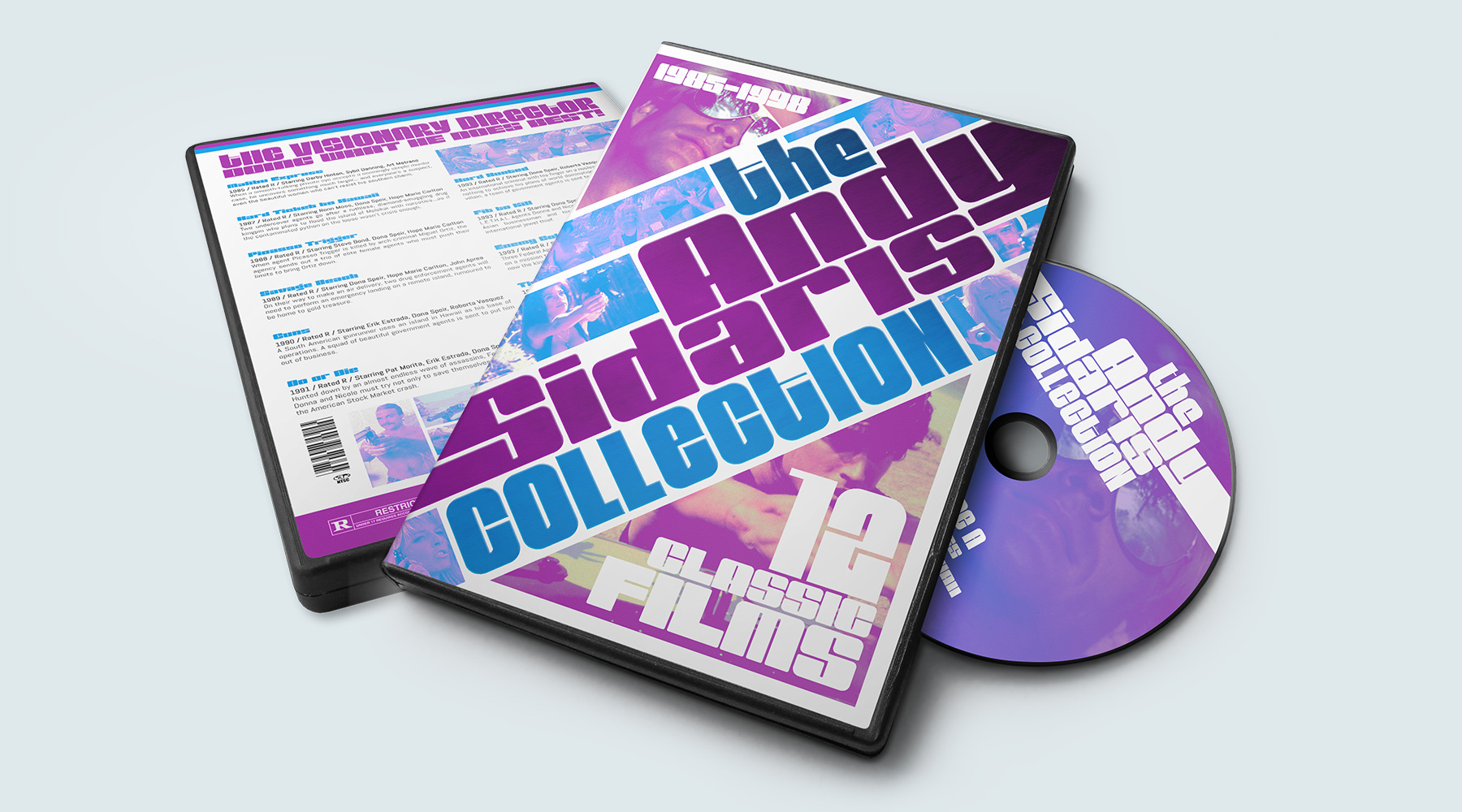
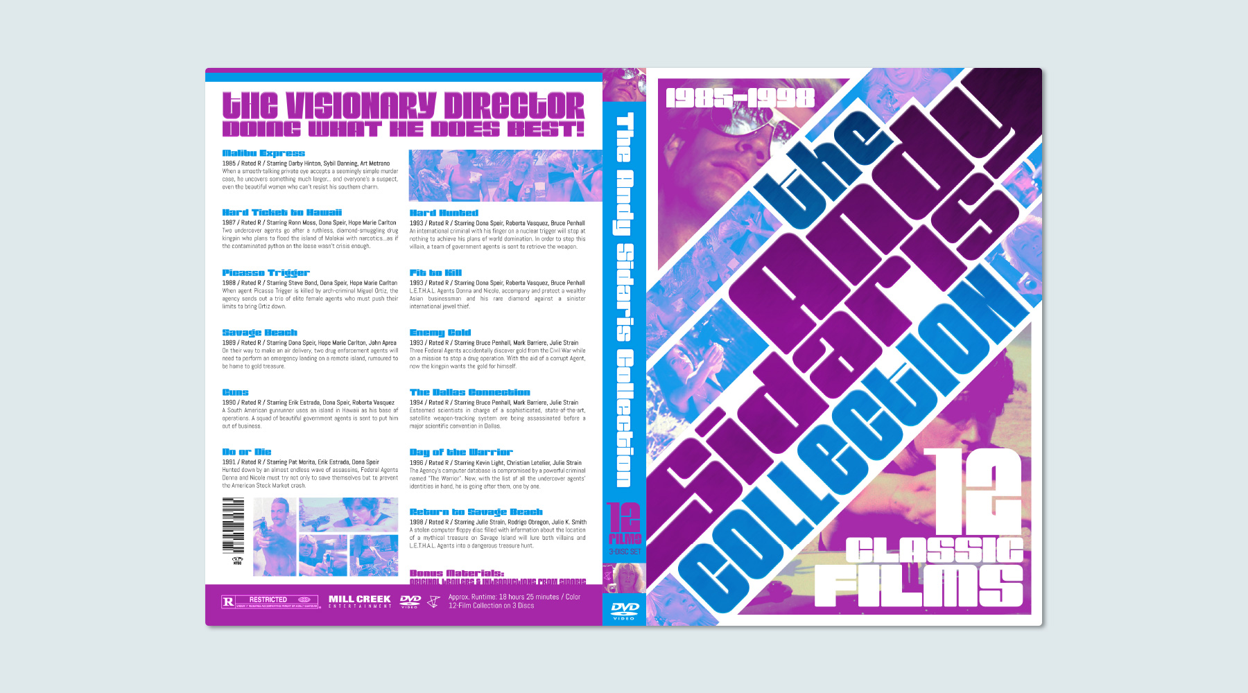
I take a lot of pride in my personal movie collection.  When I ordered this set of films, it was delivered with a case that I felt the need to replace – so I decided to make it myself, and have some fun with it. In the process of redesigning this DVD set, I actually ended up learning quite a bit about the details that go into a movie's packaging.  As a result, even though this project was just for fun, I ended up being pretty proud of how this turned out!

  • Print
  • Packaging
Posted by jingram2 in Packaging, Print