Details:
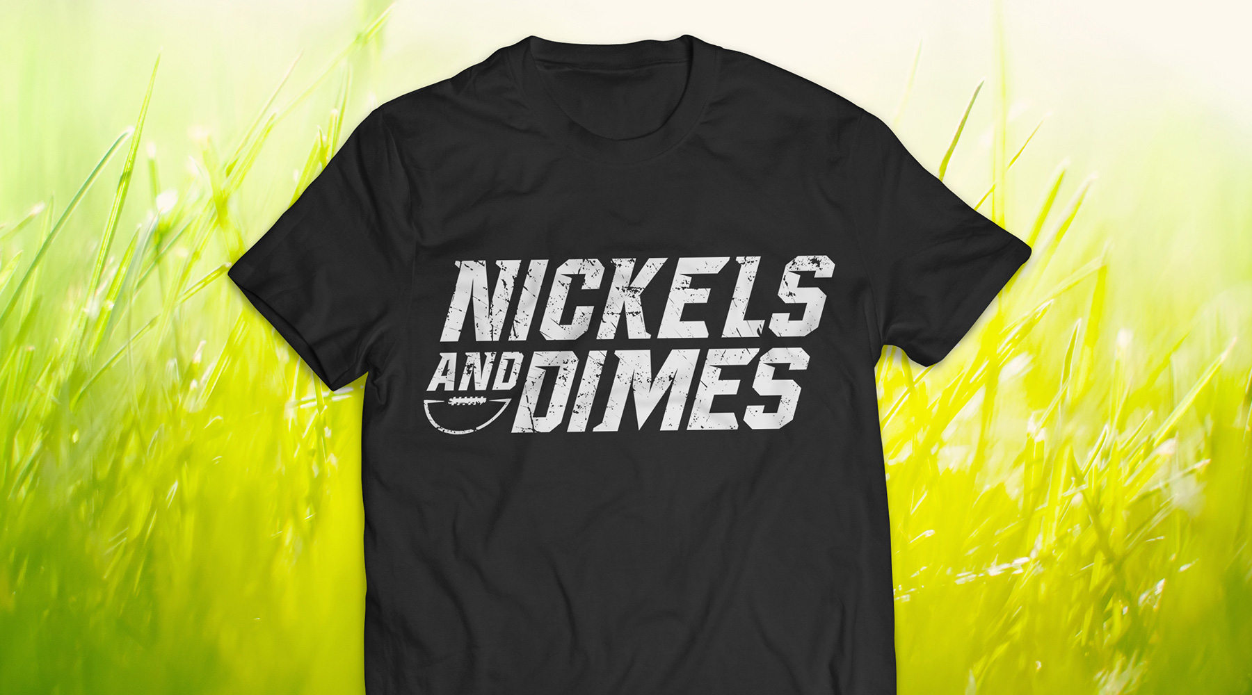
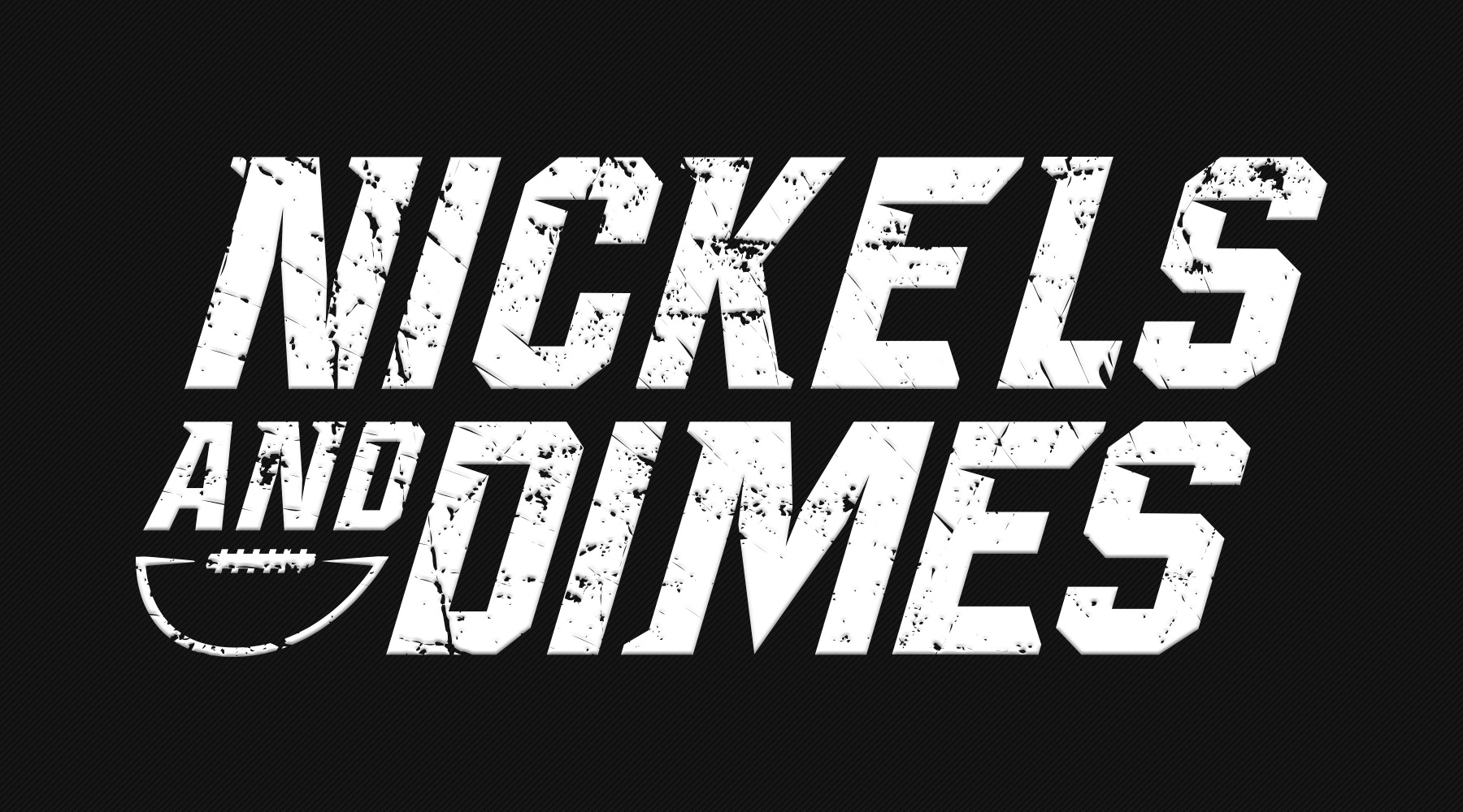
For this project, I was asked to create jerseys for a co-ed football team – according to the direction I was given, we were unable to use standalone marks or any significant imagery; the name was meant to stand alone almost completely. The end result required some experimental typography, but turned out to be the perfect blend of "intimidating and fun" that they were looking for.


