Typography

UltraBlast

UltraBlast

Details:

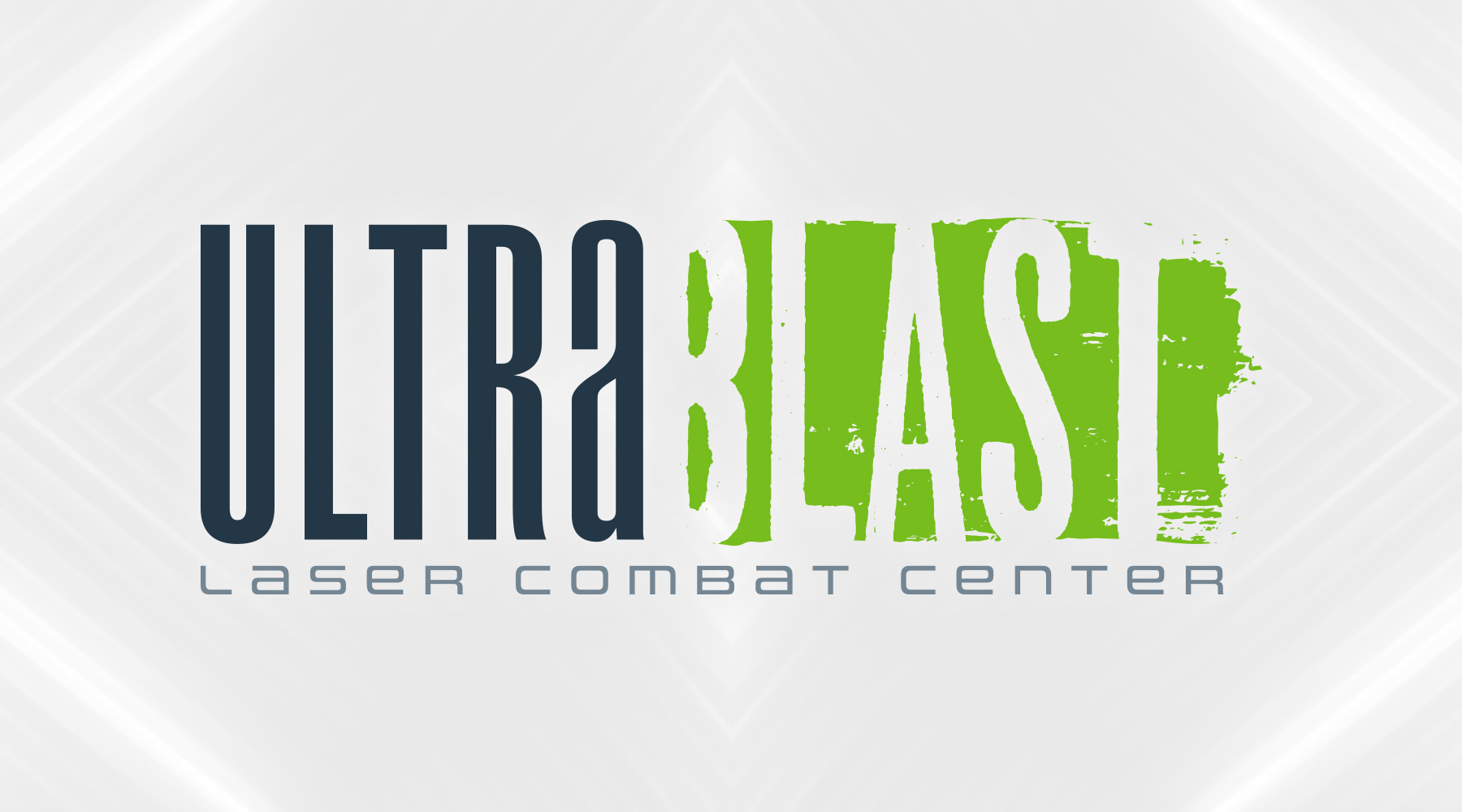
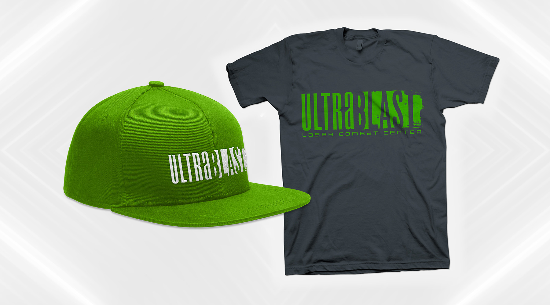
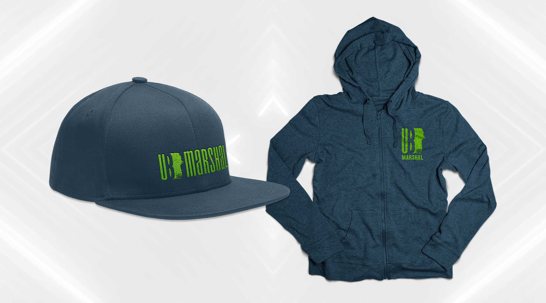
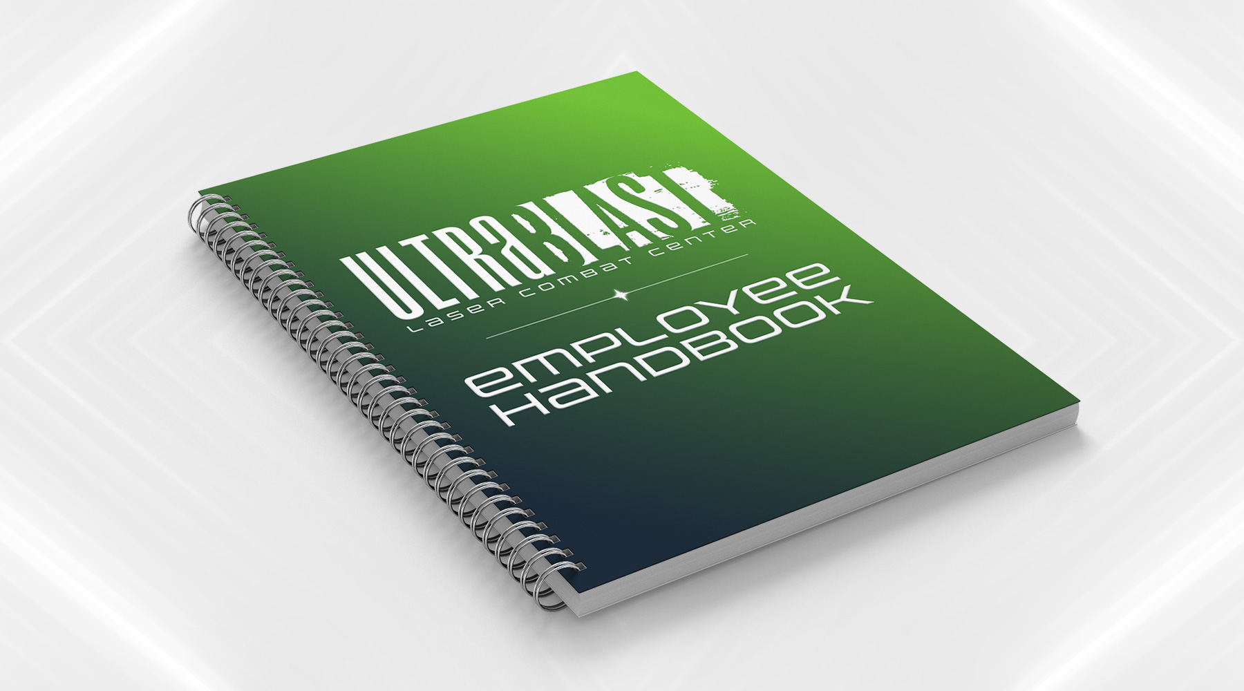
UltraBlast Laser Combat Center asked me to create for them a new brand, which needed to focus on the duality of the narrative lore they wanted to introduce as part of the patrons' experience. The futuristic narrative essentially boiled down to this: stepping into UltraBlast meant stepping into a war between an evil, all-powerful corporation, and a growing rebellion fighting against them. Each side is associated with a handful of factions, each of which may be made up of mutants, androids, warriors, and the like. The brand I created is focused mostly on the tone of the story – the solid, modern, clean "Ultra" is juxtaposed against the messy, aggressive, chaotic "Blast," with neither side looking objectively "better" than the other, allowing the patrons of the games to freely choose their own sides without influence.

  • Branding
  • Merchandising
  • Print
  • Typography
Posted by jingram2 in Branding, Merchandising, Print, Typography

Red Hills Brewing Co.

Red Hills Brewing Co.

Details:

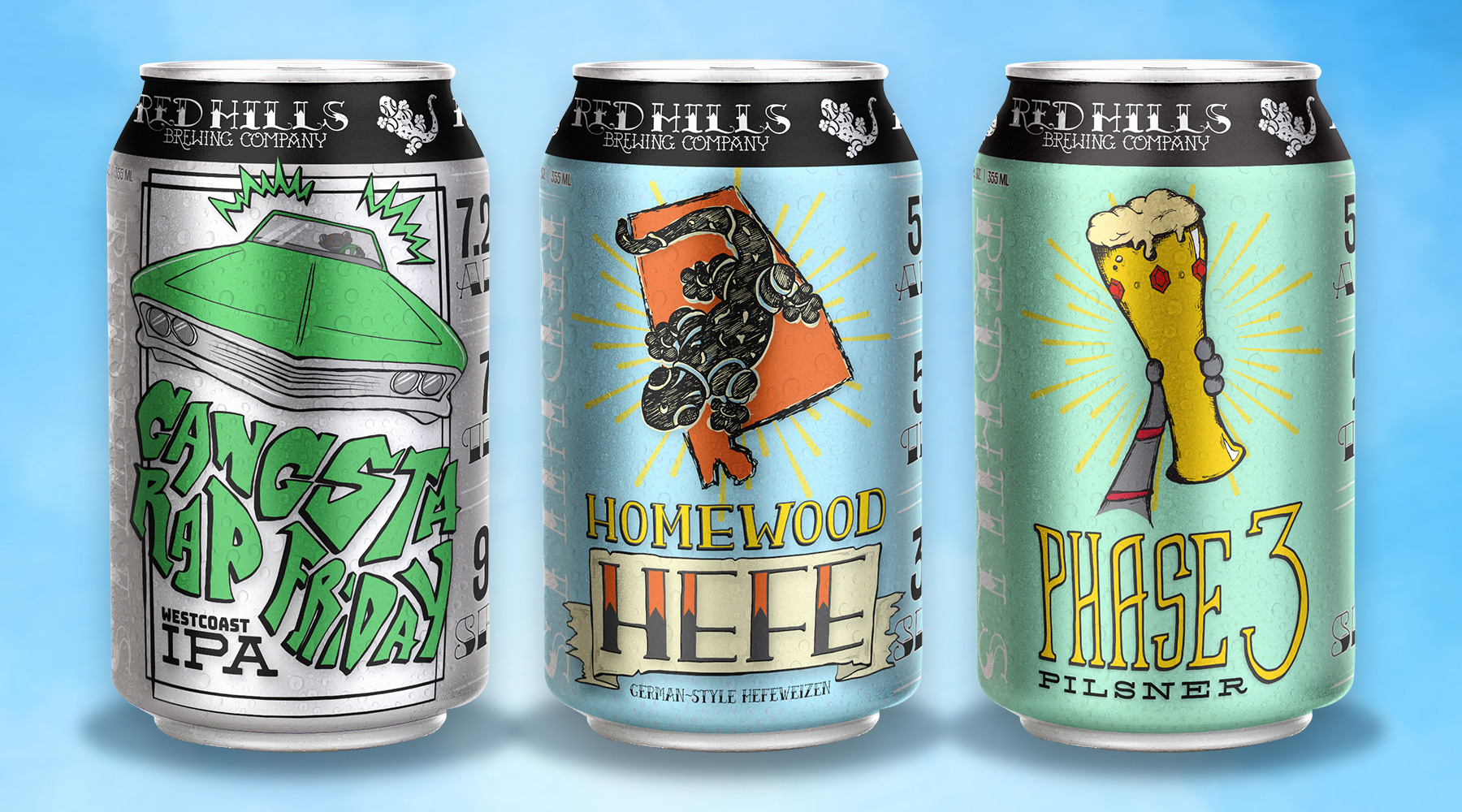
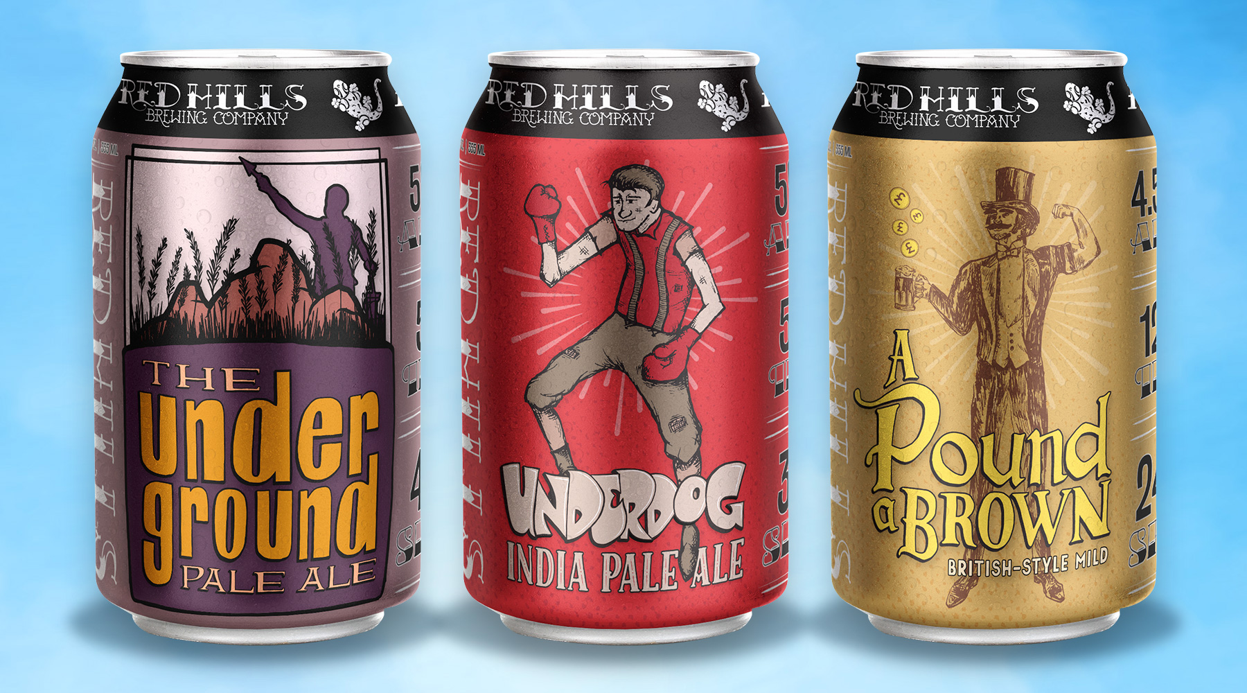
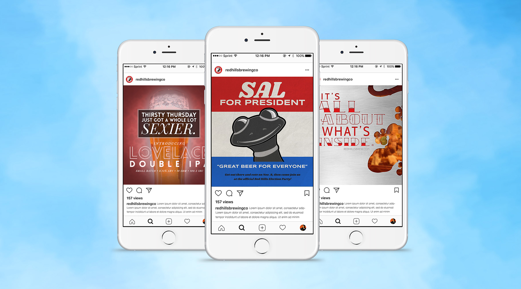
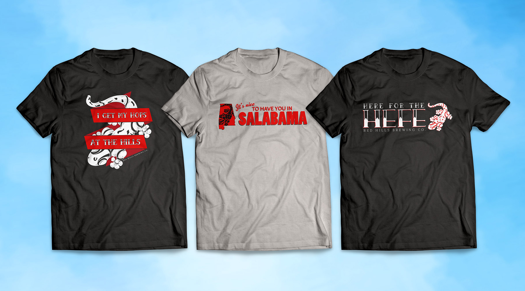
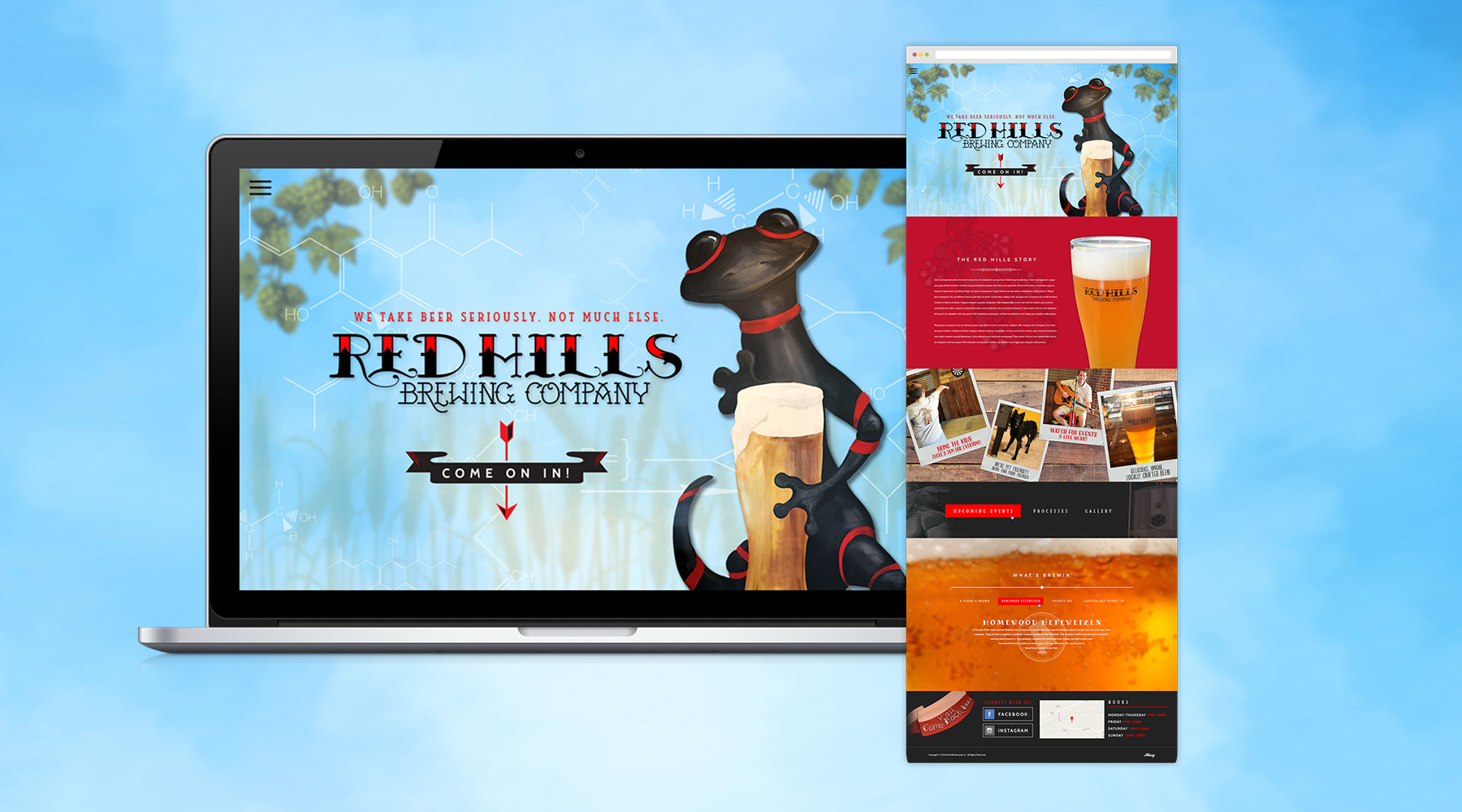
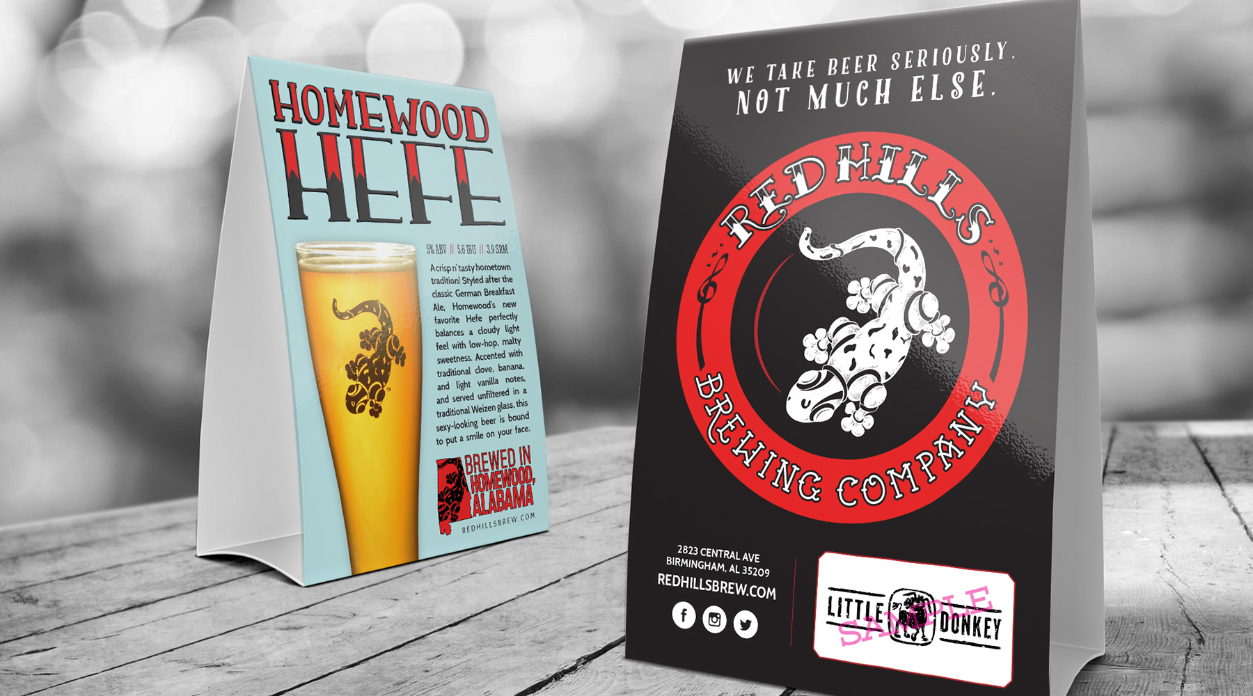
During a long relationship with Red Hills, I produced an incredible amount of creative work for them. This included beer can labels, website designs, merchandising, brand collateral, signage, countless social media ads and more. Shown here are some of my personal favorite pieces, chief among which are the beer can labels. My team and I produced a ton of hand-drawn illustrations for these, and although they may never be seen in stores, I'm incredibly proud of how they turned out.

  • Advertising
  • Merch
  • Packaging
  • Print
  • Typography
  • Web Design
Posted by jingram2 in Advertising, Merchandising, Packaging, Print, Typography, Web Design

Expectations

Expectations

Details:

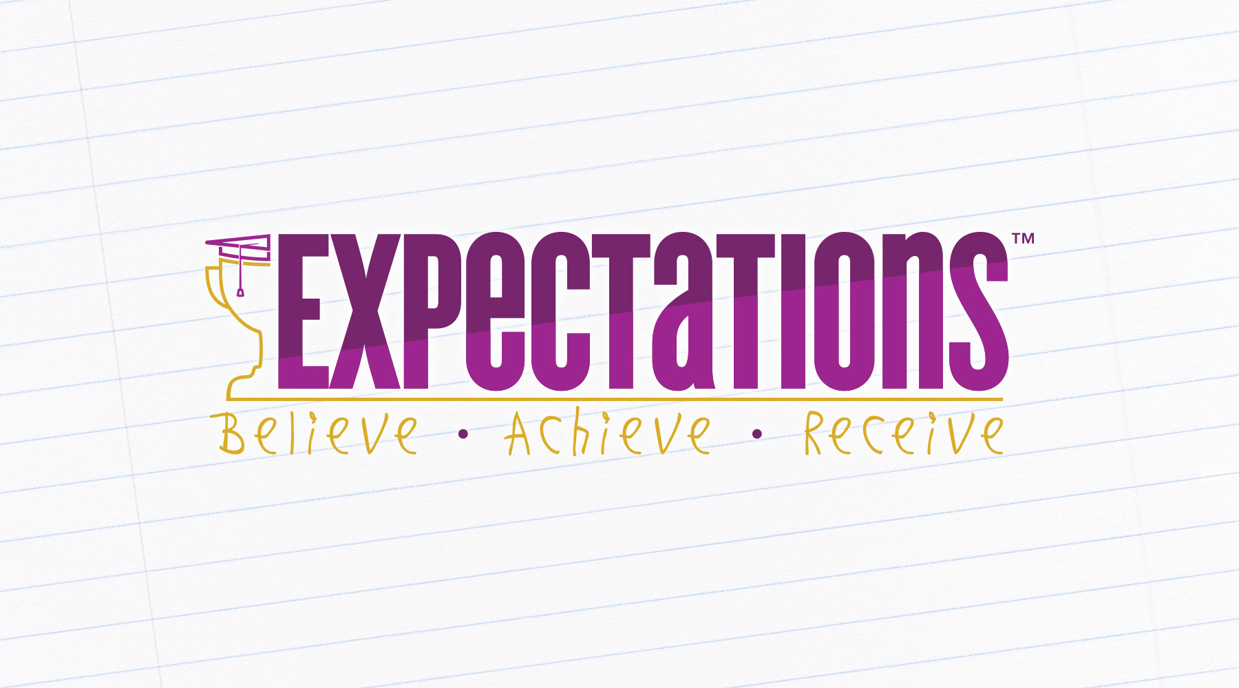
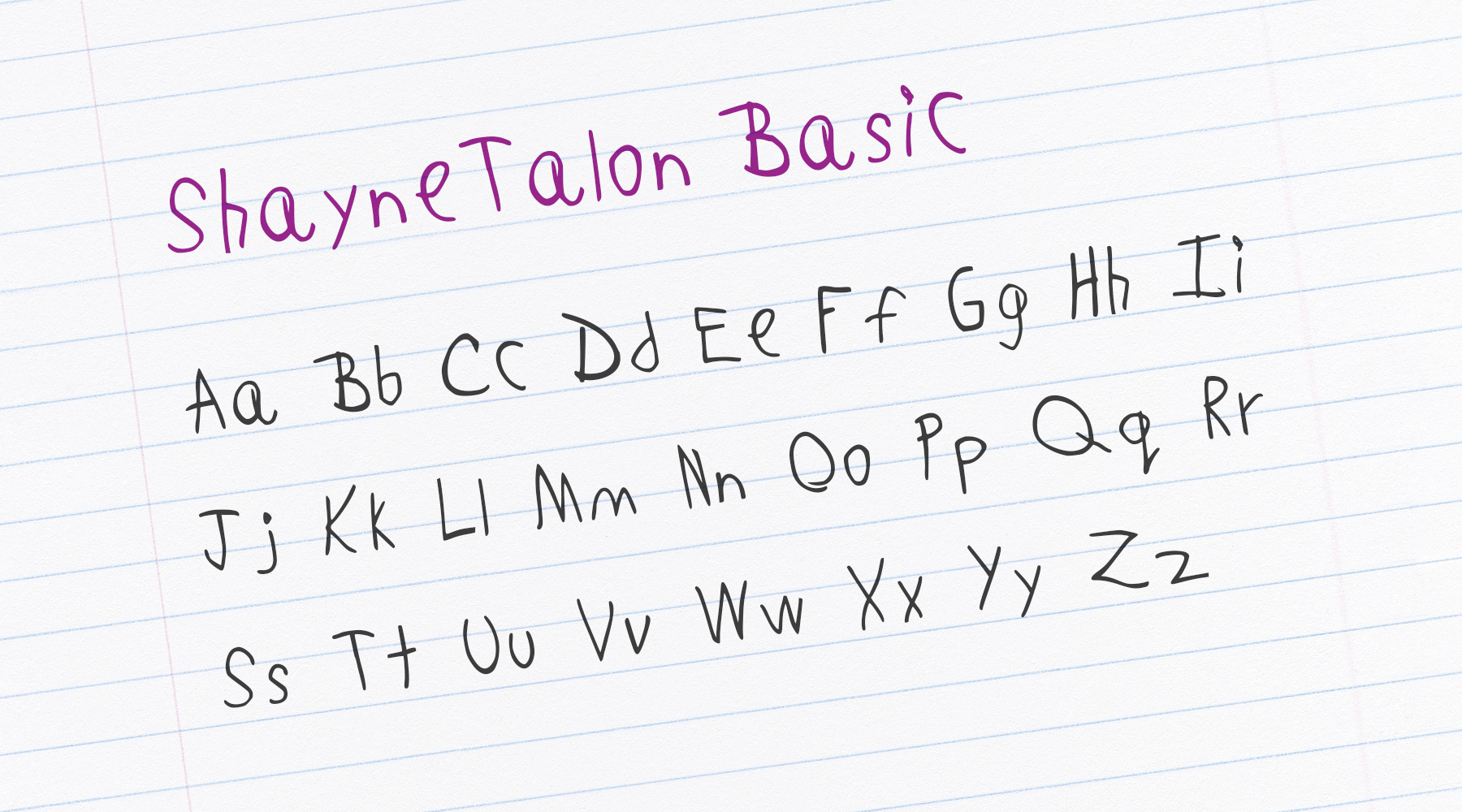
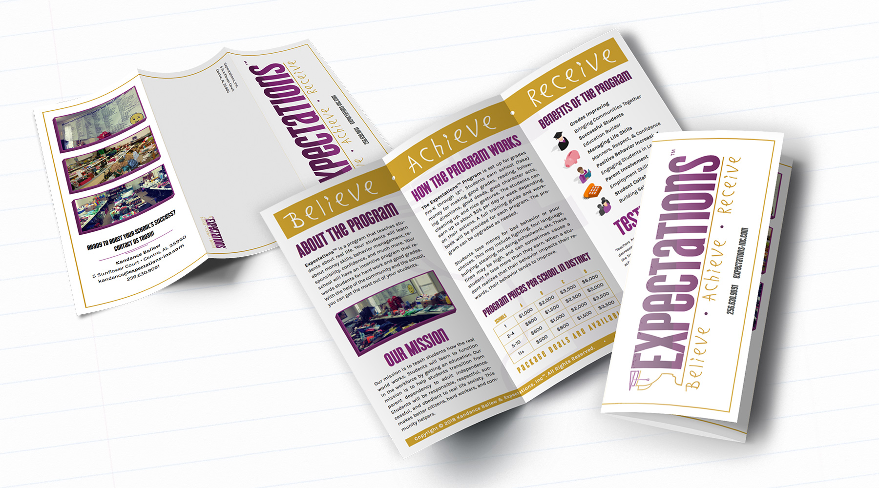
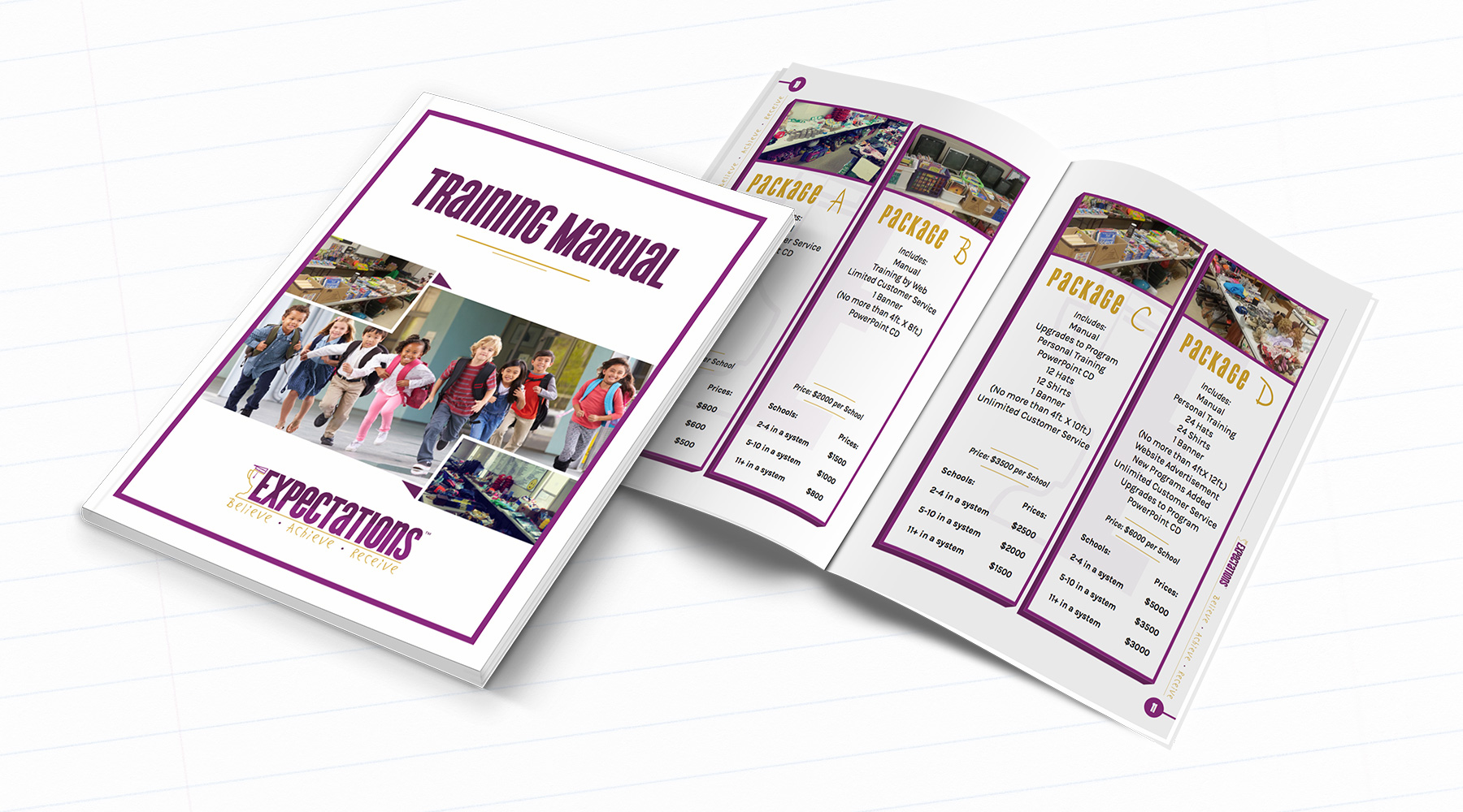
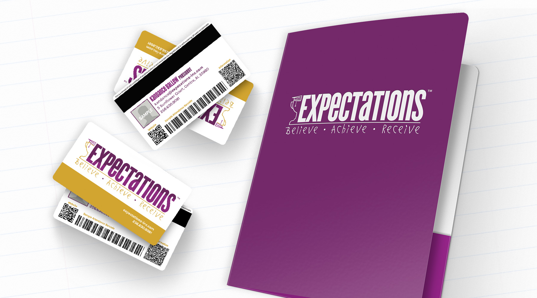
Expectations is a company which provides grade schools with an incentive program meant to encourage students to reach their full potential. I created their new brand, which includes a custom-designed font (based on the handwriting of the owner's child). I also created several print and collateral pieces for the new brand, complete with fully redesigned and reformatted workbooks.

  • Branding
  • Typography
  • Print
Posted by jingram2 in Branding, Print, Typography

UltraBlast Factions

UltraBlast Factions

Details:

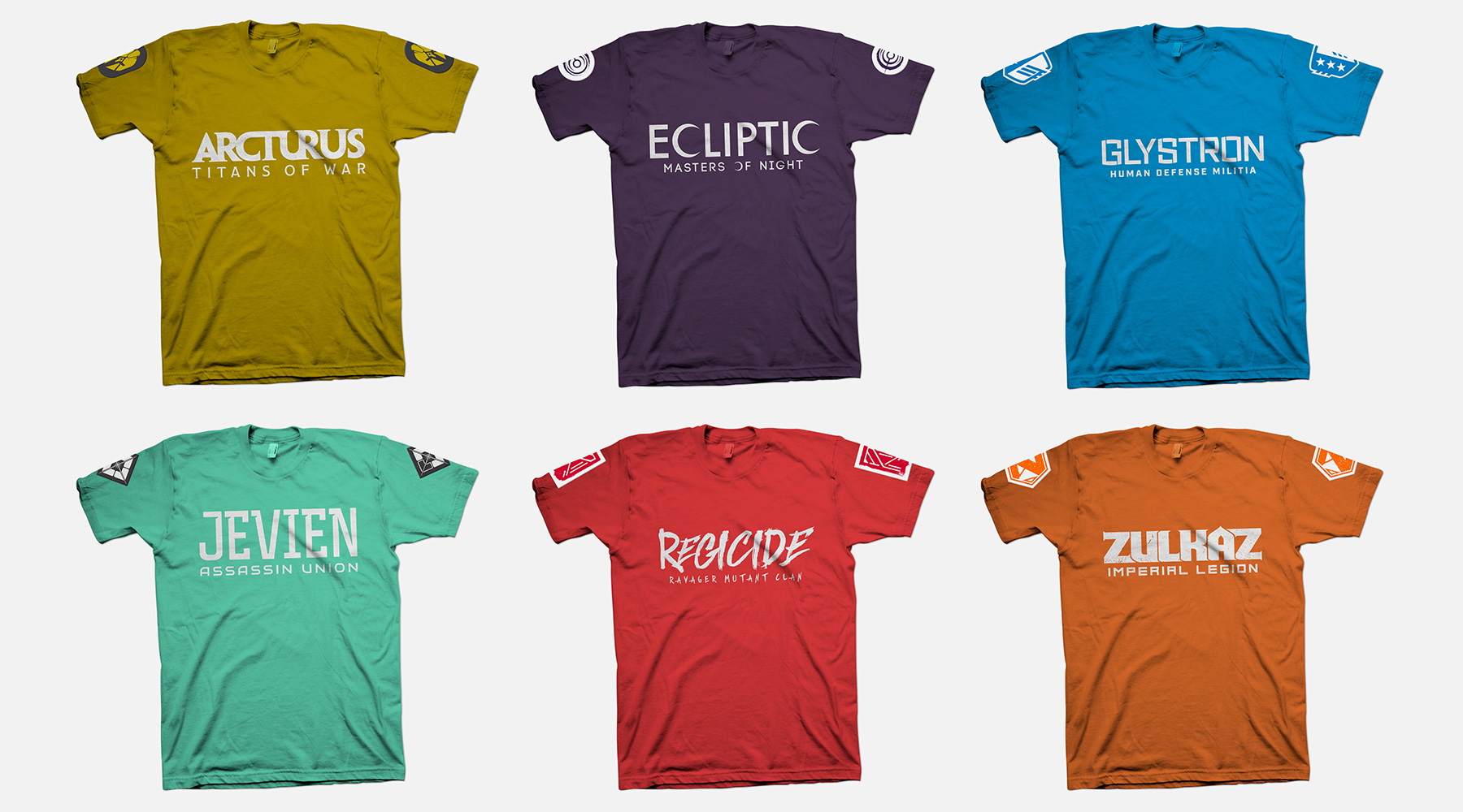
As part of the rebrand for UltraBlast Laser Combat Center, they wanted to introduce narrative "lore" to the customer experience. This narrative centered around a war between an evil, all-powerful corporation, and a growing rebellion fighting against them. The patron joins the fight by first choosing one of six factions, which could be made up of anything from "defenders of earth" to "underground mutants" to "necromancer androids" and more. My job was to create the logos for each of these factions, which would then be used on in-store interfaces, apparel, and anything else necessary. My main goal was to make sure each logo represented a unique style so that customers understood the basics of what each faction represented, and would be equally drawn to join any of the six. As an added measure, I made sure the first initial of each faction's name was present in its respective logo mark, so that each mark can work successfully as a standalone icon.

  • Branding
  • Merchandising
  • Print
  • Typography
Posted by jingram2 in Branding, Merchandising, Print, Typography

Nickels & Dimes

Nickels & Dimes

Details:

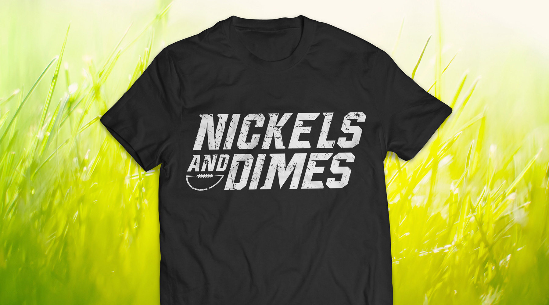
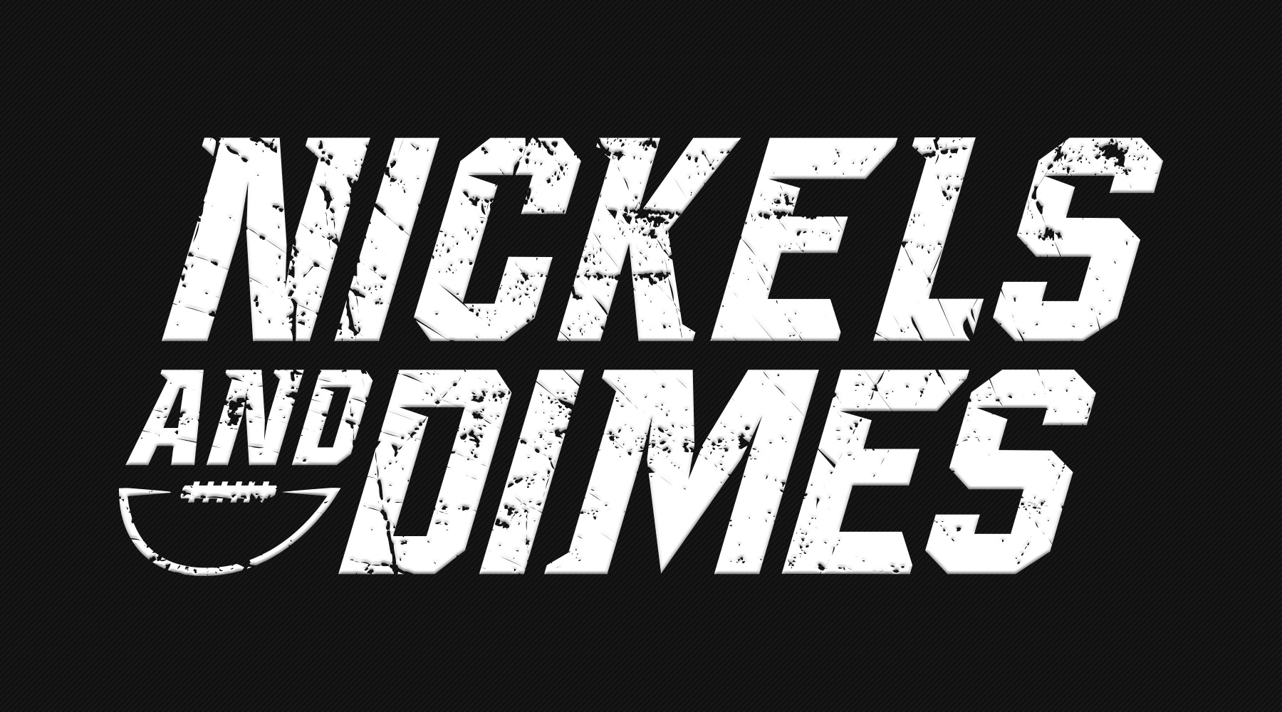
For this project, I was asked to create jerseys for a co-ed football team – according to the direction I was given, we were unable to use standalone marks or any significant imagery; the name was meant to stand alone almost completely. The end result required some experimental typography, but turned out to be the perfect blend of "intimidating and fun" that they were looking for.

  • Branding
  • Merch
  • Typography
Posted by jingram2 in Branding, Merchandising, Typography

Zoco Stylist & Boutique

Zoco Stylist & Boutique

Details:

For this project I was asked to create a brand for Zoco, a women's boutique, which needed to look modern, tasteful, and simple. The end result is simplicity itself – the angles contained within the typography are virtually all parallel with one another, and the flow of the lighter, cleaner subtitle text is broken only by a very bold and "confident" ampersand. When all is said and done, this brand feels the way Zoco wants their customers to feel: elegant, confident, and unique.

  • Branding
  • Print
  • Typography
Posted by jingram2 in Branding, Print, Typography