
Merchandising

UltraBlast

UltraBlast

Details:

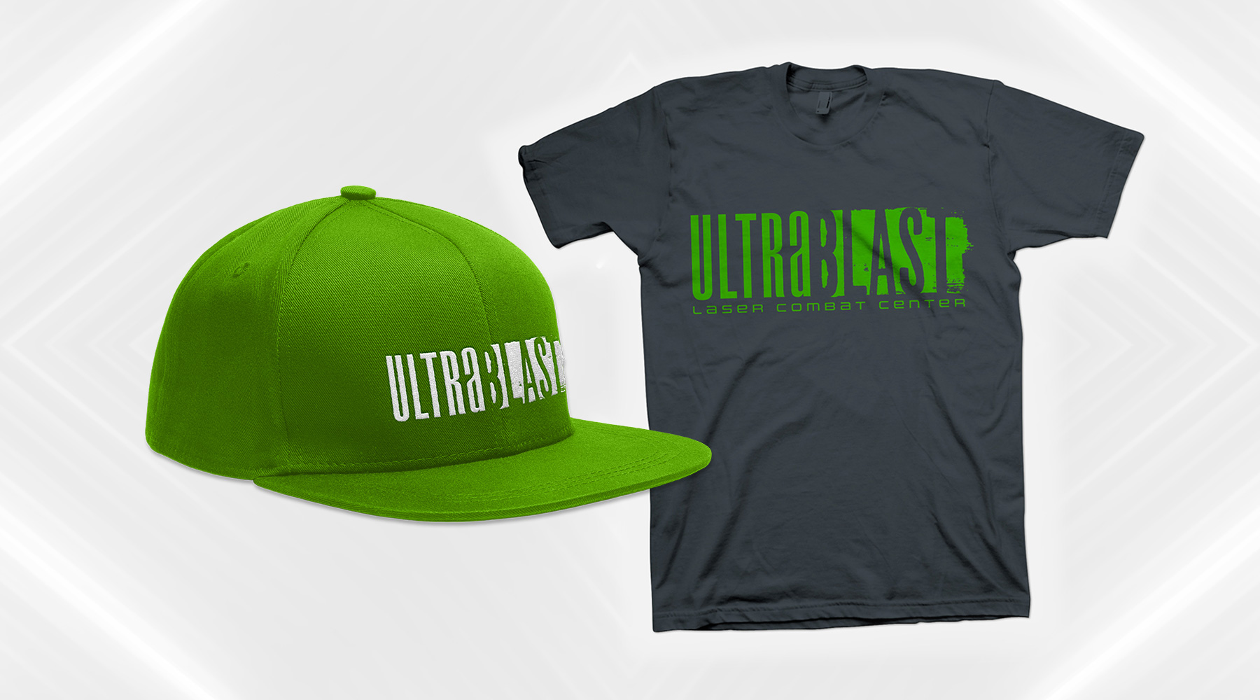
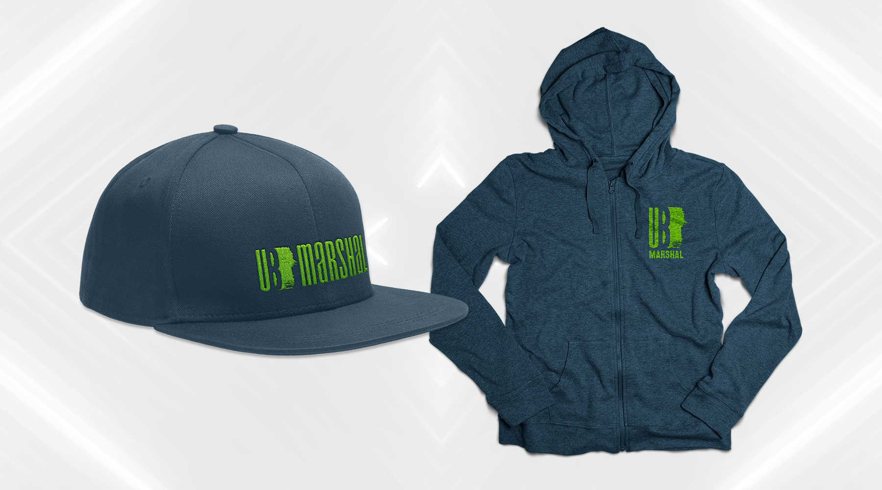
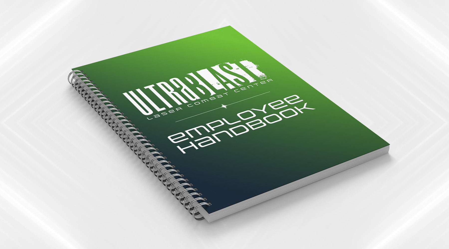
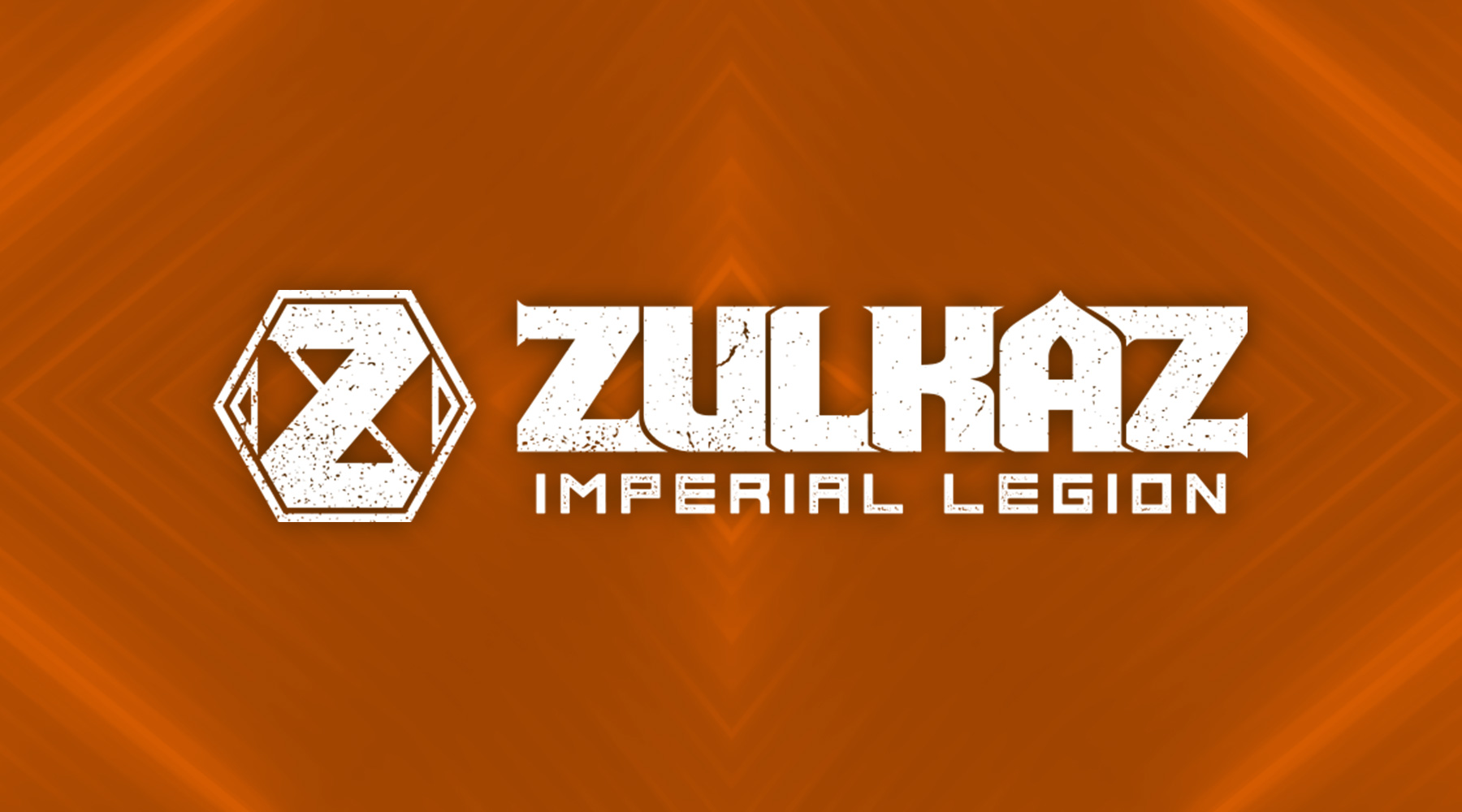
UltraBlast Laser Combat Center asked me to create for them a new brand, which needed to focus on the duality of the narrative lore they wanted to introduce as part of the patrons' experience. The futuristic narrative essentially boiled down to this: stepping into UltraBlast meant stepping into a war between an evil, all-powerful corporation, and a growing rebellion fighting against them. Each side is associated with a handful of factions, each of which may be made up of mutants, androids, warriors, and the like. The brand I created is focused mostly on the tone of the story – the solid, modern, clean "Ultra" is juxtaposed against the messy, aggressive, chaotic "Blast," with neither side looking objectively "better" than the other, allowing the patrons of the games to freely choose their own sides without influence.

  • Branding
  • Merchandising
  • Print
  • Typography
Posted by jingram2 in Branding, Merchandising, Print, Typography
Red Hills Brewing Co.

Red Hills Brewing Co.

Details:

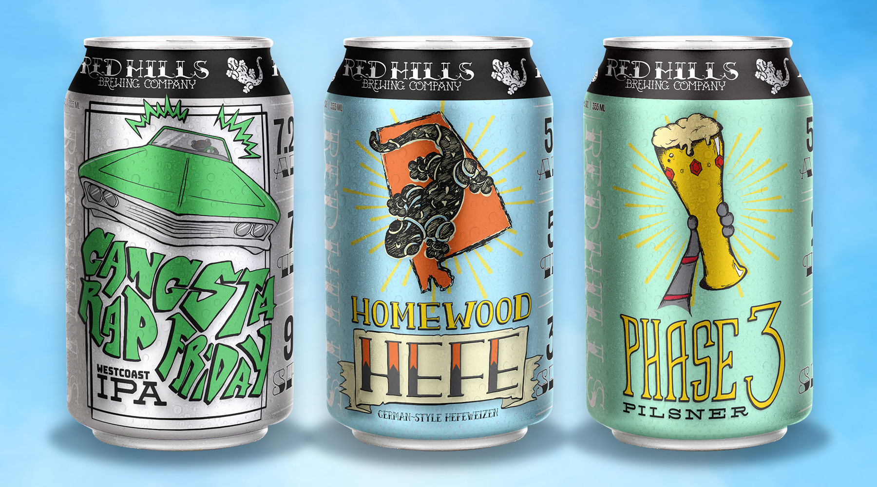
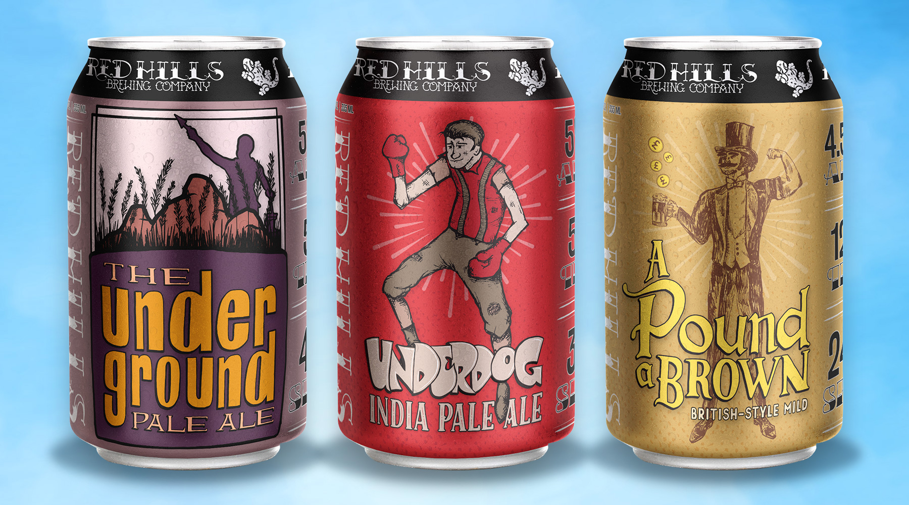
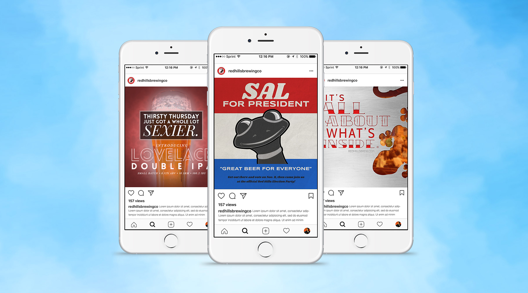
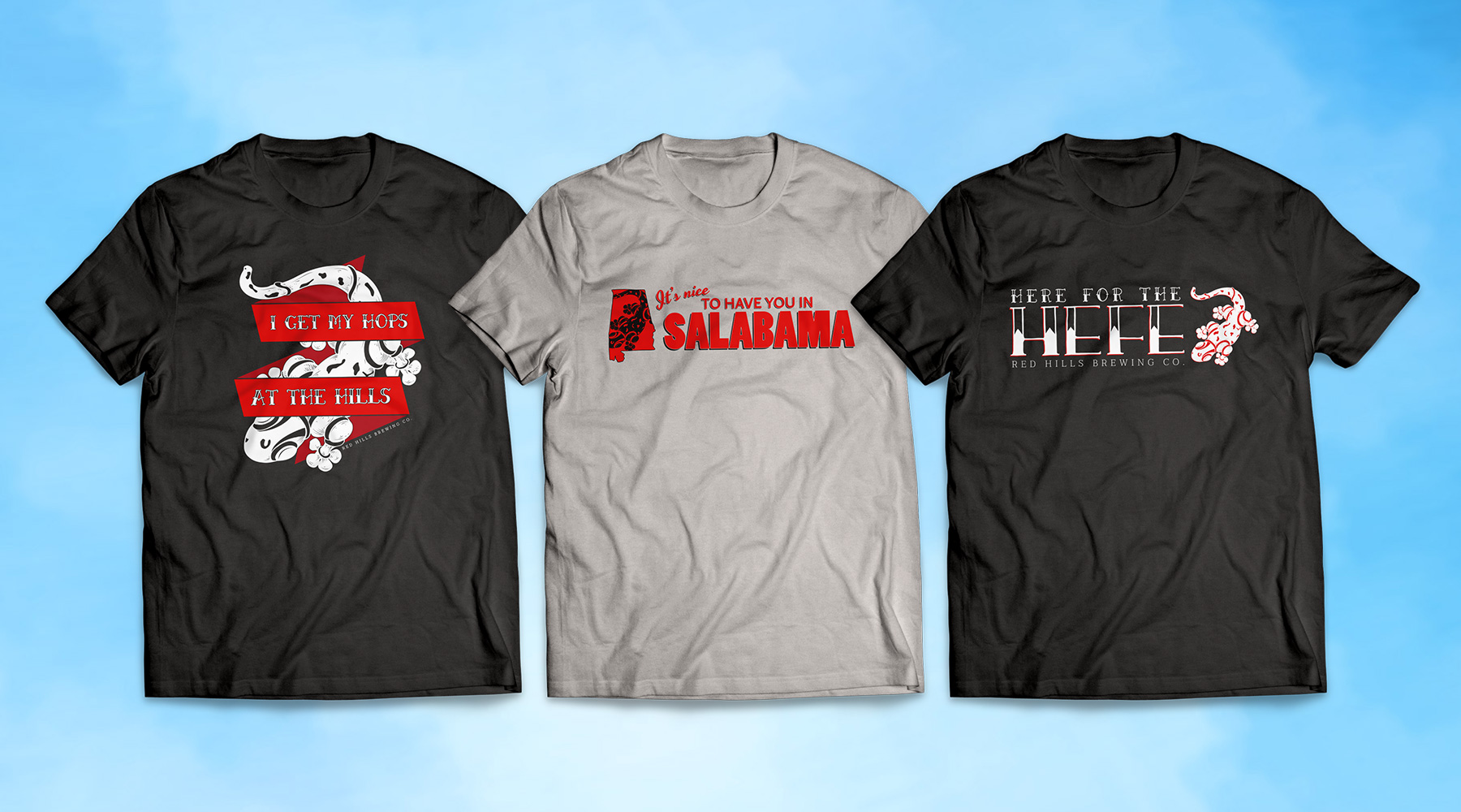
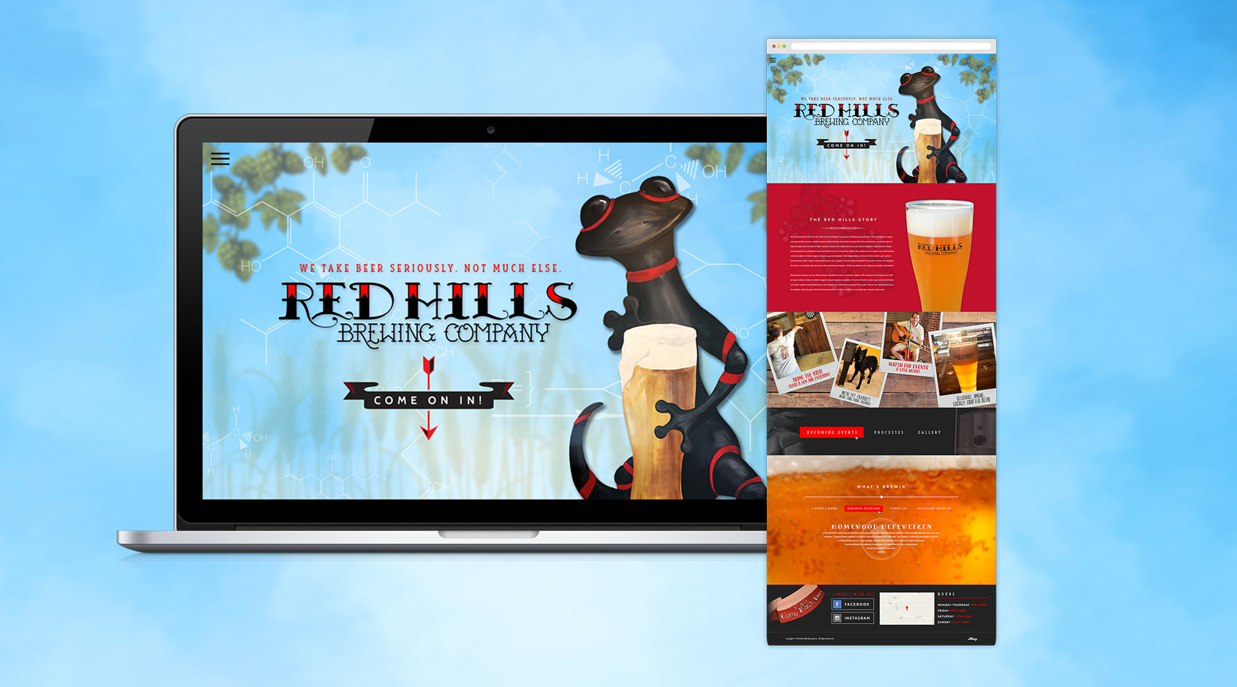
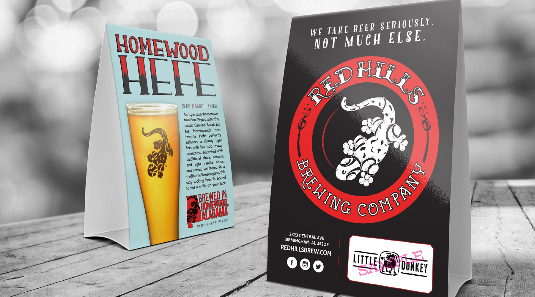
During a long relationship with Red Hills, I produced an incredible amount of creative work for them. This included beer can labels, website designs, merchandising, brand collateral, signage, countless social media ads and more. Shown here are some of my personal favorite pieces, chief among which are the beer can labels. My team and I produced a ton of hand-drawn illustrations for these, and although they may never be seen in stores, I'm incredibly proud of how they turned out.

  • Advertising
  • Merch
  • Packaging
  • Print
  • Typography
  • Web Design
Posted by jingram2 in Advertising, Merchandising, Packaging, Print, Typography, Web Design

B’ham Food Trucks

Birmingham Food Trucks

Details:

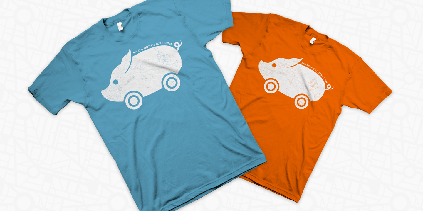
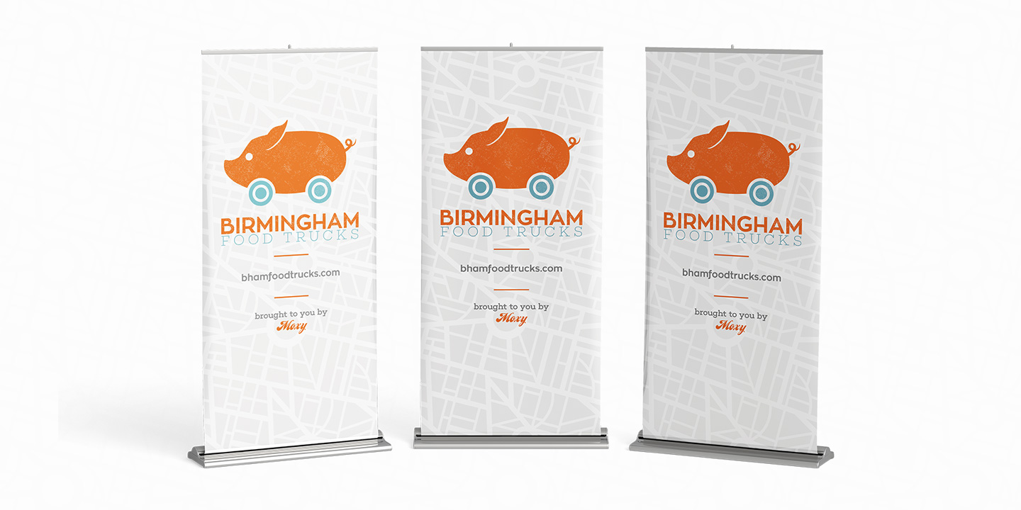
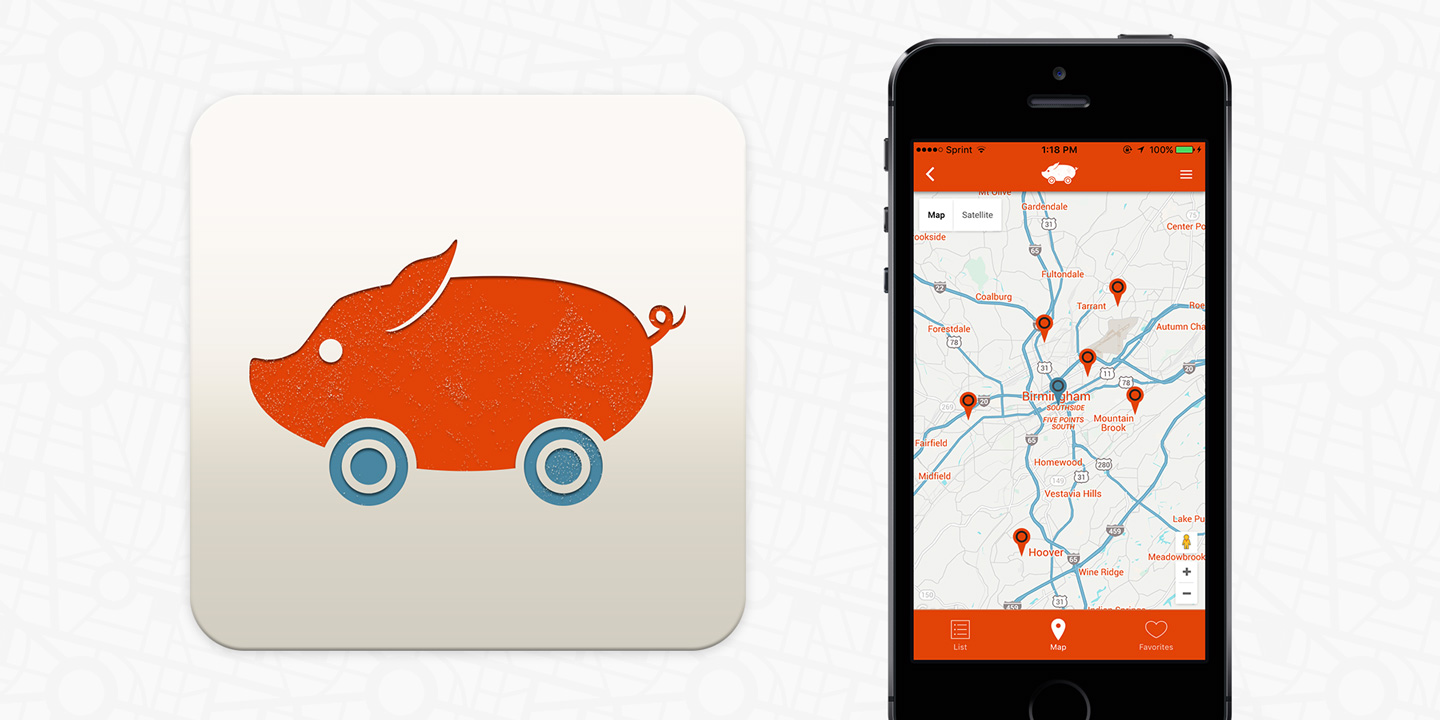
I was part of the creative team which originated Birmingham Food Trucks, a platform which tracks local food trucks and maps them in real time, according to the user's location.  I created the brand, designed the merchandising and marketing pieces, and I designed the app itself, from loading screen to user interface.

  • Branding
  • Advertising
  • App UX/UI
  • Merch
Posted by jingram2 in Advertising, App UX/UI, Branding, Merchandising

BlueJireh

BlueJireh

Details:

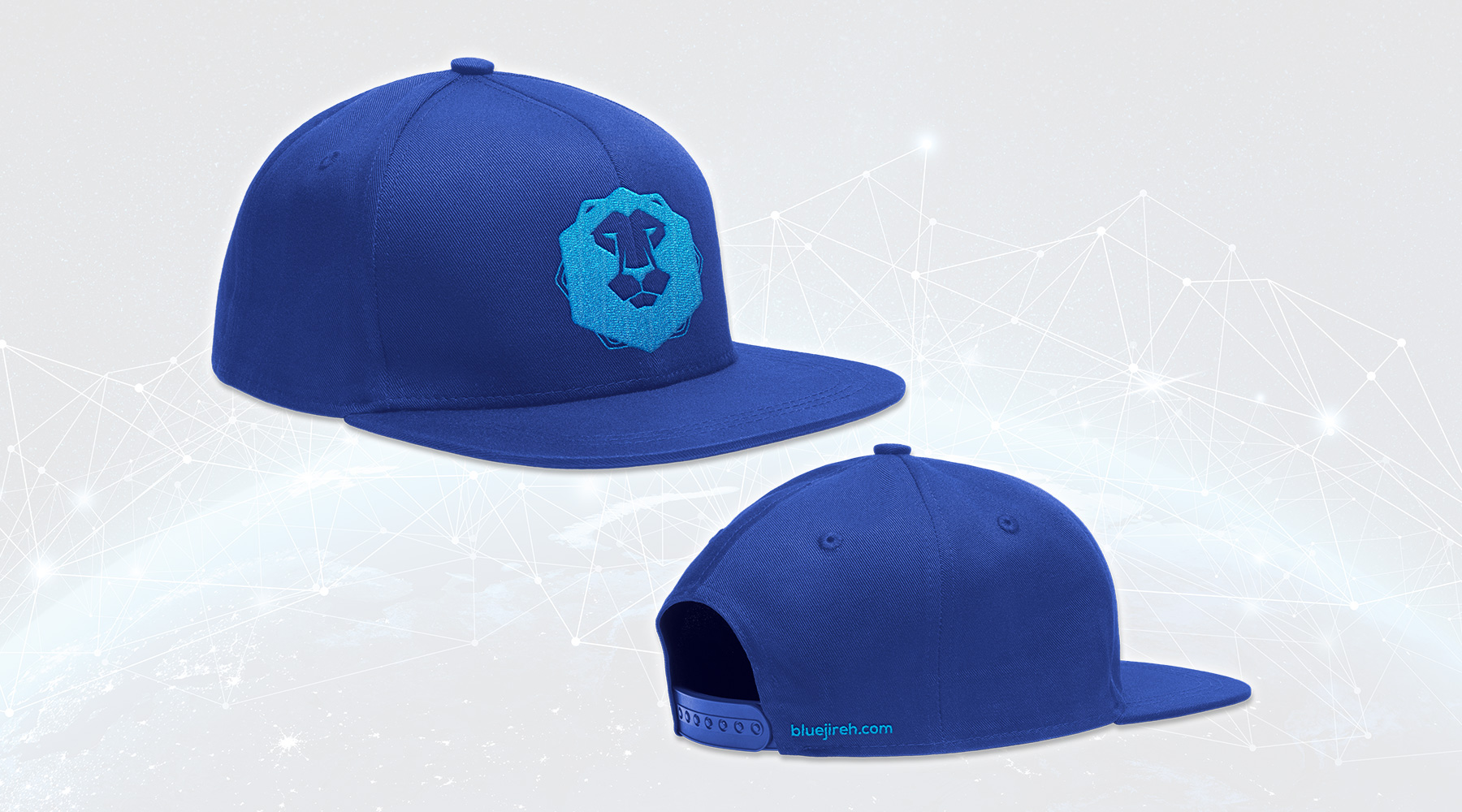
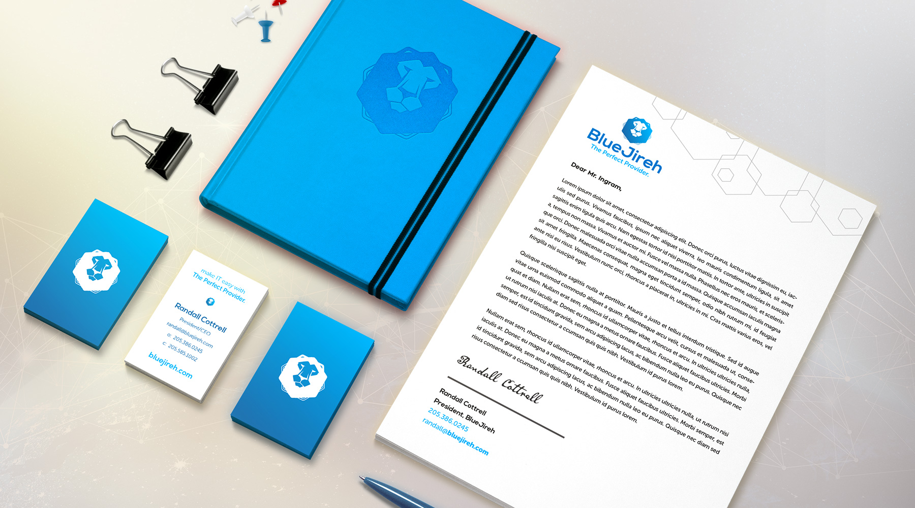
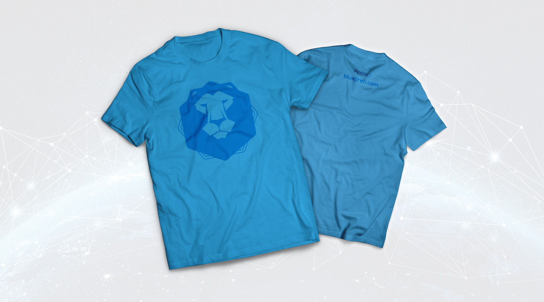
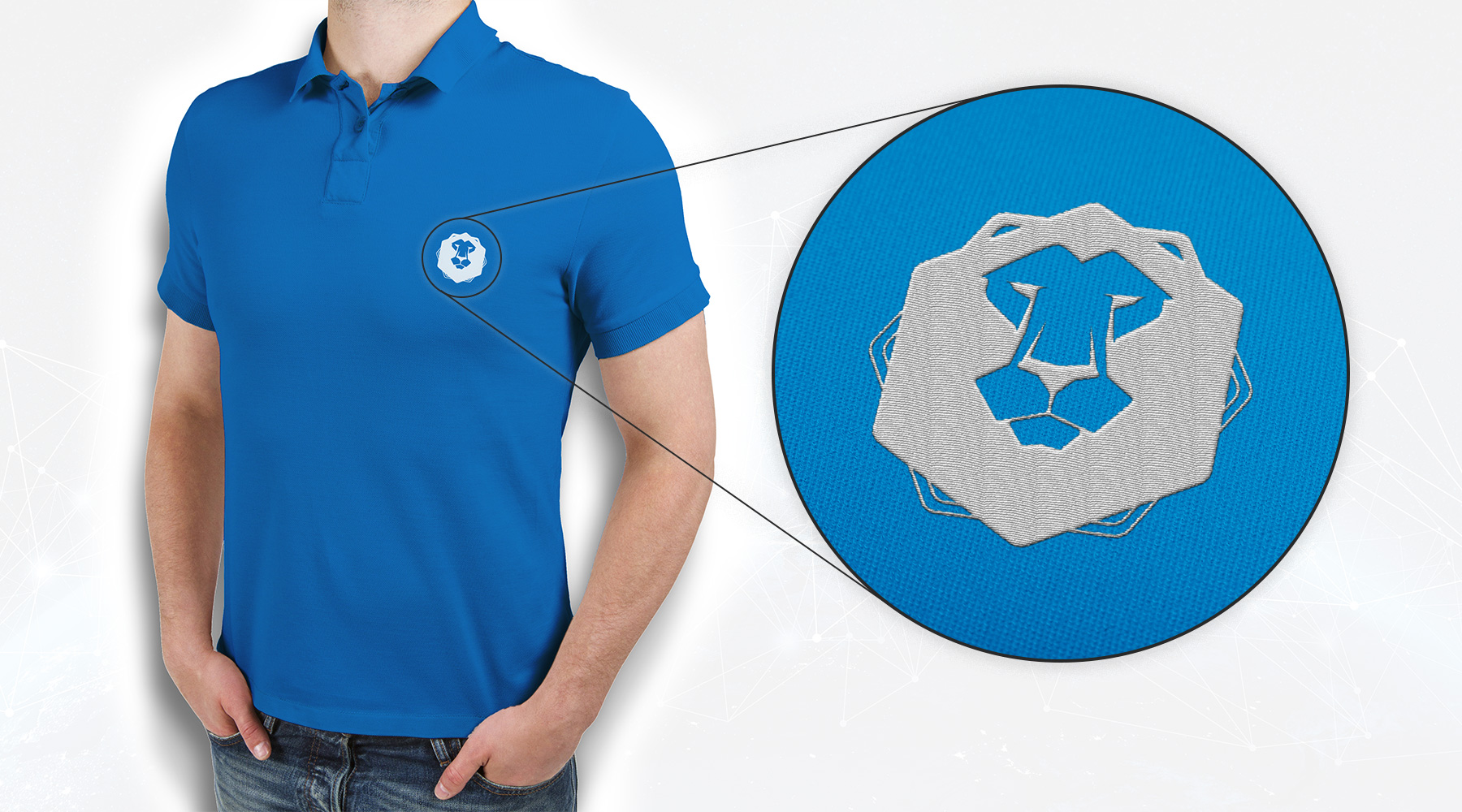
BlueJireh is an IT consulting firm who pride themselves in being an "all-inclusive, one-stop shop" for their clients. This is part of the firm's backstory involving the lion – "Jireh" is a Hebrew word for "provider," and the lion is often used as a symbol with similar connotations. I was tasked with rebranding them, with the requirement that a lion remain in the logo.

  • Branding
  • Merch
  • Print
Posted by jingram2 in Branding, Merchandising, Print

Red Cat Coffee House

Red Cat Coffee House

Details:

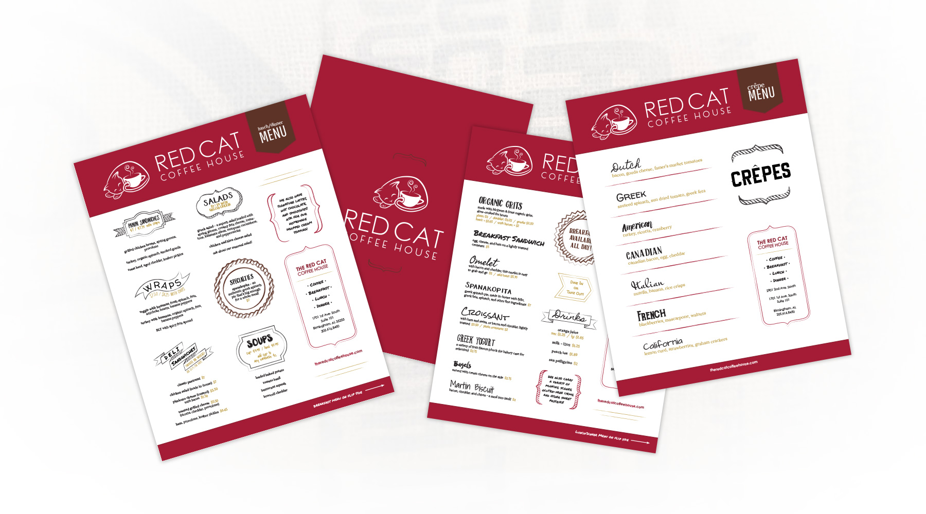
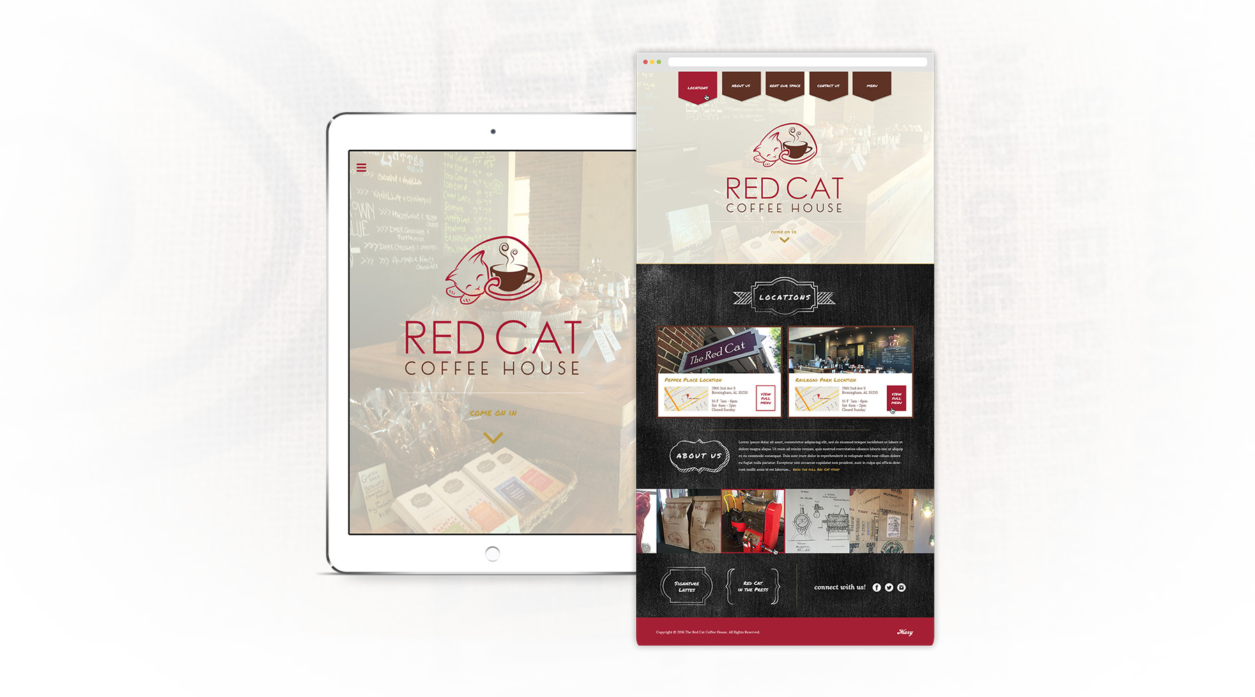
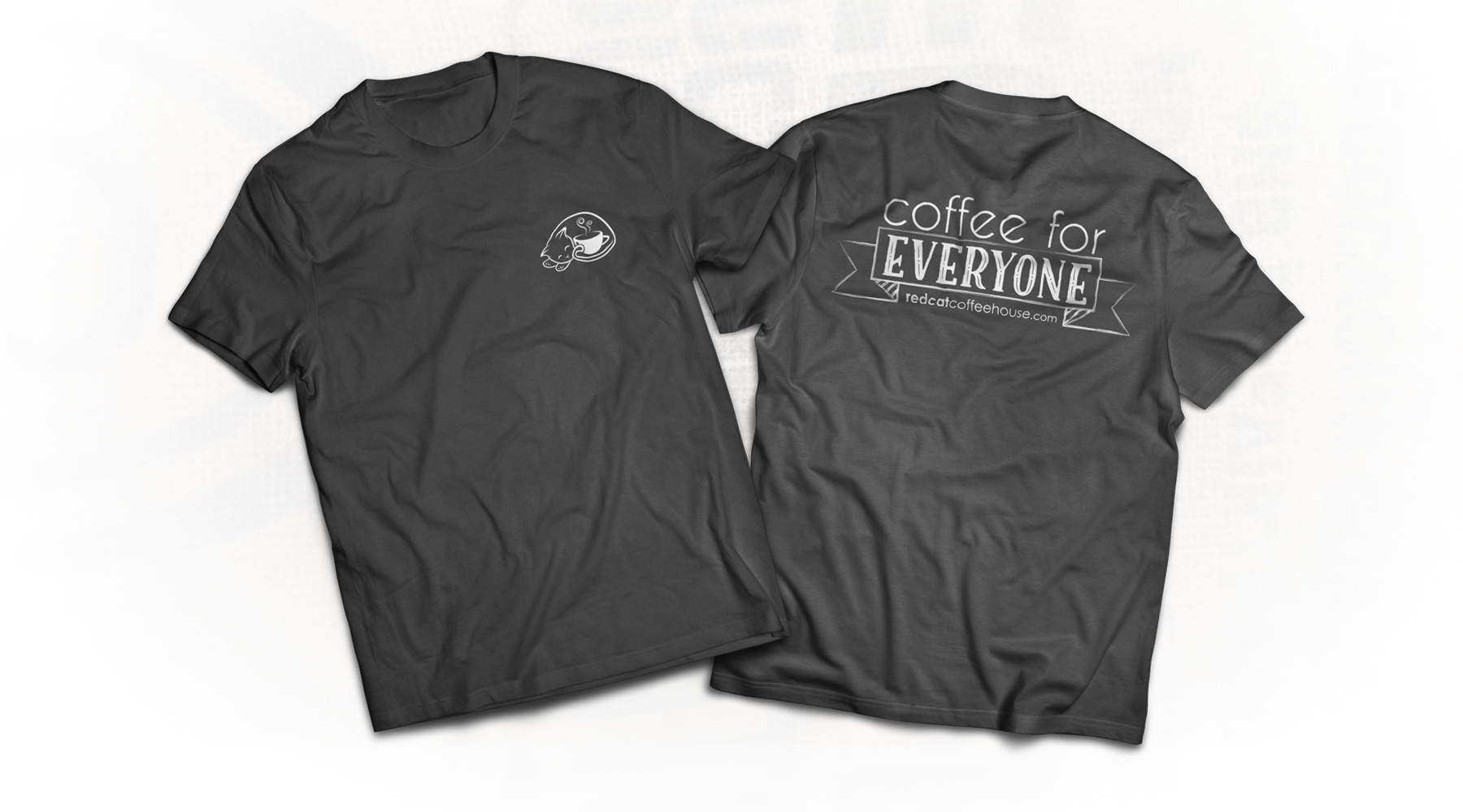
Upon opening a second Birmingham location, Red Cat asked me to help update their aesthetic.  I refined their existing logo to look a bit more up to date, and I designed various printed menus, a new website, and a few merchandising pieces for them as well.  These projects were meant to simultaneously reflect the updated brand, while tying in their original cozy look and feel, providing a smooth transition into a new public image.

  • Branding
  • Web Design
  • Print
  • Merch
Posted by jingram2 in Branding, Merchandising, Print, Web Design

Beaker Seekers

Beaker Seekers

Details:

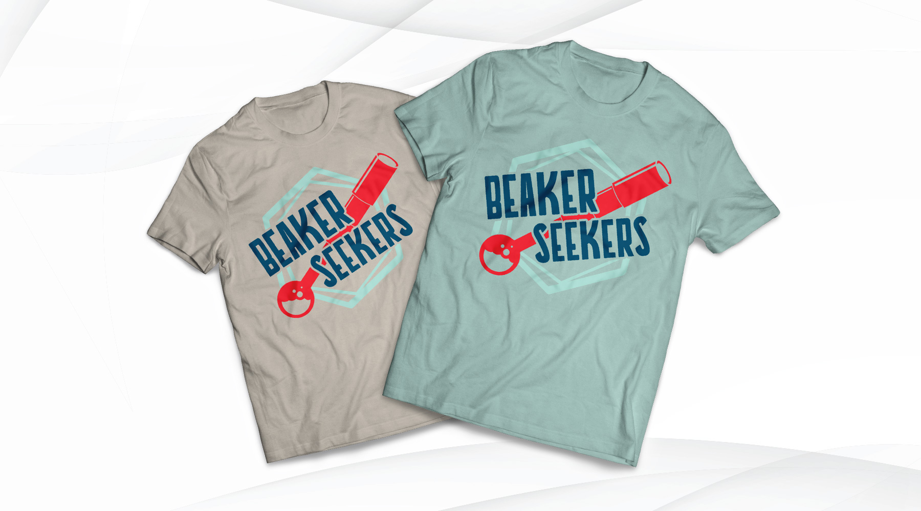
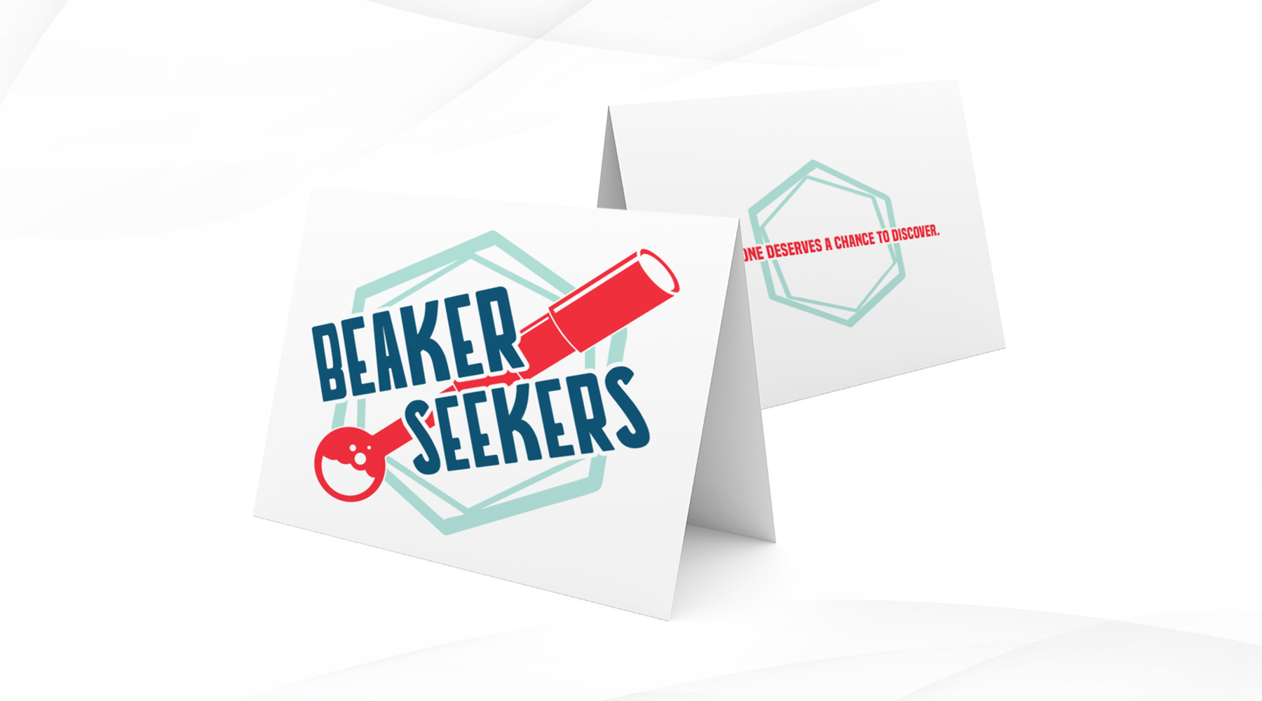
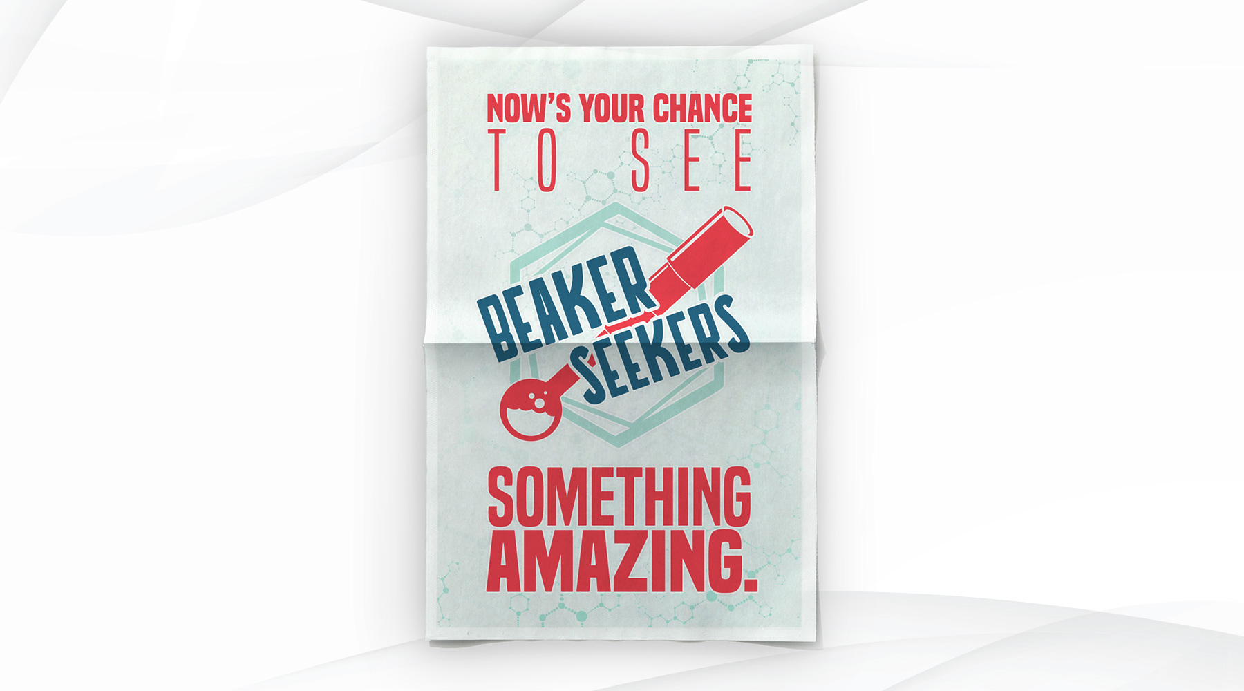
Beaker Seekers is a group which raises funds to help school systems in low-income areas afford different learning resources and field trips to places like Birmingham's own McWane Science Center. As a pro-bono project, I was asked to create a brand for them, as well as mock up a few print pieces that the logo may be used in.

  • Advertising
  • Branding
  • Merch
  • Print
Posted by jingram2 in Advertising, Branding, Merchandising, Print

UltraBlast Factions

UltraBlast Factions

Details:

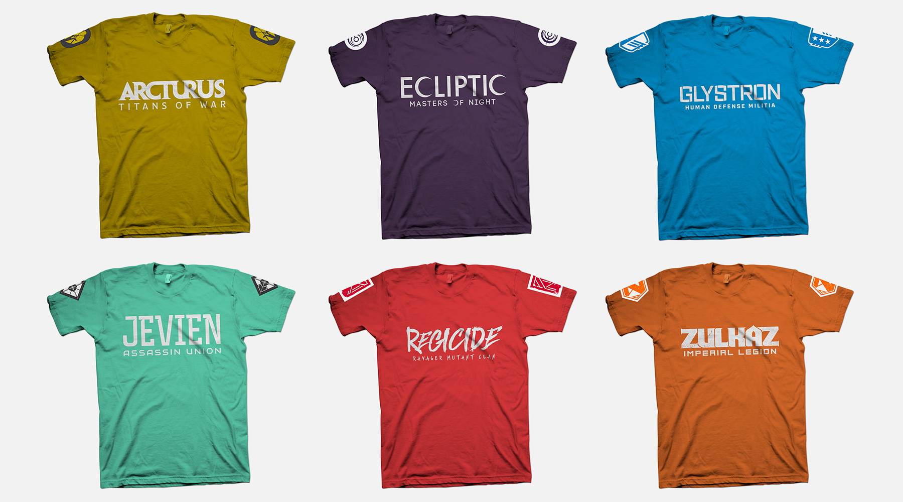
As part of the rebrand for UltraBlast Laser Combat Center, they wanted to introduce narrative "lore" to the customer experience. This narrative centered around a war between an evil, all-powerful corporation, and a growing rebellion fighting against them. The patron joins the fight by first choosing one of six factions, which could be made up of anything from "defenders of earth" to "underground mutants" to "necromancer androids" and more. My job was to create the logos for each of these factions, which would then be used on in-store interfaces, apparel, and anything else necessary. My main goal was to make sure each logo represented a unique style so that customers understood the basics of what each faction represented, and would be equally drawn to join any of the six. As an added measure, I made sure the first initial of each faction's name was present in its respective logo mark, so that each mark can work successfully as a standalone icon.

  • Branding
  • Merchandising
  • Print
  • Typography
Posted by jingram2 in Branding, Merchandising, Print, Typography
Magic City Whiskey

Magic City Whiskey

Details:

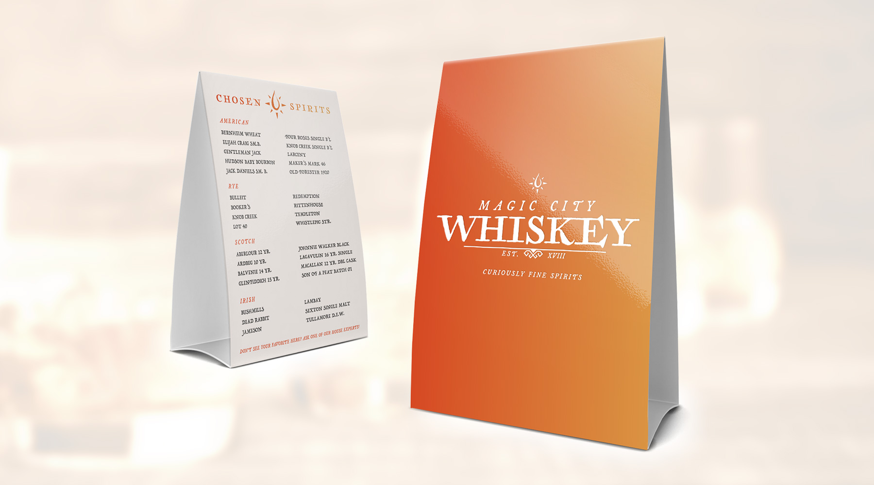
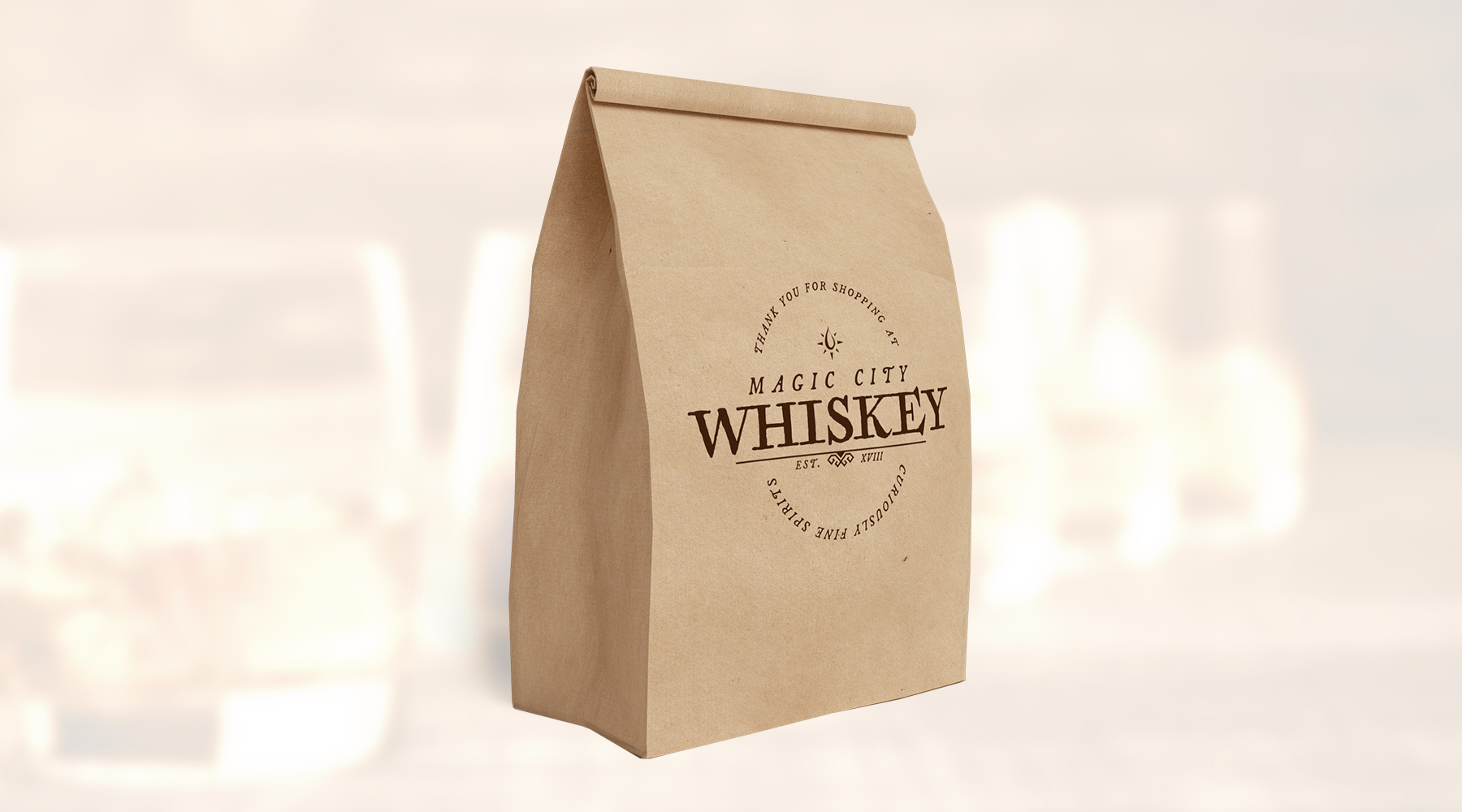
In preparation for opening one of the first whiskey bars in downtown Birmingham, this client asked me to create a brand that utilized a fresh take on Birmingham's "Magic City" nickname in its look and feel.  To accomplish this, the client asked me to use the aesthetic of the Harry Potter film series as inspiration. The end result is a unique and engaging brand, blending motifs of "old magic" and "distinguished taste" in a fun, almost tongue-in-cheek way.  The plans to open the bar sadly fell through, but this remains one of my favorite pieces.

  • Branding
  • Merch
  • Packaging
  • Print
Posted by jingram2 in Branding, Merchandising, Packaging, Print

SheRox

SheRox

Details:

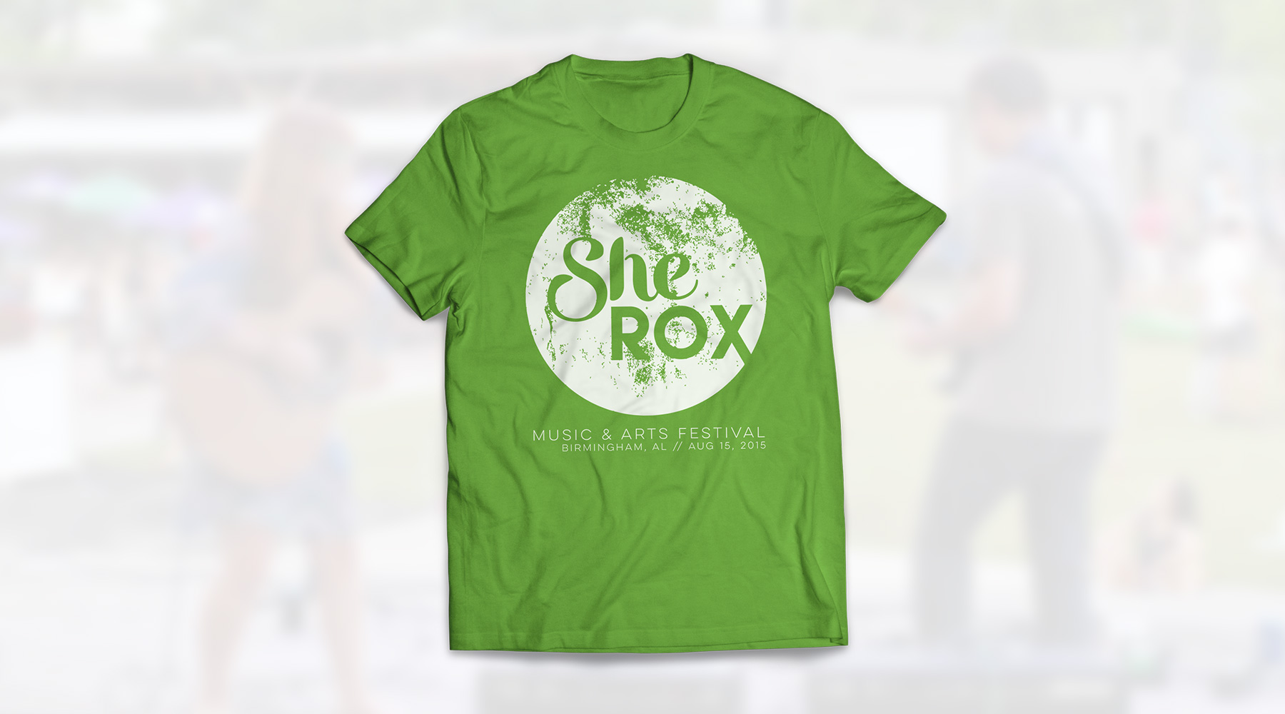
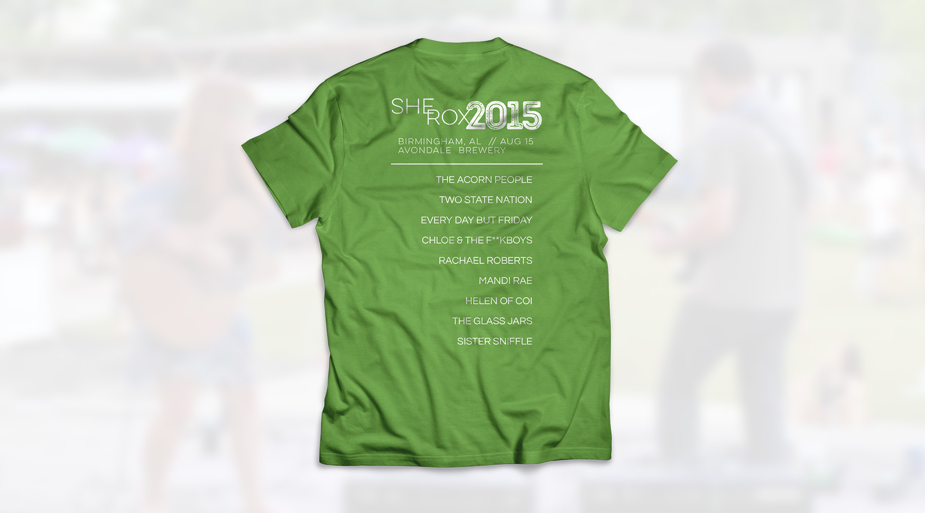
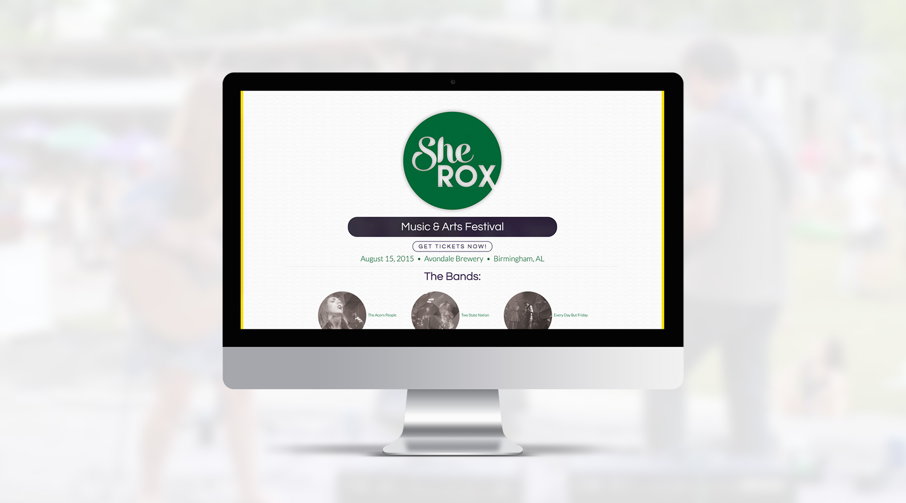
As a pro bono project, I was asked to spearhead all of the creative work for the first ever SheRox Arts & Music Festival in Birmingham, which is a female-led, nonprofit event benefitting victims of trafficking and abuse. I created the brand, designed the shirts, designed and coded the website myself, even helped with some of the photography during the event. This is a project I'm very proud of, and a cause I'm excited to support.
  • Branding
  • Web Design
  • Merch
Posted by jingram2 in Branding, Merchandising, Web Design

Nickels & Dimes

Nickels & Dimes

Details:

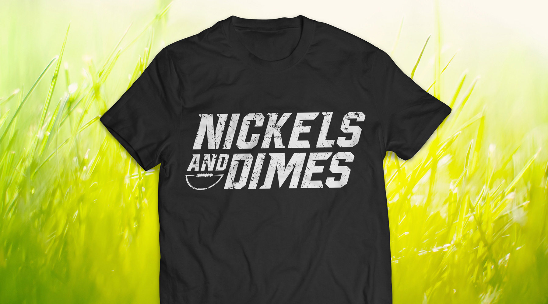
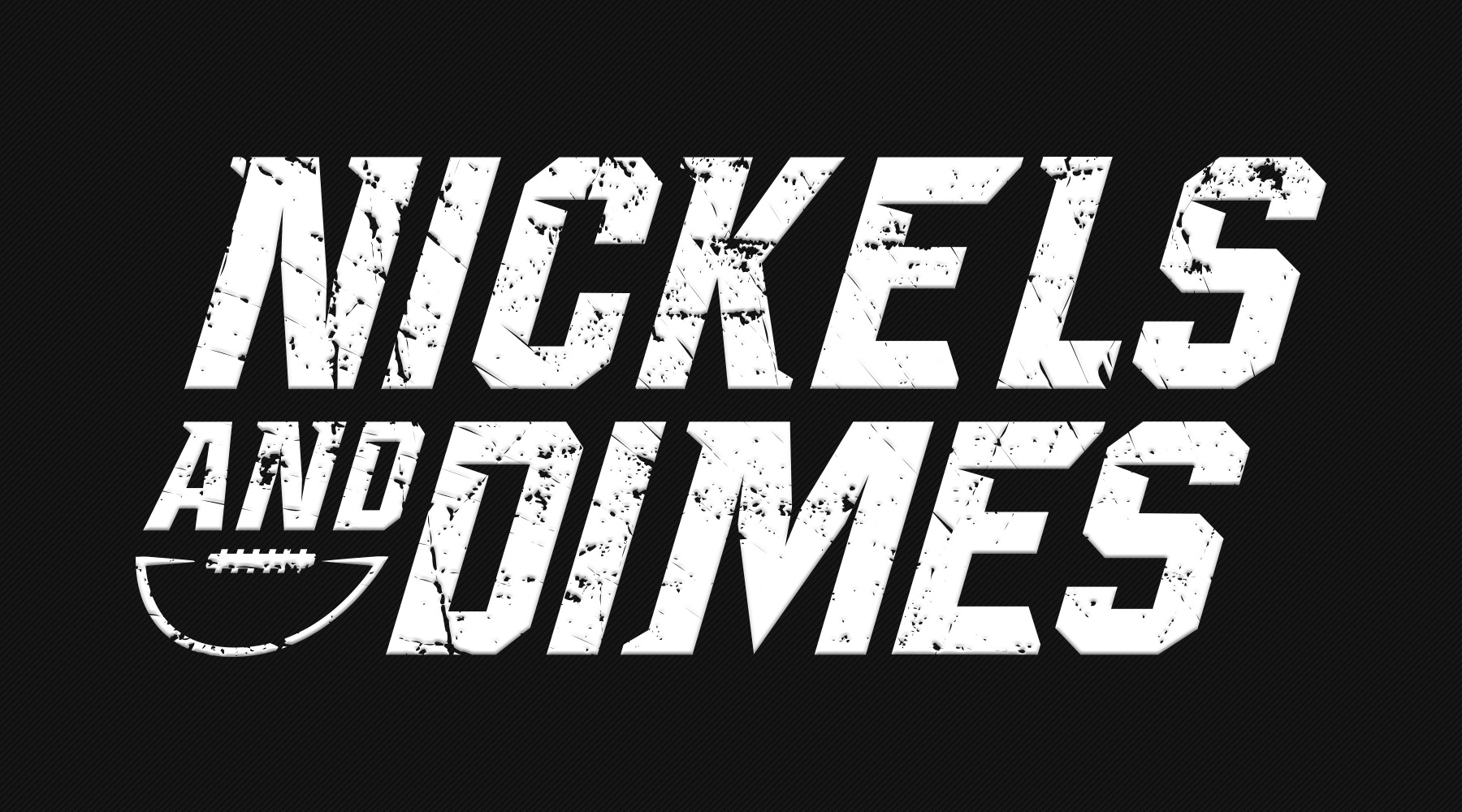
For this project, I was asked to create jerseys for a co-ed football team – according to the direction I was given, we were unable to use standalone marks or any significant imagery; the name was meant to stand alone almost completely. The end result required some experimental typography, but turned out to be the perfect blend of "intimidating and fun" that they were looking for.

  • Branding
  • Merch
  • Typography
Posted by jingram2 in Branding, Merchandising, Typography